#TransformTuesday: 22 May
Every week, Transform examines recent rebrands and updated visual identities. This week's picks are below. For more from #TransformTuesday, follow @Transformsays.
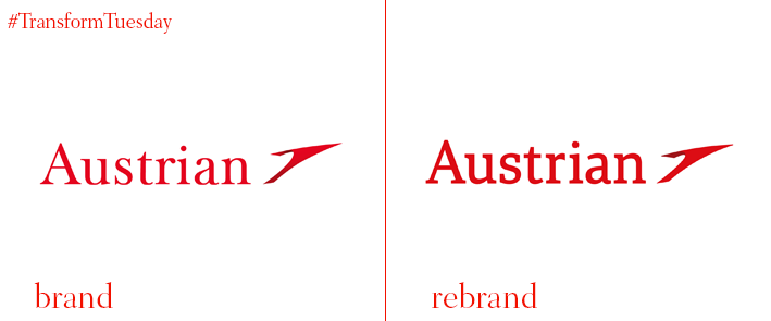
Austrian Airlines
Adapting to the digital age, Austrian Airlines has rebranded to further evolve its brand identity. After the announcement of the upcoming new website and app, scheduled for the turn of the year 2018/2019, and following the brand’s reinforced internet presence, Austrian Airlines decided to revamp its image. The rebrand aims to modernise the look and feel of the brand. Andreas Otto, board member and CCO of Austrian Airlines, says, "Digitization is changing our lives. Our products, our brand and our company are also preparing for the digital future. The adaptation of our brand image is another important step in this direction." At the centre of the new brand identity is the new logo. The two main components of the brand image, the arrow and the word mark Austrian, have been renovated without loosing their recognisability. They now sport a more bold but minimalist font that increases the long-distance readability on aircraft and posters. A focal objective of the rebrand was also to improve the logo’s on-screen translation on mobile devices and smartwatches.

Benenden Health
Benenden, the mutual healthcare society, has introduced a rebrand that consists of a new name and TV and press advertising campaign. This is the first rebrand the organisation goes through in two years.The York-based not-for-profit organisation has added the word ‘health’ back into its name and is now called Benenden Health. The addition of the word highlights the organisation’s main purpose of being ‘The affordable alternative to health insurance.’ Helen Smith, Benenden Health’s commercial director, explains the reason behind the name change and the new campaign, “We have not been shouting our name, or about what we do and what we’re involved with. We want to grow our brand awareness. In research the name Benenden had negligible impact on people. However, adding back the word ‘health’ to our title meant it started to come alive for them and to tell our story. Our name-change and new campaign sees us underlining what mutuality really means and an approach towards long-term, sustainable healthcare for the benefit of current and future members.” In addition to the new name, the advertising campaign marks the beginning of the organisation’s attempt to drive recruitment and increase Benenden Health’s membership.
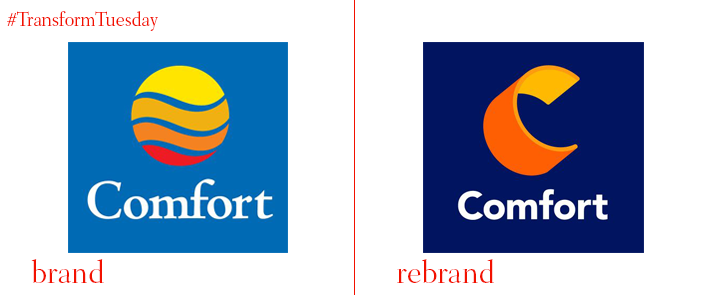
Comfort Inns
Brand strategy and design firm Landor was appointed by the Comfort hotel brand by Choice Hotels to design a new brand identity. Landor was tasked to come up with a symbol that would invite customers, all while showing the hotels’ transformation, from new lobbies to upgraded guest rooms. Wally Krantz, executive creative director of Landor New York, says, “The Comfort brand’s new identity will help pave a bold path forward. By focusing on the brand equity from its name and its yellow and orange colour palette, we maintained the core aspects that consumers love about the Comfort brand. Meanwhile, its new font and updated visual style—and especially the decision to let the logo stand on its own—lends an impactful, contemporary feel to the brand.” Comfort brand updated its image while still reflecting its heritage. Based on the brand’s values, Landor swapped the bright blue logo for a digitally- friendly look. The new visual identity, including the typography and signage, stays true to the Comfort brand promise to ‘help guests feel refreshed and ready to take on the day’. The logo is designed to adapt as the brand continues to grow.
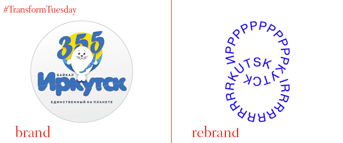
Irkutsk City
Powered by the Economy Committee of Irkutsk City Government, Russian city Irkutsk has announced the implementation of a new identity designed by UK-based Institute for Identity (INSTID.) Designing Irkutsk’s new idenity, INSTID decided to go back to the city’s roots, reflecting the city’s spirit rather than its current offerings, so that the rebrand doesn’t represent an effort to attract tourists, but rather a renovation of the urban culture. The brand core idea is formed around the tagline “Plug In!”, and represents freedom, spontaneity, wilfulness, protest, and contrast. The illustrations carry the brand’s core messaging with the electric charge representing tense proportions, contracts, and disproportions, the lift referencing abstract and absolute colours, forms, and textures, and the turn over standing for minimal standards, deliberate breach of genre principles and rules. Inspired by how close to nature Irkutsk is, with the massive Baikal next door and the seismic land, INSTID tries to portray the city in an exiting light, adopting a spontaneous and liberating visual style.

Lifeforce
Irish whole foods brand Lifeforce has been dedicated to healthy and tasty food since its foundation in 1977. However, the market’s highly competitive nature had resulted in the brand losing its audience over time. Realising it was time for a change, Lifeforce has partnered with branding and packaging design company Family (and friends) for the launch of its new brand and visual identity. Family (and friends) had the goal to create an effective and direct identity for the range, inspired by the brand's belief of ‘Nourish to Flourish,’ which indicates that eating healthy food results in a better quality of life. The new packaging is playful and lively, displaying ‘an explosive interpretation of natural vitality’ as Family (and Friends) says in the press release. Building on the brand’s philosophy of ‘allowing nature to do what nature does’, the new design and messaging maintain a minimalist look and feel, without bright colours and intricate illustrations. The new brand look and packaging range has been well received by retailers and consumers across Ireland.

SC Johnson
After almost 20 years of presence, USA-based cleaning products manufacturer SC Johnson has launched an updated identity. The company focused on highlighting its purpose by adopting a new tagline, ‘A Family Company at Work for a Better World.’ Fisk Johnson, chairman and CEO of SC Johnson, says, “SC Johnson has a long legacy as a family company committed to doing what’s right, for our consumers, communities and the environment. This is something we have been doing for generations, and we want people to know more about the many ways we are at work for a better world.” The new logo has got rid of the small design under ‘SC’, and has switched both ‘SC’ and ‘J’ to a vibrant red colour. The typeface of the whole logo has been unified, while the font size fluctuates. In the framework of the tagline update, SC Johnson is releasing three videos, in which Johnson explains how the company’s purpose helps to improve the world and benefit the next generation.
For more from Transform magazine, follow us on Twitter @Transformsays


