#TransformTuesday: 18 June
Every week, Transform examines recent rebrands and updated visual identities. This week's picks are below. For more from #TransformTuesday, follow @Transformsays
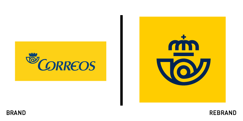
Correos
Postal services are part of the core identities of nation brands, yet they are more challenged than ever to remain relevant to their audiences. That is true of Spains national postal service, Correos, which needed a brand that would reflect its modernity, with a focus on digital implementation. It worked with Spanish brand agency Summa on the update. Summa focused on the iconic Correos symbol, the cornamusa. As the cornamusa is universally recognised and symbolic in Spain, the update was only slight, but the way it has been implemented helps broaden Correos’ potential for communications across digital and physical touchpoints. Retaining the brand’s iconic yellow the wordmark was modernised and refined as well. Summa introduced a flexible brand architecture system and a system of unique icons that retain the Correos brand character and are scalable to different sizes. The result is a more coherent, modern brand that can communicate across multiple platforms and to every audience with which Correos must engage.
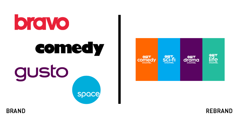
CTV channels
Parent company of CTV, Bell Media, brought the credibility and consistency of the broadcaster to rebrand four of its portfolio brands. Integrating Sci-Fi (formerly Space), Bravo, Comedy and Life (formerly Gusto) into the CTV family has allowed Bell to unite the channels through branding and across its distribution channels. “In today’s crowded media landscape, it’s essential for our services to have the same scale and brand ubiquity as our international competitors,” says Randy Lennox, president of Bell Media. “As a result we’re focusing and amplifying CTV so that it is stronger than ever.” The brands launched on 7 June and still retain unique identities, but have been folded into the CTV brand through the inclusion of the master brand logo. Each brand retains a distinctive colour and gets a moderate refresh of its wordmark.
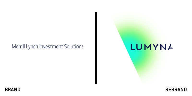
Lumyna
Moving from the Bank of America Merrill Lynch umbrella to the Italian Generali Group, the clunky named CM Investment Solutions Limited has become Lumyna. Generali worked with Dragon Rouge to update and rename the brand as part of the acquisition. Dragon Rouge drew inspiration from illumination as a means to crafting a strong brand platform and story. Paul Holmes, global head of distribution at Lumyna says, “The new name and visual identity provides a very graphic representation of our pioneering and creative approach to asset management. At the heart of our brand story is the inherent tension between the solid, dependable and institutional nature of operating a trusted asset management business, and the creative, pioneering, flexible approach we take to meeting our clients’ evolving needs.” The brand’s acquisition is part of a multi-boutique strategy for Generali Investment Partners. The visual identity uses exciting, neon colours in splashes on a predominantly white background. But the wordmark is most distinctive, with an unfinished ‘A’ that adds character to the brand.
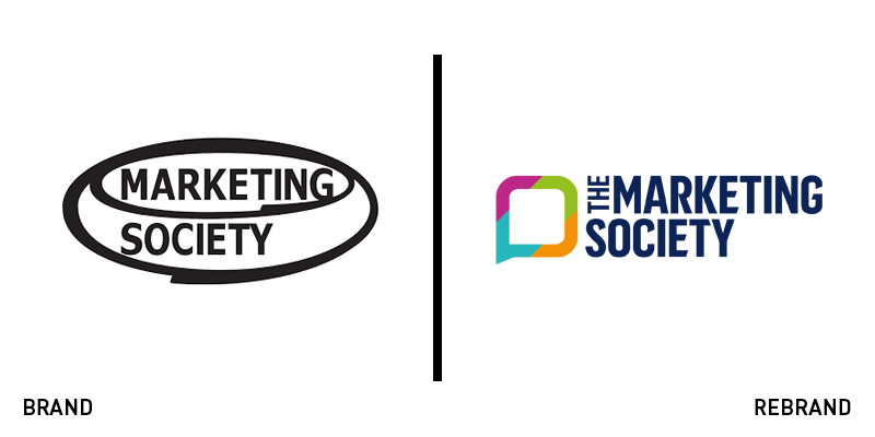
The Marketing Society
A global professional association dating to 1959, the Marketing Society faced the challenge of not marketing itself very effectively with an outdated brand. Chief executive Gemma Greaves says, “As the Marketing Society has grown over the years, how we talk about and view ourselves has changed too. We wanted to reflect this in a new identity – building on where we’ve been but with a clear purpose for the future. Working with London brand agency Bloom to update its identity, the society has focused on its achievements and heritage – this being its 60th year of operation – while also ensuring its brand is continuously relevant and meaningful. The update is digitally friendly – a challenge many heritage professional bodies have been tackling recently – and includes the introduction of a members-only website, quarterly digital publication and clearer membership access to events. The identity has rolled out across all of the society’s touchpoints in its seven global hubs.
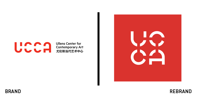
UCCA
New York-based Bruce Mau Design (BMD) worked with China’s Ullens Center for Contemporary Arts (UCCA) on a brand update that improved upon the 2012 agency carried out by the same agency. Since the 2012 iteration, the museum had undergone growth and change, including an expansion beyond its Beijing home, and was restructured in 2017. BMD was tasked with refreshing the brand to better accommodate these changes while also ensuring the organisation’s alignment to China’s overarching arts and culture strategy. The update plays upon the same design elements in the wordmark, while turning it into a square shape, thus allowing for more flexibility. It also transform’s UCCA from a museum into an arts brand – capable of further expansion – through the subtly shedding of cues that tied it closely to the heritage sector and the introduction of icons usable outside of the wordmark. A new UCCA-based pattern deploys a luxury feel akin to Burberry’s new link pattern design.
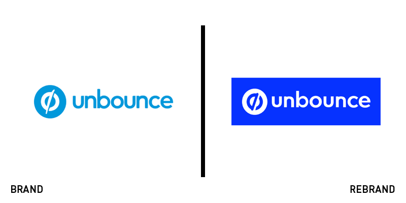
Unbounce
Vancouver-based software company Unbounce has made a name for itself in website management since 2009, but it found that its brand lacked the vibrancy and momentum its brand espoused. To reflect its character to an external audience, Unbounce’s design team worked on a brand update that would be flexible, more defined and had more ownable elements – like its typeface. The new visual identity uses pink as a primary colour with bold accents to allow for flexibility. The design team took inspiration from sports photography to put its subjects in power poses and convey the brand’s character with confidence, while also conveying a sense of motion. The updated typeface is simple and unusual, allowing for own ability while the updated wordmark has been subtly updated. Its bold rendering reads smoother and lends to more applications across different formats.


