The City of Paris’ rebrand is in harmony with the city’s roots

Brand agency Carré Noir has announced a rebrand for the city of Paris, built on the historical nave symbol of the city around a circular shape.
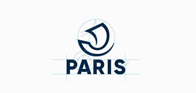
Paris still holds on to its iconic nave symbol, which has been linked to the French capital for over a thousand years. Starting with a minimal logo conceived by brand agency Carré Noir, the city of Paris has rebranded with a new visual identity that will be applied across the city over the next few months.
The new logo is strongly connected to the roots of Paris and to its citizens. “Focusing on the nave was mandatory,” Carré Noir says, “as a key historical marker and asset to the city and the Parisians.”
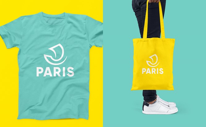
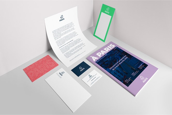
The nave itself is drawn with a single stroke, enclosed in a circular shape with a sans serif, capital-letters wordmark below the symbol. Carré Noir’s new identity shows several applications across clothing, tote bags, multicoloured bollards around Paris, stamps and brochures, with the minimal nave symbol placed against several kinds of monochromatic backgrounds or pictures.
Paris’ new identity feels young and playful in its colourful gait. The new logo has been already applied to the city’s social media channels and official websites, in the attempt to suggest a digital brand between historical and new, old and young.
“The new identity is digital, modular and allows a cohabitation with the historical identity,” Carré Noir adds. “The Ville de Paris brand gains in status and sobriety as the brand territory allows a great richness of accompanying colours. This ultimately creates a lively and rich whole.”


