#TransformTuesday: 26 February

Every week, Transform examines recent rebrands and updated visual identities. This week's picks are below. For more from #TransformTuesday, follow @Transformsays
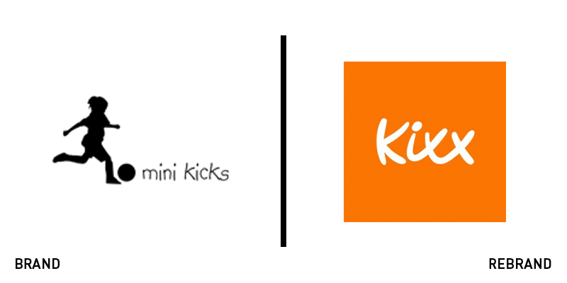
Kixx
Founded in 2011, Mini Kicks was a leading brand in children’s football coaching with up to 10,000 children coached weekly around the UK. But with a proliferation of similar businesses on the market and the business offering a diversified array of services, owner Ben Hunter wanted a new brand name and visual identity that elevated his company above the competition. Designed by Doncaster-based Moirae Creative, Mini Kicks was rebranded as Kixx with an updated logo and colours to accompany its new name. The company’s fresh moniker implies a connection to football, but is not overt in its messaging, a sign of the brand’s strong reputation and the variety of services now provided. The bright orange of the logo is visually striking, yet warm, and the font has a loose, handwritten quality that makes it unique yet approachable, perfect for this family-friendly company.

Le Goût des Plantes
Founded by two ‘nature dealer’ friends, Le Goût des Plantes is a French company that stages large plant sales in the form of festive, community-based events a few weekends per month in major cities throughout France. However, the company was looking to strengthen its visual identity in order to raise the profile of its events. To do so it worked with Brand Brothers, a brand design studio based in France, to create a revived logo that was both beautiful and recognisable, but not overly polished given the casual vibe of the sales. The refreshed branding features an exclusive typography that appears fresh, yet welcoming and evokes the natural with its soft curves. Brand Brothers also designed an exclusive icon that portrays an interlocking P and the silhouette of a leaf, a clear yet artful monogram to help establish Le Goût des Plantes as a household name.
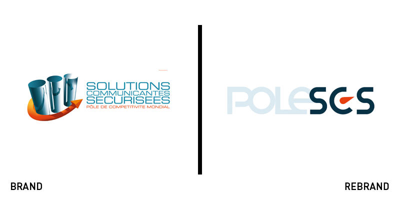
Pole SCS
Pole SCS is a global competitiveness cluster located in the Provence Alps Côte d’Azur region of France that supports over 320 companies in the development, financing and commercialisation of digital innovations. However, its original logo was dated and no longer communicated the high level of excellence for which the cluster is known. The new visual identity, created by branding agency BrandSilver, removes the ambiguous imagery of the old logo for a sleeker, modern approach. The brand refresh employs a simple sans serif font with reduced kerning in one half of the logo and expanded kerning in the other half, and preserves the brand’s original colours of light blue, dark turquoise and bright orange, the latter of which is included in the shape of an angled teardrop-shaped icon between the C and the S. The upgraded branding exudes a much needed sense of calm and balance in the uncertain environment of innovation and sets the tone for a more ambitious, promising future for the cluster.
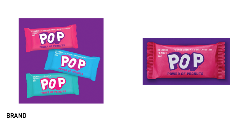
Pop
With more products than ever filling grocery store shelves, crafting a unique brand identity within the crowded snacking industry is a challenge. With the help of branding agency B&B Studio, new peanut-based snack company Pop has launched exclusively in UK Whole Foods. In order to set the brand apart from other snack bars, B&B crafted a visual identity that celebrates the snack’s nutritional value and on-the-go ease of use. The packaging is matte, which gives the brand a more high-end look, but comes in shades of turquoise, periwinkle and magenta, perfect for catching busy consumers’ eyes in crowded grocery store aisles. However, the focus is clearly centred on the bar’s core ingredient: peanuts. The Pop logo incorporates a peanut symbol into the shape of the ‘O,’ and the brand’s full name, Power of Peanuts, is listed below the logo. The end result is impactful, fun branding that showcases the straightforward, healthy nature of the snack.
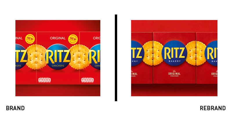
Ritz
Ritz has been a snacking staple for years, but with more consumers looking for healthier alternatives for their midday cravings, it was falling behind other, more nutritious alternatives. Thus, parent company Mondelēz chose to redevelop the Ritz recipe, cutting saturated fat by 70%. It also created a new original flavour and turned to global brand design agency Bulletproof to refresh the Ritz packaging to match the improved recipe. Bulletproof chose to maintain the classic red and blue packaging, while making subtle changes, such as the matte, richer colouring and textured look. The label also now reads ‘Ritz Bakery,’ instead of the previous ‘Ritz Crackers,’ a nod to the homemade, natural feel that the redesign aims to capture. Bulletproof adds, “We set about creating a contemporary new design, updating the key brand assets to reflect the new healthier positioning by simplifying and creating a new brand world of natural substrates, textures and styling.”


