Opinion: What is the value of ownable shapes in confectionery?

Memorable shapes and 3D brand touchpoints are key to the success of confectionery branding. How do iconic brands approach the brand and packaging decisions of the Christmas season?
A brand’s best friends are its distinctive assets, defined as ‘elements that can signal the brand (and only that brand) even without the brand name being present.’
These have always been part of the branding game – think Nike’s swoosh and its pay off ‘Just Do It,’ or Starbucks’ green mermaid – but until the evidence-based findings of Byron Sharp’s books, including ‘How Brands Grow,’ became marketing orthodoxy, few realised just how important distinctive brand assets are.
The point is that consumers have far better things to do than think about brands. They’re really not waiting for your next TV ad, new packaging design or Instagram post.
Developing distinctive brand assets requires years of consistent use, but once created they give brands the opportunity to use the assets creatively. This offers the win-win prospect of both engagement and recognition. A good example of this is the recent Cadbury campaign supporting lonely older people by ‘donating its words’ to Age UK. The packaging has been stripped of all logos, product names and descriptions, leaving just the symbol (the famous ‘glass and a half’) and the distinctive purple colour.
Most brands make an attempt to look unique but often the only thing that can’t be copied by the private label next door is the name itself and the logotype. This really isn’t enough. To truly be seen and to magnify the value of advertising spend, a brand needs two to three assets that consumers recognise at a glance.
Packaging and product shape can be especially powerful assets, because they work in 3D and are perceived by sight, sound and touch. A quick inspection of everyday confectionery shelves confirms that the sector is awash with distinctive product shapes; from Toblerone and Terry’s Chocolate Orange through to Kit Kat and Ferrero Rocher, confectionery has embraced 3D for years.
What the majority of brands have neglected, however, is their seasonal offerings. Instead of leveraging their core brand’s distinctive shape and other assets they have tended to offer generic hollow shapes plus a logo.
While some consumers are buying less confectionery on a day-to-day basis, they still want to treat their family and friends at key seasonal occasions and are prepared to pay more (pence per gram on seasonal is significantly higher than on standard lines). As a consequence, brands are starting to recognise the value of investing in seasonal products to further amplify their brand and increase sales.
The total Christmas market in the UK is worth £910m and growing at +4.4% year-on-year, the hollow figures market has been relatively flat for the last three years, with Christmas sales of £27m.
Nestlé’s decision to shake up the sector by creating something distinctive and exciting resulted in the ‘Icon’ project for Smarties. By creating strongly branded 3D figures, supported by branding and graphic design steeped in the assets, the new ‘Smarticons' take a bold step away from generic chocolate shapes.
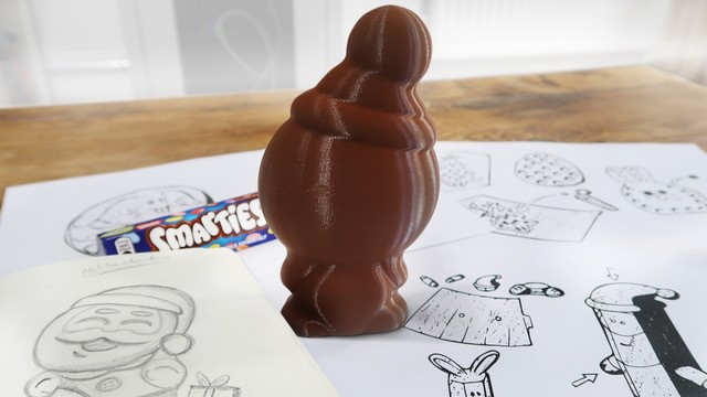

In terms of design process, early design ideas were shared with families, resulting in a clear set of requirements for the figures: they had to be recognisably ‘made from’ Smarties in terms of shape and colour, and have the right personality, combining simplicity, playfulness and imagination.
The value of the research was turbocharged by the creation and rapid adaptation of 3D printed figures, allowing consumers to respond to the designs in a natural way, and without getting sticky fingers!
Armed with these insights it took the combined expertise of 2D brand specialists Osborne Pike and 3D innovators Studio Davis to build the brand world with the distinctive assets of Smarties: the specific ‘lentil’ form, the rainbow of colours, the shakeability and the brand promise of stimulating imaginative play.
The new characters have become a 3D symbol of the brand, a novel way to play with distinctive assets, and as such create strong consumer engagement. They’ve also been adapted to work at four different sizes and price points.
Early sales results (eight weeks to 26th October) have shown a 75% increase year-on-year, comparing the new Smarties Icons versus last year’s more generic figures. Social media reveals that consumers find the characters highly engaging, and as such perfect for gifting and stocking fillers.
It’s still early days of course, but it looks like sales will comfortably outstrip expectations; more importantly, a whole new set of character assets is set to increase the ‘mental availability’ of the Smarties brand throughout the year.
Steve Osborne is a partner at Osborne Pike


