Brand overhaul for Milwaukee Brewers
American baseball team the Milwaukee Brewers is celebrating its 50th anniversary with a complete branding overhaul, which makes its debut this month.
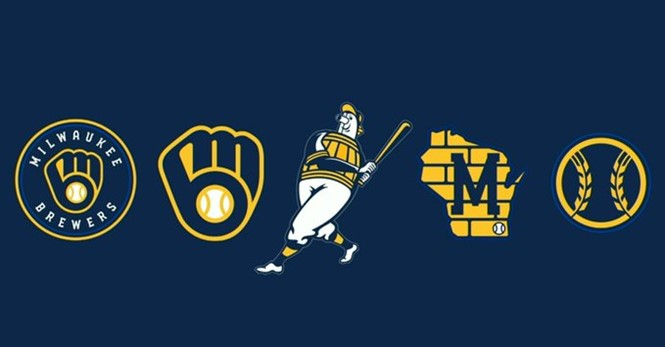
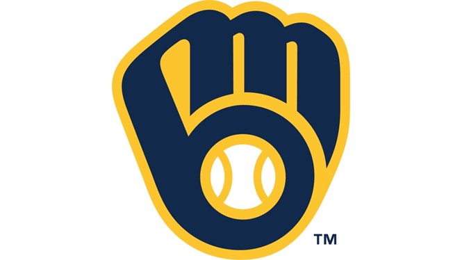
The club is retiring its script logo and returning to an updated version of its traditional ball-in-glove symbol in a move that seeks to marry its history with its future. Design agency Rare created the new logo, connecting the tip of the letter B and the start of the M, which is meant to symbolise the connection between the team and its community. The baseball in the new logo has seams dividing it into three, representing the Brewers fans, their city and their state.
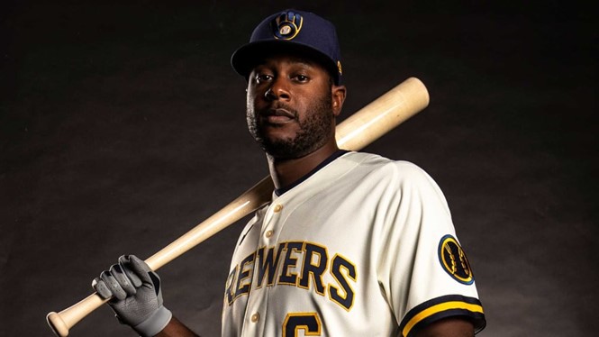
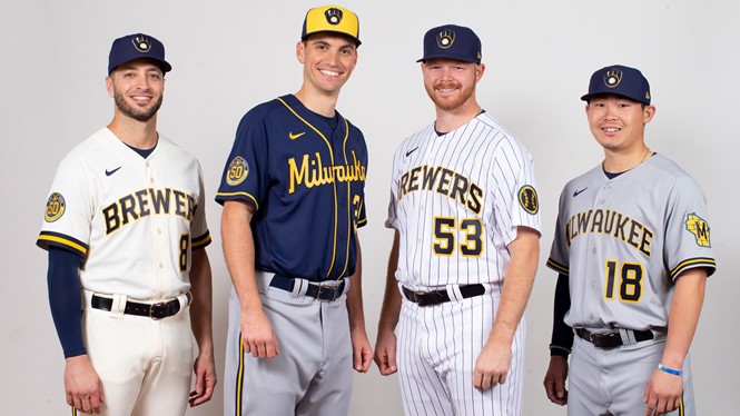
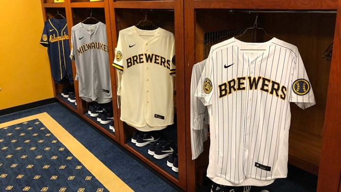
As well as the logo the Brewers has unveiled new uniforms, with cream replacing the home whites in homage to the Cream City, Milwaukee’s nickname due to the cream-coloured bricks used in its construction.
The alternative home uniforms are white with pinstripes. On the left sleeve of both versions is a baseball patch with seams of barley, which represent the city’s brewing history and hence the club name.
The away uniforms come in grey and navy versions, with a Wisconsin state logo on the sleeve and Milwaukee written in script across the chest respectively.
Referring to the redesign, Brewers owner Mark Attanasio said: “We started this in 2016 and it’s been a work in progress. Hopefully next year we have a championship team, a great new logo and 50 years to celebrate.”
Photo credit: Milwaukee Brewers


