Fun-filled design meets FMCG strategy in Livia's rebrand
Today, Livia's announced a major rebrand and repositioning. In an exclusive with Transform magazine, Family (and friends)'s Derek Johnston talks about the retail packaging strategy and design used in the Livia's rebrand
There’s a bite taken out of a square of millionaire’s shortbread on the new pack of a better-for-you snack brand. Something about the teeth marks is attractive, rather than repulsive, beseeching consumers to lean in and take a big bite.
That imagery is emblematic of the approach taken by London-based brand agency Family (and friends) in its work on the rebrand of Livia’s – formerly Livia’s Kitchen, the vegan and free-from snack brand. The agency has deployed strategies that work for the likes of Mars and Walkers and other FMCG snack brands to rebuild Livia’s positioning and redevelop its brand.
“What we’re trying to do, not just with Livia’s, but with a number of better-for-you snack brands is to move away from that traditional, hair shirt, brown paper bag, very clinical vegan/gluten-free world. Especially since more and more people seem to be moving towards that kind of lifestyle and that kind of diet, whether they have a need for it or just a desire,” says Family (and friends) co-founder Derek Johnston. The goal for Livia’s was to focus on positioning itself as a mainstream snack brand, one that packs all the taste consumers would expect from a sweet snack, but just happens to be better for you.
The new positioning focuses on the strapline, ‘Better treat yourself,’ as a means of building attention on social and reflecting the brand’s desire to be off the ‘free from’ shelf and in the general snacking section. That positioning shift – replacing the old strapline, ‘Mixing it up, naturally’ – will be supported by social and marketing activity to build awareness and attract new audiences like parents of children and men.
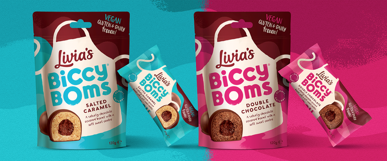
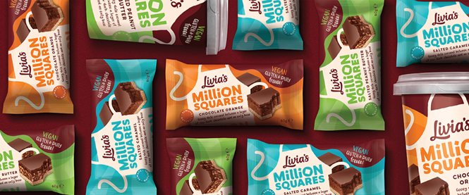
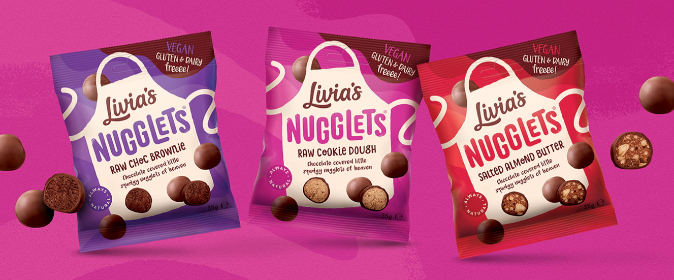
To revamp Livia’s visual identity, Family (and friends) worked with FMCG marketing strategies while also recognising what was working for the brand and what was hindering its growth. The most notable retention from the previous pack is the apron icon. Each product previously had an apron device that served as a signpost for the logo and product information. It was well-recognised, but a bit staid. Now, the apron dances.
“What we’re trying to do, not just with Livia’s, but with a number of better-for-you snack brands is to move away from that traditional, hair shirt, brown paper bag, very clinical vegan/gluten-free world. Especially since more and more people seem to be moving towards that kind of lifestyle and that kind of diet, whether they have a need for it or just a desire”
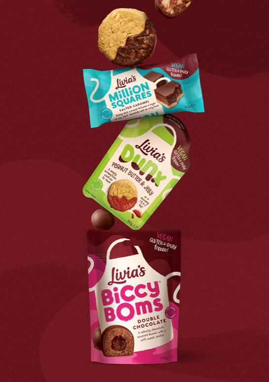
“The apron’s still a really key iconic asset, but we wanted to bring it to life more and give it more energy, make it dance a bit,” says Johnston. “If you go onto Olivia’s Instagram, you see her do a lot of dancing; she’s quite a vivacious and lively young lady.” And dance the apron does, across every product’s packaging with its strings waving gaily across the pack. The energy carries through the product names as well with a fun range of typefaces and quirks of typography. The agency also amped up the colour palette, bringing more vividness into the visual identity.
One of the things also retained from the previous brand was Livia’s name. Founder Olivia Wollenberg has been the driving force behind the company since she began baking in her parents’ kitchen. But, the word ‘kitchen’ has now been dropped. It didn’t need to be there anymore, really, says Johnston, as the brand is turning toward a more mainstream positioning. But the word ‘Livia’s’ is now enlarged and bulked up to retain that brand equity, while providing an element of consistency across a more colourful range.
But the pack is also one of the key assets for communicating a crucial differentiator in snack foods – taste. Consumers, research shows time and again, care most about how a snacking product tastes. So it’s all very well and good to have nice branding if you can’t follow through. Livia’s definitely does hit the spot in terms of flavour, it was just a matter of communicating that on pack. Johnston’s team stripped all of the free-from badging and iconography from the pack, decluttering things a bit. It then turned to hero shots of the products, writ large across each pack, to make a bigger impact with regards to taste. “Heroing the products on pack is absolutely vital,” Johnston says. “You need that kind of impact on shelf because you’ve just got to use your packaging as a piece of advertising and make it big and bold.” A smaller ‘vegan, gluten & dairy free’ element has been retained on every product’s upper right hand corner.
The overall result is compelling and lively and seems more at home alongside M&Ms and Maltesers – particularly the Nuggets range – than alongside the all-sage-green world of Sainsbury’s Free From packaging.
Livia’s Instagram post announcing the rebrand states, “We will always do whatever it takes to stand out from the crowds, and since we have seen such success recently, there have inevitably been some Livia's look-a-likes which have come to market. We are flattered by this, but will always be one step ahead of the game! We will continue to innovate, surprise and delight you all.”
The rebrand will also extend across digital and social assets, rolling out shortly, as well as new retail activations.