#TransformTuesday: 14 August

Every week, Transform examines recent rebrands and updated visual identities. This week's picks are below. For more from #TransformTuesday, follow @Transformsays

BetEasy
If only it was easy for CrownBet. In July, Australia’s Federal Court banned the online gambling company from changing its name to Sportingbet due to infringing upon competitor Sportsbet’s brand. In response, the company has re-rebranded from CrownBet (which it adopted in 2015) back to its original name, BetEasy. Interbrand designed the original BetEasy brand and the company is working with Melbourne ad agency the Monkeys on the rebrand campaign. The new look is purple and turquoise, using the purple from the CrownBet branding but bringing in a new vibrant accent colour.
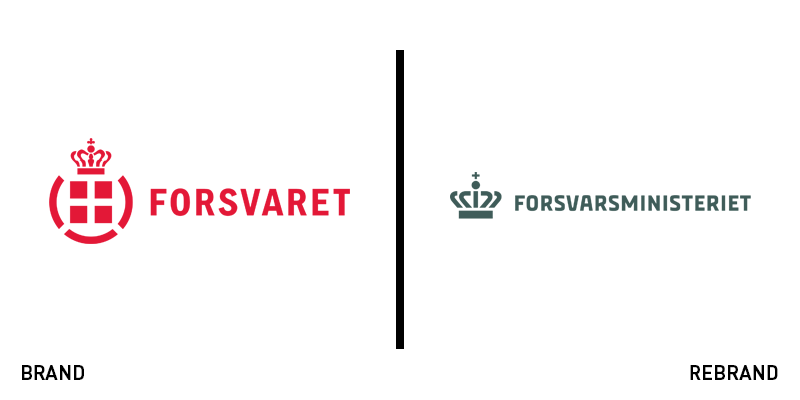
Danish Ministry of Defence
Denmark is a small country of about 5.7m, but representing it from a united standpoint – and now a united brand – is the Danish Ministry of Defence. The organisation, containing Danish military forces, the Danish Emergency Management Agency and the ministry itself are now represented by one central brand and a family of related sub-brands. Designed by Copenhagen-based Kontrapunkt, the new approach uses a crown icon as the main logo with alternative logos including the crown device for each of the services represented by the ministry. The agency says the key challenge was balancing difference and cohesion effectively in redesigning the brand system.
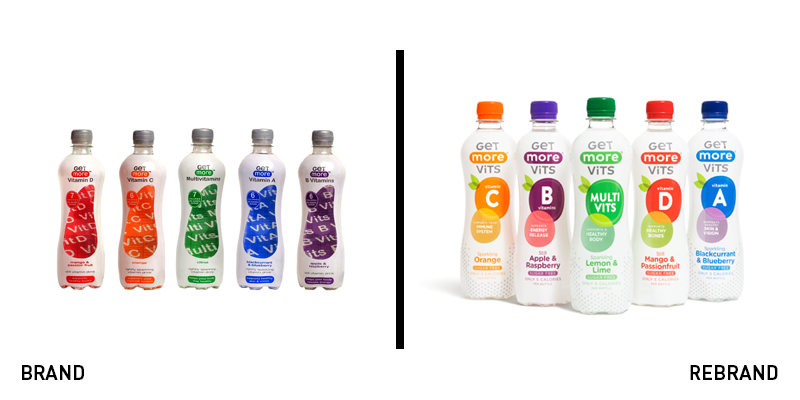
Get More Vits
Despite a successful product gracing the shelves of the UK and Ireland’s health food shops since 2012, Get More Vits lacked an effective packaging strategy. Its previous packaging was defined by a unique bottle shape and colour coding system to help with product identification. Working with Family (and Friends), a London-based brand agency, the company changed its name from Get More to Get More Vits and introduced a more fun packaging design that puts fruit front and centre. It better expresses the contents of the products than the previous approach while still retaining the colour coded product differentiation system and bottle shape.
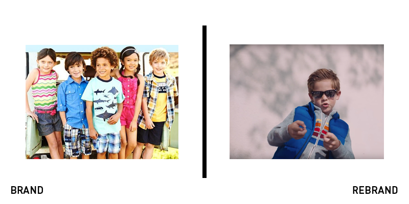
Gymboree
Since 1976, the play centre and clothing brand for kids Gymboree has touched the lives of millions of Americans. Since selling its play centre business in 2016 and increased competition from other apparel brands, Gymboree filed for bankruptcy last year. Now owned by lenders, the company has unveiled a new visual identity to save its flagging brand. Including a new outlook on materials and sourcing as well as a Millennial-friendly nostalgia-drenched approach, the new brand has split opinion among parents but is nonetheless taking confident steps in a new, and newly redefined direction. It is now predicted to achieve a slow level of growth over the next few years.
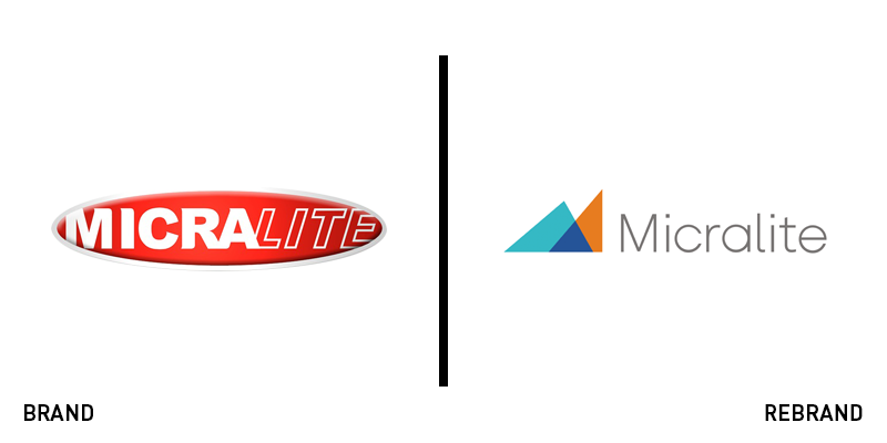
Micralite
Designed as a low-stress, lightweight pram, Micralite worked with creative agency isobel to embrace its founding purpose once again with a new brand strategy. Its positioning, designed to reflect the ‘life-enhancing’ principles of its products, focuses on modern parenting and excellence in engineering. The new logo reflects one of Micralite’s differentiation propositions – that its strollers fold compactly and simply. Sam Donnelly, brand marketing manager for Micralite says, “We’ve made huge changes to both the product and the brand based on real challenges parents face on a day-to-day basis with little ones in tow. But we’ve ensured that we empower parents to feel like they can maintain their personality and style after having children.”
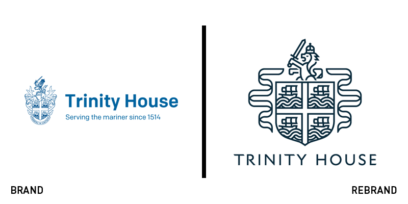
Trinity House
UK seafarer charity Trinity House has been supporting its community since 1514. Helping it to do so has been a simple wordmark and an ornate shield indicating the organisation’s royal charter. However, with communication needs rendering the heraldic approach unwieldy, Trinity House turned to Better Brand Agency for a rebrand. The brand had to still reflect the organisation’s heritage and loyal community while offering a more consistent, refreshed face for the future. The result is a pared down heraldic icon retaining the key elements of the original brand coupled with a navy blue colour. The new strapline, ‘For the benefit and safety of all mariners’ clearly expresses the charity’s positioning.

![[MN] Metis Cover](/media/21749/mn-_metis_cover.png?anchor=center&mode=crop&width=312&height=124&rnd=134225482970000000&bgcolor=ffffff)


