Little llama called Larry stars in digital brand's new look
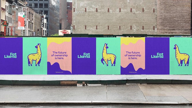
With a mascot called Larry the Llama, a neon coloured visual identity and a host of quirky, lovable animations, Fat Llama’s new rebrand is off to a spitting, woolly, camelid start.
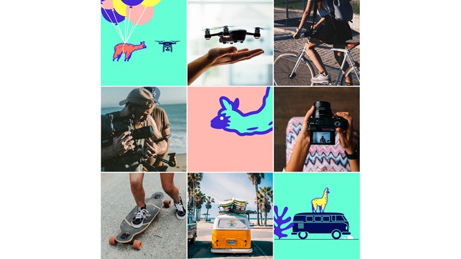
Working with London studio Koto, lending and borrowing marketplace Fat Llama embraced the whimsical, sassy character of their namesakes when developing the new brand. “The new brand really centres on our mascot, Larry, who characterises Fat Llama perfectly. He’s loyal, helpful and trustworthy, but he’s also cheeky, sassy – a bit irreverent. Expect to see him floating from balloons one minute and hitching a camper van ride the next – but also finding the time to signpost you through the different areas of the site. Larry was also designed in anticipation of the animation trends in design and UX – as you’ll see, he was born to move.” With animations designed by British animator Griff, the new brand replaces a less engaging, static logo with a far skinnier llama.
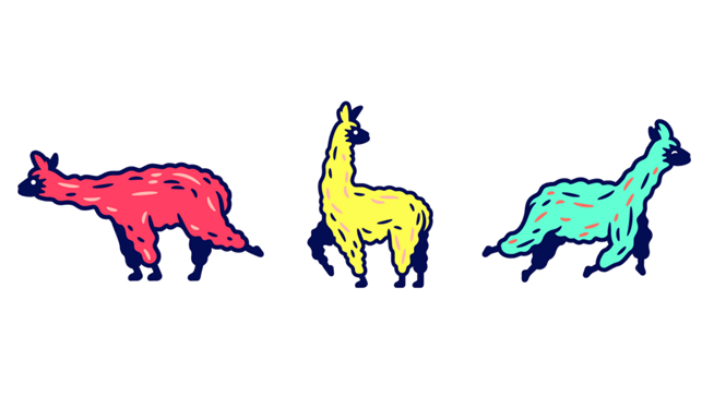
And move, Larry does, in gifs and animations, lending even the still images of the lovable llama a sense of motion that is belied by their static form. The visual identity is full of bright pastels and wavy lines – evoking Larry’s woolly fluffiness. Interspersed with illustrations and animations are images from a library of lifestyle photographs, some of which feature real versions of the items illustrated – like in one case, a drone.
For a digital-first brand like Fat Llama, the bright, characterful approach is likely a choice that will help it stand out, gain attention on a computer or phone screen and help users immerse themselves into the brand’s world.
It’s a big task for a little llama to shoulder, but Larry and his cohort are renowned pack animals, capable of bearing the burden of a brand.


