Disconnect between external and local identity for French place brand

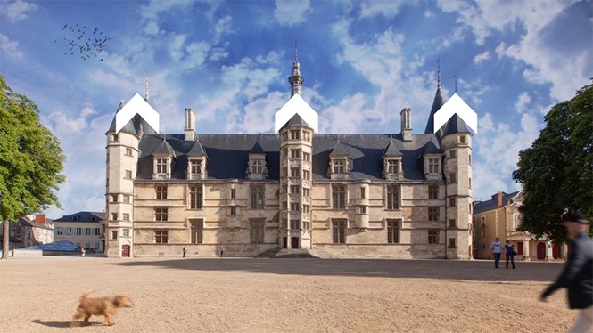
As the capital of the quiet and rural Nièvre Department in central France, Ville de Nevers is a town characterised by its mediaeval and Renaissance heritage. Acclaimed for its art, architecture and rich history, Nevers, often described as ‘sleeping beauty,’ is home to landmarks and tourist attractions such as cathedrals, churches, workshops and museums.
Despite its old-fashioned charm, like many medium-sized cities, Nevers is struggling to hold on to its demographic and is gradually sliding into economic decline. In an effort to combat its reputation and adapt to today’s economy, Nevers, in collaboration with Paris- and Lyon-based graphic design studio Graphéine, has crafted a place brand to reposition itself as a modern and dynamic town fit for accommodating future generations.
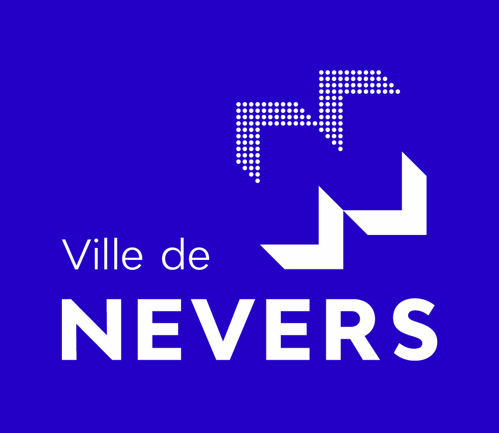
Designed to engage and excite, the rebrand is an upgrade from the city’s former logo. Prior to the redesign, Nevers’ visual identity consisted of a navy illustration of the town’s historical monument Ducal Palace tainted by an unsettling yellow stain, front and centre.The new logo continues to pay homage to the palace in a more subtle manner by taking the distinctive polygon-shaped turrets of the building and turning them into chevrons that are then rearranged to form the letter ‘N’ in their counterspace.
The place brand retains a blue palette but is refreshed with an electric cobalt blue. Building upon depth and dimension, the graphic incorporates both solid and dotted chevrons, and the typeface echoes the structural composition of the monogram with a small ‘Ville de’ and a bold, uppercase ‘NEVERS.’
The simple nature of the chevrons enables the brand to utilise the graphic in a variety of applications including video presentations and an array of amusing animations. Although the striking and colourful animation work successfully engages its audience, it feels better fit for an industrial and tech-driven city, rather than a quiet town.
The new logo means to spark interest and generate the necessary attention, but it does not change the fact that the identity of a town like Nevers lies in its charming heritage. The place brand highlights the disconnect between the town’s visual expression and its internal identity.
In order to successfully attract the right demographic, Ville de Nevers must tell an accurate narrative about its culture and history by successfully bridging the gap between its place brand and its identity.
For more from Transform magazine, follow us on Twitter @Transformsays


