#TransformTuesday: 6 June
Every week, Transform examines recent rebrands and updated visual identities. This week's picks are below. For more from #TransformTuesday, follow @Transformsays
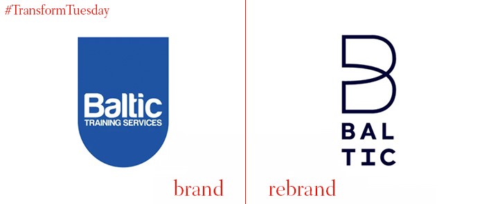
Baltic Training
Baltic Training is a UK-based apprenticeship training provider which focuses largely on tech and tech-driven solutions. A recent rebrand project by UK-based creative agency Better Brand Agency sees Baltic Training adopt a renewed visual identity and brand ethos. Aiming to reflect its progressive and ever-growing apprenticeship programme, the rebrand was driven by qualitative data collection and an in-depth understanding of the apprenticeship sector. Better created a dynamic brand identity which focuses on Baltic Training’s passion for the service it offers. Baltic Training marketing manager, Brooke Hodgson, says, “I envisioned this change as a way to introduce an innovative new brand to represent the digital service we provide at Baltic [and] provide a solution that would help us maintain happier employees, customers, apprentices, and lifelong brand advocates.”
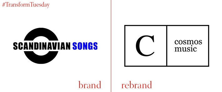
Scandinavian Songs
The company previously known as Scandinavian Songs is one of the largest independent music publishers in Denmark, Norway and Sweden. Comprising three units – Scandinavian Songs, Hawk Records and Reactive Songs International – the company has announced an internal rebrand, including a name change to Cosmos Music Publishing. This change comes two years after the company was acquired by Cosmos Music, a Swedish indie music label. Its further brand development includes additional staff and a greater focus on marketing collaboration.
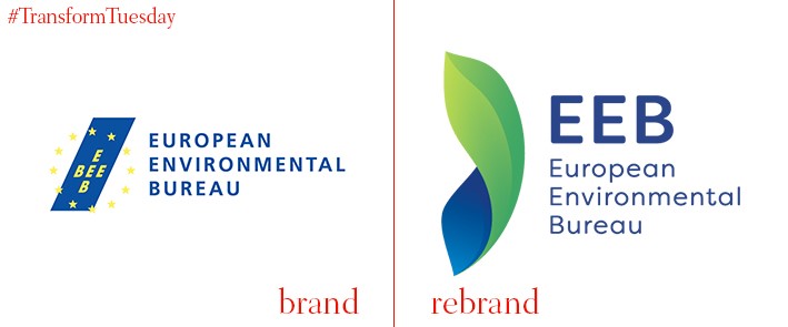
European Environmental Bureau
The European Environmental Bureau (EEB) describes itself as ‘Europe’s largest network of environmental citizens' organisations… [standing] for sustainable development, environmental justice and participatory democracy.’ It has its headquarters in Brussels, Belgium; May saw the EEB released a rebrand which apparently distances itself from the European Union flag image, which adorned its previous logo. While retaining a deep blue typeface colour, the EEB’s updated design is seemingly less political. The most recent iteration introduces green to EEB’s palette which emphasises the organisation’s environmental credentials while retaining its regional focus.
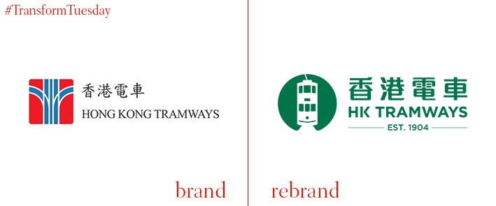
HK Tramways
Hong Kong’s privately-owned tram system, HK Tramways (known as Tramways) has, along with Hong Kong-based marketing communications agency Stepworks, developed a new visual identity for its tram system. A new logotype replaces the previously abstract design, which comprised the old logo since 1974. Tramways’ new iteration adopts a friendlier aesthetic; its picture of a tram assuming a smiling face shape highlights the company’s commitment to retaining an energetic and iconic transport brand. Emmanuel Vivant, managing director of Tramways, says, “We hope each journey would give our passengers a lift, not only physically but also emotionally. We wish everyone would have more memorable and cheerful moments on our trams.”
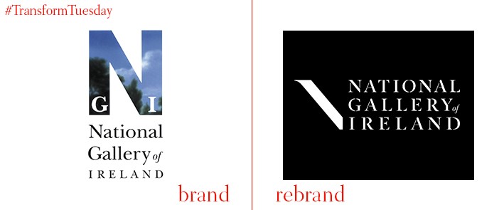
National Gallery of Ireland
The National Gallery of Ireland (in Irish, Gailearaí Náisiúnta na hÉireann), an institution which showcases the best of Irish and European fine art, has unveiled an updated visual identity. Carried out by Manchester-based agency True North, the update includes an integrated brand strategy and imagery highlighting Ireland’s relationship with its artistic past. A stencil typeface, inspired by the building in which the gallery is housed, lends a flexible edge to the National Gallery of Ireland’s visuals and brings it into the contemporary age. True North has also developed its new website and communication direction. Speaking to website Prolific North, Victoria Pinnington, senior designer at True North, says, “The new branding hopes to enhance visitor experiences onsite and online, to both inspire existing audiences and attract new audiences.”
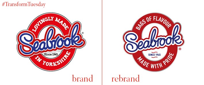
Seabrook Crisps
In 1945, Mr C Brook and his son founded Seabrook Crisps, named after a shop’s error whereby C Brook’s name was spelled ‘Seabrook.’ Often shortened to Seabrook’s, the crisp is still produced in Bradford, Yorkshire, in a factory known as Seabrook House. The company recently chose Leeds-based brand design agency Robot Food to update its packaging and ensure the heritage crisp remains a first choice for consumers among a category saturated with numerous crisps and crisp alternatives. Martin Widdowfield, design director of Robot Food, says, “We… [gave] Seabrook a much braver, more disruptive attitude. No more clutter, just big bold ‘look at me’ branding. Seabrook is now more relevant, without being mainstream in approach.” Robot Food is also in the process of developing an integrated communication campaign and new product development strategy.


