#TransformTuesday: 30 May

Every week, Transform examines recent rebrands and updated visual identities. This week's picks are below. For more from #TransformTuesday, follow @Transformsays

Booths tea
Prominent across the north of England, Booths supermarkets are purveyors of fine food and drink. The brand’s 28 stores offer own brands as well as name brands, including tea. Recently, Booths worked with London’s Smith+Village brand agency on a redesign of its tea packaging. Using colour as the primary brand tool, the tea range now features simple packaging, interesting colours, clean, sans serif typography and simple, everyday language. Tea is key to the Booths brand as it still grades and packages its teas at its Preston premises. Debrah Smith, creative director at Smith&+Village, says, “The tea range totally embodies Booths as a business. The jewel-coloured boxes of the different tea varieties sit together as a strong family and have real presence on shelf amongst the brands. The piece-de-resistance is the packaging for the strong afternoon tea bags, which we called Builders’ Tea, because after all, that’s what we all call our favourite brew.”

Figuera Mountain Brewing Co.
Branding in the craft beer market relies on creativity, heritage and a strong sense of identity. For Figueroa Mountain Brewing Co., a family-owned business in California’s Central Coast, a new visual identity has been launched to help the company grow. The brand’s characteristic nostalgic feel will be retained, but with more modern touches. “Our packaging grew as we grew over the years. With such rapid growth we were always thinking about one package at a time so it was important for us to really focus on the big picture in order to achieve consistency. We wanted to focus on the story behind the beer as well as providing the consumer with an idea of what to expect from our beers,” says president Jaime Dietenhofer. In fact, the brand’s original identity was pained by the creative director’s mother. Now, a new approach will give the hand-drawn, nostalgic feel a modern, mature platform on which to shine.

Ombar
Since the interest in raw chocolate bars has increased, a proliferation of brands have hit the market. That has made it harder for those competing on the confectionery shelves at Whole Foods to stand out. For MoodFoods’ Ombar, an organic chocolate bar from Ecuadorian cacao farms, its recent rebrand has allowed it to focus on the star of the show – the chocolate. Previous packaging was heavy on the health and wellbeing properties of raw chocolate. But with more competition, Ombar turned to British brand agency Ocean Branding to put the chocolate back in the picture, literally and figuratively. The new look features paint-style Os in different colours with short descriptions of the chocolate in a freestyle script. The simple, colourful and chocolatey approach is rolling out across western Europe.
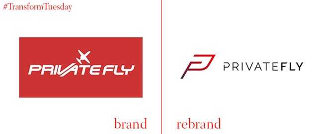
PrivateFly
Reaching new heights, charter jet company PrivateFly launches a new brand on the eve of its 10th birthday. PrivateFly has led its sector in terms of technological development as it was the world’s first to offer online booking for chartering private jets. CEO Adam Twidell says, “PrivateFly has evolved continuously, but this proces of developing our new brand identity has been a major project, over many months. We’re very proud of our new look but it’s much more tahn just a facelift. This has been a deep evaluation of our core values, listening and learning about what our customers, aircraft operators and partners need from us.” With a new website, a new ‘PF’ logo and refresh of the colour palette, PrivateFly is ready for its second decade of business.
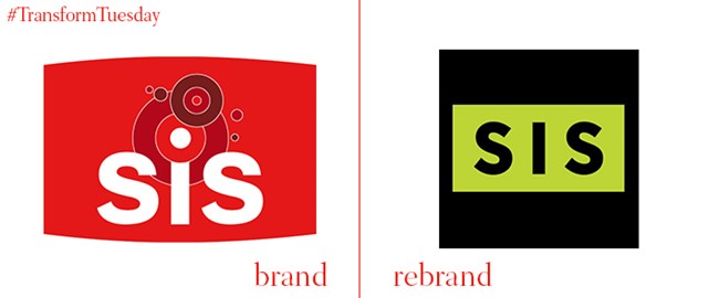
SIS
Data is not the sexiest of industries. But data for the global sports and betting market can be. Thirty year-old betting and gaming data content firm SIS turned to London brand consultancy SomeOne for a new run at branding. SomeOne responded with a black, neon yellowish-green, and white colour palette designed for digital, a graphic beam that runs through the visual identity and a renewed focus on digital assets. SomeOne’s lead designer Lee Skinner says, “For any brand, like SIS, provenance is hugely valuable. It’s a powerful asset that separates you from the crowd. That said, when you exist in a sector that’s constantly evolving with technology advancing as quickly as it does, the question must be asked – is provenance enough to remain relevant and keep your seat at the top table for years to come?” In answering ‘no’ to that question, SIS’ new brand will evolve with it and with the industry.

WSP
WSP, a Montreal-based engineering consultancy services company operating worldwide, had grown by acquisition. It turned to Montreal-based brand firm Sid Lee to examine its composite brand identity and craft a new identity that could unite the 85 plus companies under the WSP banner. The new WSP brand uses photography fairly heavily to bring WSP’s activities and expertise closer to the real-world applications it supports. Graphics and other digital assets put forward motion into the brand as well. The new website features simple navigation, video and photography and a clear brand positioning.


