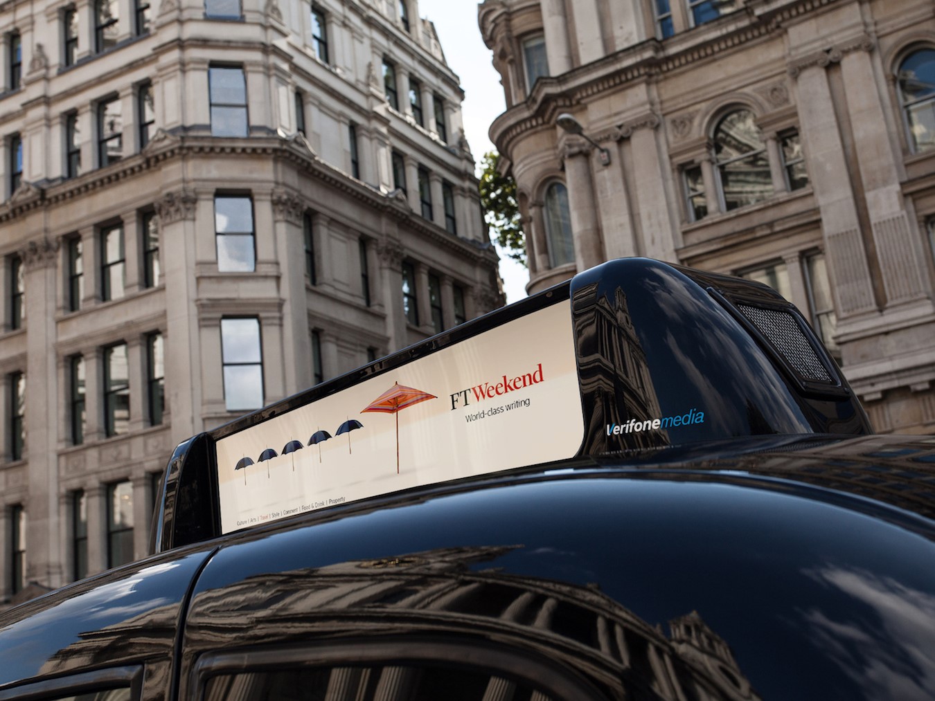
Carefree campaign for FT Weekend brand
Among the giants of international print journalism, there are a few titles which stand out through brand image alone. The Wall Street Journal’s bold and historical lettering is instantly recognisable among a plethora of competing North American titles; German weekly news magazine, Der Spiegel (the Mirror), is as well-known for its scathing political editorials as it is for its independence and fierce investigative prowess. Yet, in the financial sphere, no title is perhaps as instantly recognisable as the Financial Times (the FT). The paper’s light salmon pink colour palette alone has come to epitomise City dealings, and economic news across London and the world.
Considering the synonymy of the FT with economic market news and a free market capitalist stance, then, the paper’s production of a weekly lifestyle supplement in the form of the FT Weekend sometimes falls under the radar. The paper recently appointed London-based creative agency, Founded, to develop an integrated brand campaign and communicate the FT Weekend’s lifestyle and wellbeing angle to a wider audience. The brand campaign follows the launch of a refreshed and redesigned FT Weekend designed by the paper’s in-house design team, led by design consultant Mark Leeds and launched in March 2017.
Currently rolled out online and in print, Founded’s brand campaign strengthens the aim of its March relaunch. Based on the notion of weekends being a celebration away from the office, Founded has developed visuals which takes classic work cues, such as office chairs, and replaces them with a more weekend-oriented alternative.
Its humorous yet engaging brand position aims to appeal to audiences which may initially dismiss the Financial Times as being purely a source of economic news. With a plethora of UK competition from a diverse array of weekend supplements with loyal audiences, Founded draws on the FT Weekend’s unique angle on current topics and influencers to develop a campaign based on the longevity and trustworthiness of the FT brand, without the seriousness.
This focuses the FT Weekend on being a must-have supplement, rather than being a weekly digest aimed towards those who might buy the Financial Times for daily economic market news.
In a press release, chief communications and marketing officer for the FT, Darcy Keller, says, “The new campaign emphasises the distinctive and rewarding experience readers around the world find in the pages of FT Weekend. With few exceptions, people are growing more and more busy during the week, driven by to do lists, focused on immediate tasks and scanning news in bite-sized chunks and on in-between time.”
“We all look forward to that weekend feeling when our time is ours – not to tune out, but to tune in. FT Weekend, with its original, thought-provoking writing, is tailor-made for people who want to expand their horizons and relax – without switching off.”
Damian McGee, managing partner at Founded, says, “The campaign celebrates the weekend, a time when FT Weekend readers can truly indulge their minds and relax without switching off. The creative idea puts the unique FT Weekend content at its heart in a charming and visually compelling way.”
Back in 1888, the FT’s salmon pink-orange tone was originally born from the need to save costs and differentiate the paper from the, similarly named, ‘Financial News.’ While now more expensive for the Financial Times to continue printing on its historic coloured paper, its legacy continues - even extending into its latest publication offering.


