#TransformTuesday: 20 June
Every week, Transform examines recent rebrands and updated visual identities. This week's picks are below. For more from #TransformTuesday, follow @Transformsays
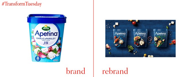
Apetina
In the UK, Netherlands, Poland, Norway, Sweden and Finald, 2017 sees the launch of global cheese brand, Apetina’s, new packaging design and brand direction. Developed in conjunction with global packaging design agency, Bulletproof, the cheese brand aims to inspire more creative cookery and be known as something with which chefs can be a little experimental. The agency says, “The current cooking cheese category is an ocean of cold blue and white, with lacklustre photography focussing on salads and unappetising white cheese. Our aim was to shake up the status quo and dynamically bring to life on pack the exciting culinary opportunities that exist when cooking with Apetina.” Apetina’s new packaging will roll out to the rest of the world during 2018.
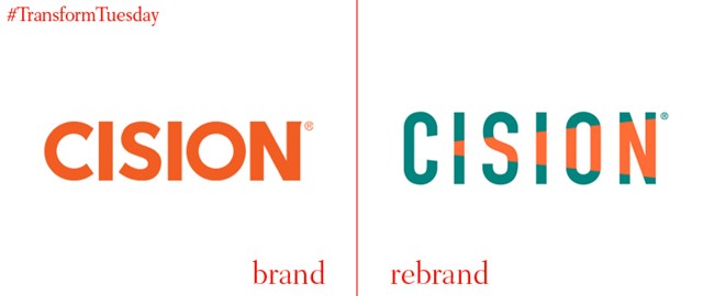
Cision
Following at 2014 merger with public relations firm Vocus, global media services company Cision added Gorkana Group, Visible Technologies, PRWeb, HARO and iContact – and later PR Newswire – to its brand portfolio. The company tones down the bright orange in favour of a mixed palette which includes a contrasting teal shade, a theme which is also reflected in the new PR Newswire branding. In each brand name, the orange shade growing stronger through each letter to symbolise the company’s seemingly uninhibited growth – fitting as earlier this month, Cision also bought Paris-based media monitoring company L’Argus de la Presse.
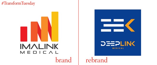
DEEPLINK Medical
An increasingly diverse, ageing population is leading to the need for healthcare solutions which span all generations and ailments. Initially developed by radiologists, the imagery solution provider Imalink has rebranded as DEEPLINK Medical to respond to the needs of a changing world. A complete overhaul, including visual identity and brand positioning, has been carried out by Nice, France-based design agency Brand Silver. Gone is the previous banking- or tax company-esque aesthetic in favour of a bolder, more meaningful identity which delivers the message of what DEEPLINK hopes to achieve.
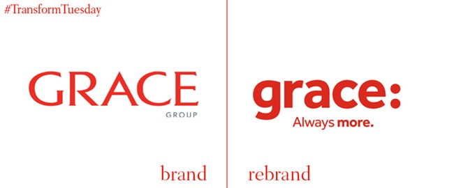
Grace
Sydney-based records management, storage and removals company, Grace, which was founded in Austrlia 106 years ago, has announced a complete overhaul of its original brand design, led by Australian branding agency United Yeah. While driven by an updated strapline – ‘Always more.,' the brand retains the red so synonymous with the Grace brand. And, the company’s decision to redevelop its identity comes as all nine companies which comprise the Grace brand architecture unite under one coherent identity. Marketing manager, Racquel Collard, says, “Always more […] describes our rich history, the scope of our united businesses, our service reach, the scale of our future plans. But I think the most important thing is that it speaks to our promise to our customers, that we aim to exceed their expectations in every way and to never stop striving to improve for them.”
Helsinki
Helsinki is the capital of the Nordic state of Finland and is the largest metropolitan area in the country. Its administrative department, the City of Helsinki, has until now been represented through a series of disparate brand identities which – while denoting its various departments – never offered a single, coherent city brand. Finnish brand design agency Werklig, also based in Helsinki, has devised a new brand direction for the City of Helsinki. Although in its early stages, the design reflects the administration’s responsibilities and aims to unite its 40,000 employees under one common identity. its backgrounds and crisp, evocative photography are inspired by Helsinki landmarks.
inOui
France is served by a network of highspeed and normal train routes, which traverse the country’s 643,801 km² to connect travellers with their destinations. Recently, however, a decline in people using the highspeed TGV train service, instead opting for slower but cheaper bus routes, signalled a need for a change in network brand positioning. A new visual identity, inOui, was unveiled in May this year, which coincides with a large investment in customer service staff training and the installation of Wi-Fi across the inOui fleet. Parent brand SNCF also owns the low-cost Ouigo service, which it hopes will account for 25% of all high-speed passengers by 2020.


