#TransformTuesday: 16 May
Every week, Transform examines recent rebrands and updated visual identities. This week's picks are below. For more from #TransformTuesday, follow @Transformsays
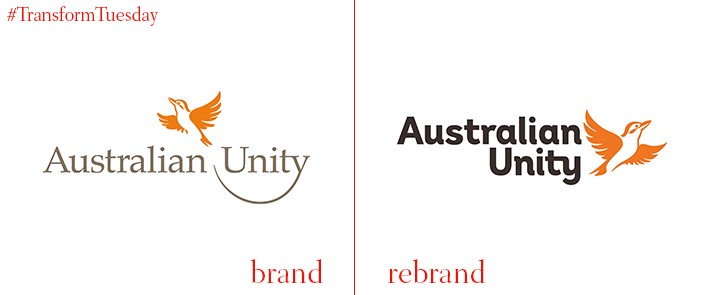
Australian Unity
Australia-based mutual company, Australia Unity, is an insurance provider with policies driven by customer need. Operating since 1840, Australia Unity has a respected following across the country, enhanced through a brand strategy based around optimism. Australia Unity commissioned full service growth consultancy, PENSO, to develop its new brand campaign, which plays on the concept of optimism via a bright orange colour scheme and unites the company’s driving forces of health, wealth and living. Head of brand for Australia Unity, Laura Jennings, says, “We needed to articulate our diverse range of products while maintaining the trust we have built up over more than 170 years. This platform simply articulates our offering and it will help us stand out in an increasingly cluttered market.”
CSM Live
At the BT Sports Awards, held on 27 April, global branding and live experience agency ICON unveiled its latest rebrand. This includes a name change to CSM Live, as well as an overhaul of its visual brand and assets. Despite operating since 1947, CSM Live has been behind some of the biggest sporting events in recent times, including the London 2012 Olympics and Paralympics and 2014 FIFA World Cup. Its rebrand new branding reflects CSM Live’s continual evolution, as the worlds of sport and media converge. CSM Live’s CEO, Alastair Bewick, says, "We're proud of what we have achieved as ICON and equally excited about what the future holds as CSM Live. This is not about operational change but the ambition to make our offer, and that of CSM, more easily understandable and ultimately to provide a better overall service to our clients."
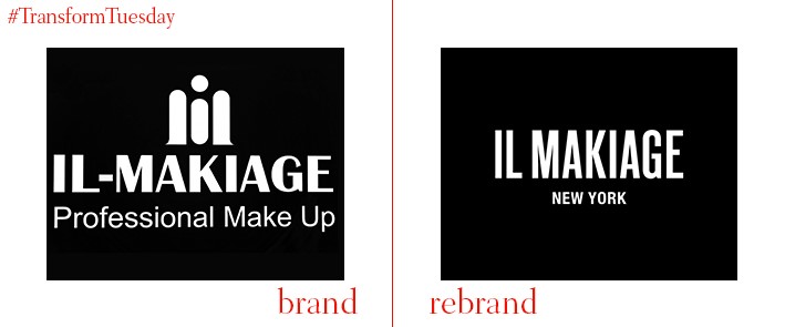
Il Makiage New York
Since being founded in 1972, Il Makiage Cosmetics has consistently produced high-quality, striking make-up and cosmetic solutions. Although native to New York, in recent years Il Makiage has expanded to Paris, Rome, Seoul and Israel. The brand’s recent visual overhaul, courtesy of Tel Aviv-based brand studio, Studio Koniak, encompasses its packaging and marketing materials, as well as its wider branding, logo and art direction. Studio Koniak’s Il Makiage product page says, “Starting with the launch of a new makeup line, the brand was relaunched with a new logo and new identity, implemented in a wide variety of product lines, several campaigns and a new international e-commerce website.” The website is currently under construction.
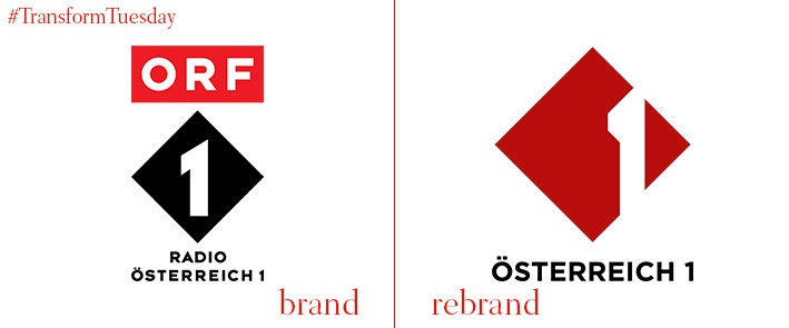
Ö1
The leading radio network Austria’s public broadcaster, ORF, is Ö1 which is short for Österreich 1 (Austria One in English). In April 2017, the network released a new logo which aims to retain Ö1’s heritage while developing a forward-facing brand to appeal to audiences across Austria. Ö1’s visual identity, developed by ORF’s design team and medical student Yasmin Sowa, is reflective of its medium. Sounds and ears are central to Ö1’s brand design, with the variety of graphics highlighting the diverse array of programmes broadcast by the network.
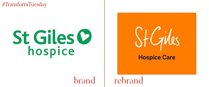
St Giles Hospice
London-based brand design agency Studio Certain has updated the visual identity for West Midlands, UK-based hospice, St Giles Hospice, in an effort to generate more positive perception around palliative care. Often, in the UK particularly, hospice care can be branded as a negative experience, provoking awkward or negative reactions. Studio Certain, however, has opted for a bright orange design which emanates hope and light while reminding the patient and their families that enjoying life is the focus for St Giles Hospice’s work. Using a hand drawn typeface, Hanken Sans, creates a personal feel for the hospice’s identity and reflects the close care its patients receive.
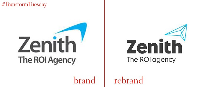
Zenith
Zenith is a global ROI agency and part of the French multinational Publicis Group. Zenith recently revealed an updated brand identity and overall agency rebrand based around its new mantra, “We blend data, technology and brilliant specialists to scout out new opportunities, solve complex challenges and grow client business.” The ‘peak’ which formed Zenith’s previous logo now leads the renewed brand proposition. A bright colour palette and array of photo-based imagery cements Zenith’s position as a forward-thinking communications firm. Global brand president at Zenith, Vittorio Bonori, says, “We have a vision for delivering transformational growth for our clients and this required a new way of working that embraces both technology and invention. I believe that Zenith’s new proposition and brand identity builds on our distinctive ROI positioning and sets us further apart from the competition.”


