#TransformTuesday: 14 February
Every week, Transform examines recent rebrands and updated visual identities. This week's selections are below. For more from #TransformTuesday, follow @Transformsays
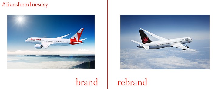
Air Canada
One of Canada’s most enduring domestic airlines, Air Canada, has overhauled its livery and brand offering in a celebration of the airline’s 80th birthday. In a redesign carried out by global creative and branding agency, Winkreative, the iconic Air Canada maple leaf as a roundel – a design missing from the fleet’s livery since 1998 – is returned to the aeroplane tail. Its red-on-black design contrasts with the white of the plane body, with the new brand identity also rolled out for staff uniforms and the plane’s interior. The rebrand aims to strengthen Air Canada as the leading Canadian airline.
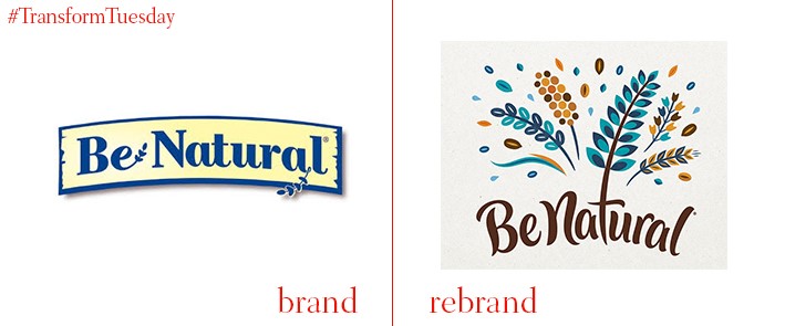
Be Natural
Be Natural, a brand of sweet snacks and cereals which has been owned by Kellogg’s Australia since 2000, has introduced a new logo and packaging. The new offering is designed by Sydney-based Loop Brands. With a focus on the natural ingredients of each products, the designs by Loop Brands encompass plants, grains and other healthy aspects of the cereals. Be Natural has also undergone a change of typography, presumably to differentiate its products from other ‘natural’ cereal products of a similar aesthetic. The new packaging also carries images of fruit and grains, emphasising the healthy aspects of Be Natural’s products and ensuring the products are visible amidst the crowded cereal shelves.
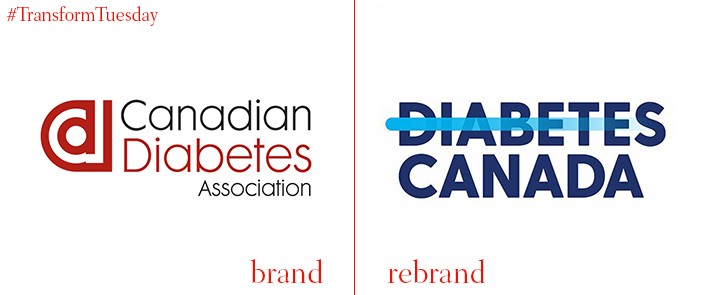
Diabetes Canada
Diabetes Canada, a charity that recently rebranded from its former moniker, Canadian Diabetes Association, aims to raise awareness of the disorder’s widespread nature and break down sometimes negative perceptions people have of diabetes sufferers. Diabetes Canada has also launched End Diabetes as its accompanying campaign, where the words of people with the condition are put to a song and transmitted across the charity's digital platforms. Diabetes Canada president and CEO, Rick Blickstead, says, “Diabetes Canada and the movement to End Diabetes bring to life our vision of Canadians with diabetes living a life free from fear of stigma, discrimination, and the complications that often come with this serious disease.”
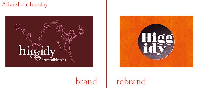
Higgidy
UK-based pie, quiche and rolls producer, Higgidy, has updated its visual identity with a new design based on the aesthetics of mismatched dinner plates. The rebrand, carried out by London-based B&B Studio, focuses on Higgidy as a leading savoury food brand and natural qualities of each product. All illustrations were carried out by a team of illustrators. Shaun Bowen, founder and creative partner at B&B studio, says, “The packaging design was inspired by a lifestyle aesthetic born out of the beauty of imperfection, and the mismatched plates gave us the opportunity to tell a story around each recipe, either in terms of its inspiration, ingredients or associations. We worked closely with founder Camilla Stephens to truly appreciate each recipe, then with each individual illustrator to ensure the story came to life in the most appropriate way.”
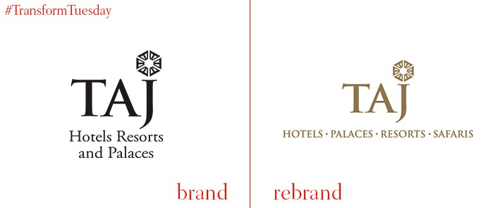
Taj Hotels Palace Resorts Safaris
India-based Taj Hotels, owned by the Indian Hotels Company, has rebranded to bring its portfolio under one offering. As well as the destinations that already have the Taj name, the change effects its sub-brands, Vivanta and Gateway. These will now assume the Taj name, in light of research which suggests brand recognition, and emotional connection between guests and resort, was low. All the Taj hotels are also now grouped according to their offering – Taj Hotels, Taj Palaces, Taj Resorts and Taj Safaris. Rakesh Sarna, CEO and MD at Taj Hotels Palaces Resorts Safaris says, “The new brand identity honours the renowned legacy of the Taj in a structure that will create greater brand resonance with our guests and also allow for considerable value creation for all our stakeholders."
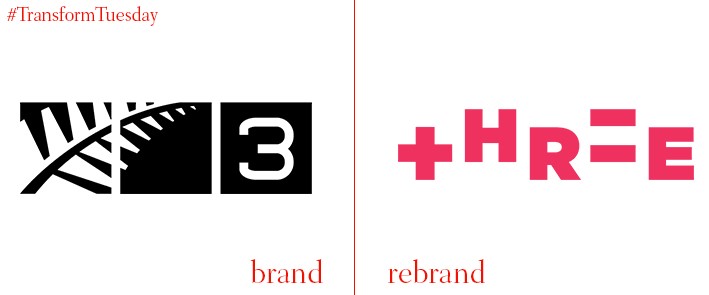
Three
The New Zealand-based television network previously known as TV3 has rebranded and updated its visual offering, to henceforth be known as Three. This is the first major departure from the TV3 name for the channel, despite undergoing various logo and thematic changes over the years. The visual identity is purportedly inspired by arithmetic and is decidedly less severe than its previous iteration which gave no hints as to the diversity of programmes aired. A series of vibrant and playful campaign posters have been released to coincide with the channel update, suggesting the channel will continue to move in a less serious direction.


