Charitable organisation Crimestoppers rebranded by The Team
Founded in 1988 as the Community Action Trust, the independent charitable organisation now known as Crimestoppers has held its current name since 1995. Encouraging members of the public to anonymously provide information which could help prevent crime, Crimestoppers is directly credited with 134,000 arrests and charges, and recovering £131mn worth of stolen goods over the last 30 years. Despite its historically high brand awareness, however, the charity has unveiled a rebrand carried out by London-based brand and communications agency The Team.
While an independent organisation, research by The Team showed that the Crimestoppers brand was often perceived as either a police initiative, or linked to popular true-life British crime programme, Crimewatch. The charity also struggled in communicating its mission with a wider external audience; it needed an impetus for people to donate the money so vital for ensuring the service continues to run.
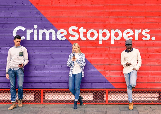
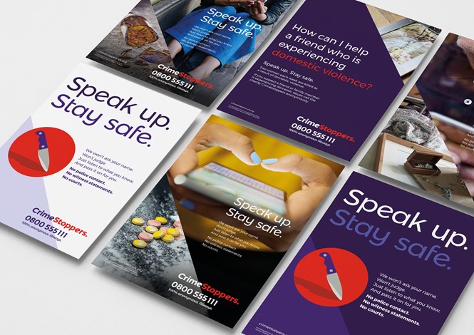
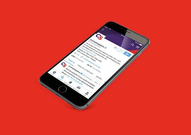
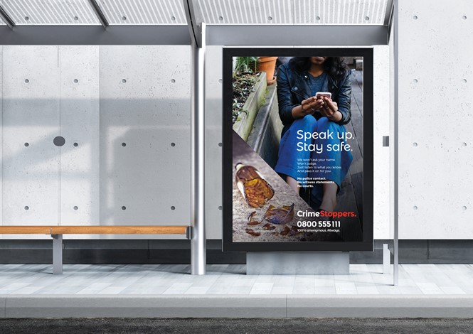
Following a pitch, The Team was appointed to lead the rebrand and deliver a campaign to reflect the true purpose of Crimestoppers. The fifth visual rebrand for the charity since 1988, its latest iteration uses digital-oriented campaigns to communicate the brand to a younger generation, encouraging the use of mobiles to report crimes. Usingh classic red and purple shades to comprise its main colour palette, with teal and mustard undertones, the Crimestoppers visual identity avoids any police association. It is also flexible enough to be applied across its regional UK centres.
Mark Hallas, chief executive of Crimestoppers, says, “We have worked hard with The Team to refresh our brand and are delighted with the results. We have done this in a way that we feel will make more people call us with information about crimes in their community or their workplace.”
“Additionally, the refreshed brand provides the right platform to better engage supporters both in the public and commercial arenas. While we work closely with the police, we are an independent charity and need to ensure the public knows that,” says Hallas.
Through research, The Team developed four values in ‘We care,’ We’re inclusive,’ ‘trustworthy’ and ‘determined.’ Informing the development of the new Crimestoppers brand, the identity’s design system is based on road signage. Built around 45-degree angles – upwards for ‘speak up’, and downwards for ‘stop crime,’ – the accompanying tone of voice is friendly and approachable in its message.
“The use of photography creates empathy, featuring people in everyday environments and a fly-on-the-wall documentary style with natural lighting,” says The Team. “The anonymity at the heart of the brand can be reflected by cropping out people’s faces. By including the use of mobile phones, people are encouraged to get in touch. An illustration style has also been added for when photography isn’t appropriate.”
Creating a brand for both ‘stoppers’ and ‘supporters’ required an integrated strategy with enough flexibility for the charity to use across all applications. In employing a vibrant, people-oriented and confident identity, The Team has ensured the Crimestoppers brand will continue to define how crime is fought in the modern communications era.
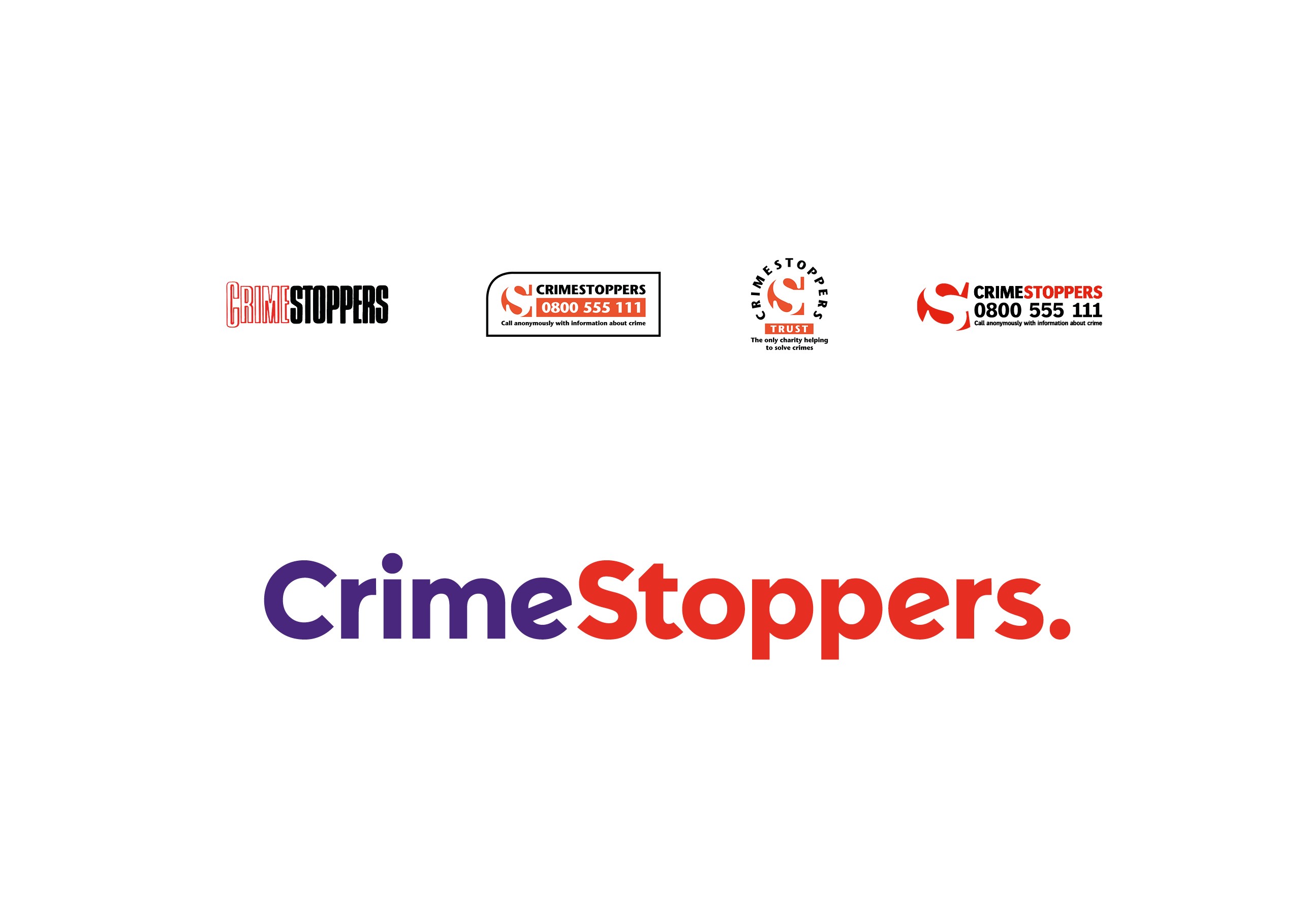
Evolution of the Crimestoppers logo


