#TransformTuesday: 4 October
Every week, Transform examines recent rebrands and updated visual identities. This week's picks are below. For more from #TransformTuesday, follow @Transformsays
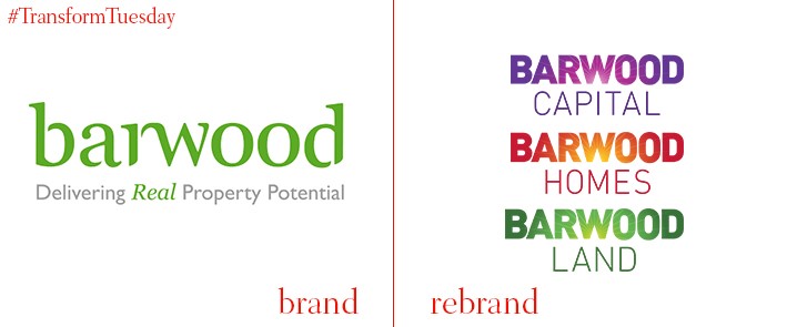
When a company is comprised of three different businesses, developing distinguishable identities for each can present a challenge. A solution to this is what London-based design consultancy, Kimpton Creative, provided for Northampton-based property company, The Barwood Group. Made up of land acquisition, residential developments and property investment businesses, it was clear each arm of The Barwood Group required a separate identity. Kimpton Creative developed a unique identity for Barwood Land, Barwood Homes and Barwood Capital, using glowing type to emphasise its core value of ‘enriching.’ With marketing materials to match, the three separate businesses now have their own brand identity, easily distinguishable from the parent company.
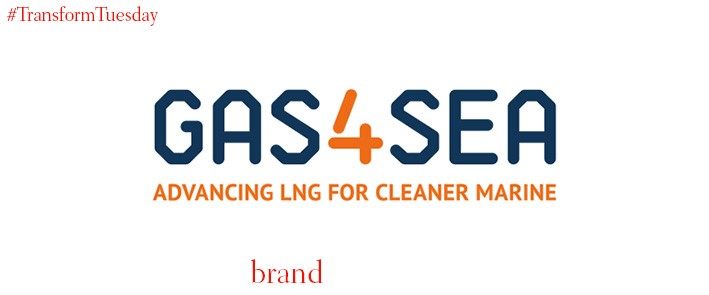
Gas4Sea is a new brand which has been developed by leaders in the energy sector, to provide environmentally friendly fuel to ships. Global brand consultancy, Industry, has created an identity for the Gas4Sea brand which emphasises the precedent the new company has set for shipping fuel, while ensuring the identity is relevant to all shapes and sizes of ships. Use of a marine blue and orange colour palette highlights the sector’s focus, while a more contemporary font juxtaposes the historic connotations of shipping. Sholto Lindsay-Smith, CEO of Industry, says, “This is a global brand for a new era in marine fuel. Developing a clear market position from the outset was crucial, conveying the regulatory impetus for change and the readily available solution. Gas4Sea is instantly recognisable with a clear strategy and brand platform that sits comfortably alongside its maritime peers, positioning it as a global leader in this new market.”
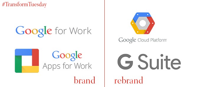
Google has announced it is officially scrapping the Google Work brand, in favour of the wider ranging-sounding Google Cloud. In a similar vein, the tech giant has also rebranded its Google Apps for Work suite. Its new name, G Suite, reflects the variety of services offered by Google Apps for Work and has also provided the opportunity for Google to introduce some new features into its software. There is speculation this move comes as Google attempts to compete with the likes of Microsoft and Amazon, as each company’s portfolio of services continues to expand and encompass more of Google’s traditional remit.
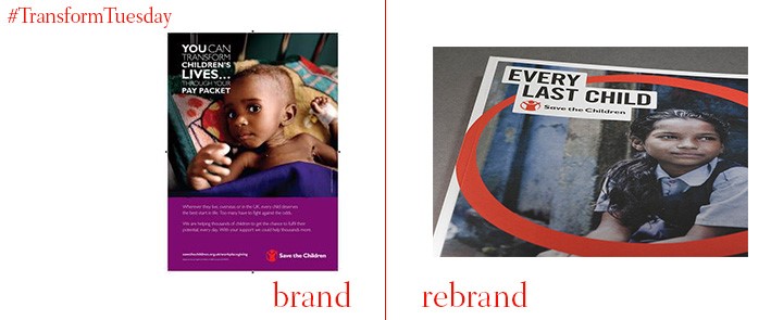
International branding agency, Design Bridge, has created a new identity and brand campaign for charity, Save the Children. This follows a strategic expansion, and aims to reflect the charity’s global outlook. Save the Children, founded by Eglantyne Jebb in 1919, is based on several basic principles including being compassionate, courageous, pioneering and outspoken. These words now form the Save the Children brand characteristics, and consequently the design for Design Bridge’s updated visual identity. Holly Kielty, creative director of brand language at Design Bridge, says, “We developed a tone of voice that focuses on telling true, human stories in a heartfelt and compelling way. The tone is always proactive, future-focused, and fiercely protective, communicating a sense of hope. Messages are conveyed simply and confidently, bolstered by new typography and a system we have created for highlighting headline text as a bold call to action."
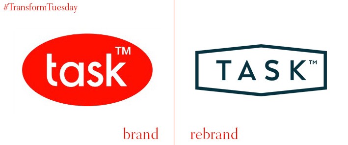
Contract furniture developer, Task, has recently relaunched a newly-renovated showroom to further elevate its presence in the furniture industry. Located on Great Eastern Street, London, a redesign of its premises was carried out in conjunction with Resonate Interior Architecture. The firm guided the creation of Task’s new showroom environment, and created brand spaces for two of its Italian partners, Marelli and ICF. Fergus Bowen, director at Task, says “This rebrand and redesign of our showroom is a seismic shift for Task and represents the next evolution in the business. We are delighted with the results and look forward to welcoming all our customers both old and new into the space.”
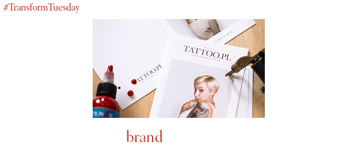
In an effort to dispel the often negative opinions surrounding tattoos and tattoo art, Poland-based tattoo studio, TATTOO.PL, has commissioned the Polish office of brand and advertising agency, Minima, to create a campaign emphasising the positivity of tattoos. The communications strategy focuses on the artistic meaning of the client tattoos, while emphasising the beauty and intricate detail which goes into designing each individual piece. Slawomir Fraczek, owner of TATTOO.PL, says, “Our main aim is to popularise tattoo and body art through our activity and co-operation with the members of the tattoo subculture. The communication strategy designed by Minima clearly reflects our philosophy.”


