Spotlight on Odeon
Cinemas once drew audiences for the experiences they offered rather than the films they had on offer. British chain Odeon is using that ethos to reinvigorate its brand experience. Emily Andrews reports on the new visual identity and immersive brand touchpoints
Of all the projects that a branding professional could be asked to tackle, a cinema brand is probably one of the most desirable. Cinemas which – as a source of storytelling and escapism – are so much more than the sum of their parts, offer a unique creative opportunity. Alex Andlaw, creative director at UK creative agency, Rufus Leonard – which recently rebranded European multiplex chain, Odeon, says, “It’s really interesting that the brand is selling the same products as every other cinema (the films), so you have to drive brand recognition and differentiation to increase participation. It’s also a really fun thing to design.”
While the film industry has its opportunities, it also has its fair share of challenges. Cinemas have lost much of their audience to alternative activities such as television, video games and online content, which can now be enjoyed both at home and on the go. Where once the cinema dominated, a wide range of media and a huge array of alternative leisure activities now compete for the public’s precious free time. Add competing cinema chains into the mix and Odeon struggled to find differentiation. One of the unique qualities available to the cinema brand is that it offers a fully immersive entertainment experience that sets it apart in a world dominated by mobile devices, multiple screens and short attention spans. It was this experience that Odeon and Rufus Leonard decided to put at the heart of Odeon’s new brand.
Odeon’s new visual identity plays on ideas of escapism; portraying the cinema as an immersive and sensory experience by incorporating those qualities into the look and feel of the new design. Andlaw says, “We wanted it to look imaginative and engaging and ultimately get people to feel excited about Odeon again. We wanted to make it feel like a place you can go to escape into new worlds and be transported.”
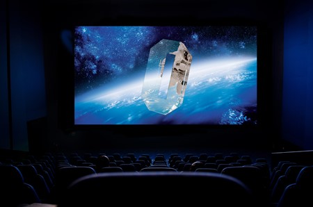
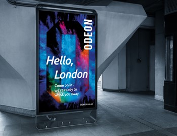
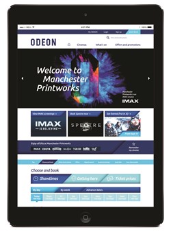
The letter ‘O’ in the Odeon logo is at the centre of the cinema chain’s new brand essence, ‘transporting imaginations,’ since – like cinema – it doubles as a portal to another world. The large ‘O’ appears at the centre of much of the new brand imagery, which subtly hints at travel and exploration. Photographic images such as close-up shots of powder paint and bubbles have a sensory feel. The Odeon wordmark itself remains unchanged. It was thought that this and the Odeon’s signature blue were an intrinsic part of the brand’s heritage, and so were too valuable to change. However, to that blue, shades of fuchsia and orange have been added. The new colour palette in its entirety is reminiscent of the natural world; sunsets, skies, the sea and space, and contributes to the new brand essence. A new typeface has also been introduced, as well as a new design template that takes its outlines from the ‘O’ in Odeon. The templates are suitable for use in Odeon’s brand communications.
The aim was to differentiate Odeon from its competitors by promising a unique cinema-going experience. Andy Edge, commercial director (UK & Ireland) at Odeon, says, “By creating a new brand essence that sits at the heart of all our guests’ experiences of Odeon, we hope to really create a truly definitive experience that they will associate with Odeon. Every part of that experience needs to make sense alone, yet add to the whole.”
“We wanted it to look imaginative and engaging and ultimately get people to feel excited about Odeon again. We wanted to make it feel like a place you can go to escape into new worlds and be transported”
James Ramsden, executive creative director at Rufus Leonard, says, “For years, people have been choosing where to see their favourite movies based on how close they are to their local cinema. The time has come for customers to expect something more individual, special and magical from a cinema brand.” The aim was to create a brand that encapsulates some of the magic that used to be an inseparable part of the cinema-going experience.
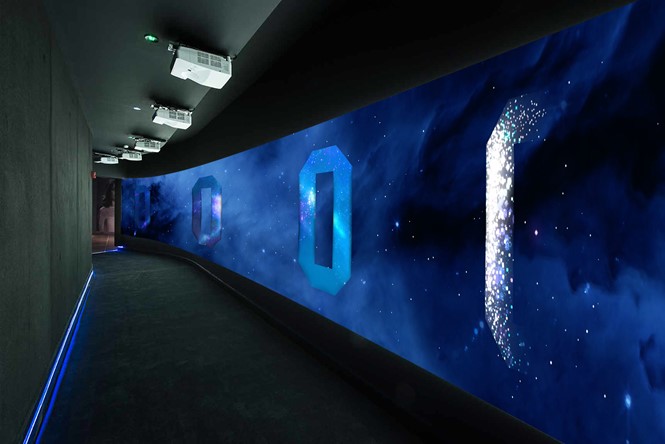
In a physical manifestation of Odeon’s new brand essence, transporting imaginations, Rufus Leonard created a brand experience for audiences at Odeon’s new iSENSE cinema in Charlestown, Ireland. iSENSE screens are Odeon’s extra-large, high definition screens (similar to the IMAX format), and offer a particularly immersive viewing experience. Those at the Charlestown cinema accessed their screening room by way of a 7m tunnel with immersive film projected onto the walls. Rufus Leonard plans to implement more initiatives such as this off the back of the new Odeon brand and its principles. The improvement of the user experience within the cinemas themselves is intended to contribute to the public’s engagement with the new brand.
If one aspect of the brand development project was to give Odeon a new look and feel, then the other was to consolidate all of its sub-brands, including Odeon Kids, Odeon Newbies and Odeon Silver cinema. It was decided that all of Odeon’s eight sub-brands would remain separate entities – they had good recognition within the business and with customers. There had to be a clear sense of brand continuity, with the new brand essence, transporting imaginations, clearly present across each one. The new brand also needed to be consistent across the entirety of Odeon’s communications framework, with the entirety of the business’ diverse and wide- ranging stakeholders. Edge says “By creating a new brand essence that sits at the heart of all our guests’ experiences of Odeon, we hope to really create a truly definitive experience that they will associate with Odeon. Every part of that experience needs to make sense alone, yet add to the whole.”
Andlaw says, “The main thing we wanted and needed to change was the brand architecture; to provide a new brand pyramid with new principles. With this we could then understand how the messaging structure would work and develop the brand-led communication, prices-led communication and provide new sub-brand look and feel.”
The new imagery plays a large role in connecting the sub-brands to the overarching Odeon brand and to its newly-defined principles. The new templates; which use the identifiable, sharp angles of the ‘O’ to create a distinctive and flexible graphic system, are particularly useful for application across the sub-brands – and across communications with a range of different stakeholders – since they subtly communicate the parent brand’s influence without using the Odeon logo in its entirety. This allows for the sub-brands to develop their own unique identity within the design framework of the parent brand.
The brand imagery was intended to be applicable across a range of different touchpoints; from digital and print to out-of-home, in-cinema and on merchandising. Extra layering can be added for more sales-led messaging. The new font is digital-first, allowing the new identity to maintain consistency across digital and physical assets, and the blue-hued brand images convert into short, pre-show films to be played before the main feature at every Odeon cinema across the UK and Ireland. Odeon makes the most of the most emotive tool at its fingertips – film – to better communicate its brand message. The new identity has laid the foundations for a wide range of future applications and implementations. Andlaw says that the ultimate goal of the brand development project was, “To inject new life into the brand, bring consistency and structure to the communication and build a foundation of assets that the brand and business can grow with.”
The turnaround period for the new identity was brief, Andlaw says this was a major challenge, “We had a very tight deadline to create and land the new brand vision and pre-show. When it is such a big organisation, it can be hard to get everyone in the right place at the right time – which can be challenging during a tight deadline – but as with all great challenges you feel great once you have completed it as a team, and the client is really happy. Even better when the customer says they love the work.”
The launch coincided with the release dates of blockbuster films; Skyfall and the Hunger Games: Mockingjay, Part 2 in October 2015. The ad campaigns of those two films (which were also created by Rufus Leonard) featured the new Odeon branding.
In the modern world, the cinema offers a fully immersive experience in a way that a mobile device is unable to. Odeon is positioning itself as a brand that facilitates that experience.
Andlaw says of the new Odeon brand, “We wanted it to look imaginative and engaging and ultimately get people to feel excited about Odeon again. We wanted to make it feel like a place you can go to escape into new worlds and be transported. We wanted to deliver the personality of the brand through the visuals. We also created a simple and flexible visual system that could communicate the multiple areas of the business.”
Edge adds, “Odeon is a mass market brand so our target audience ranges from mega film fanatics through to those who primarily go to the cinema for the big blockbusters. As such, we needed to create an identity which would draw on a common thread for everybody.” It was the cinema-going experience, and all of its magical, transportational qualities, that became that common thread. Whether that will be enough to bring people to the cinema, or to ensure that they choose Odeon over alternative multiplexes, remains to be seen.
Peer review
Dan Einzig, CEO and founder, Mystery Ltd
I can see the need to evolve the brand’s visual communications and to help audiences feel like they are experiencing a premium brand, but from what I’ve seen, this feels more a campaign design than a rebrand. As a campaign, it does help position the Odeon brand as more premium, but I’m not seeing how it engages emotionally in the way they say they are trying to achieve.
I’m not a fan of brand messaging that tells the audience what to do or how to live: “Let your imagination run wild,” “Give in to the magic,” “Discover somewhere larger than life,” because for me, these can sometimes come across almost as instructions. It comes across as dated – how brands used to speak in ‘the good ol’ days!’ Future-facing brands are much more engaging. They express their own values and connect emotionally with their audience through shared beliefs, experiences and stories.
I think it’s hard for a cinema brand to compete with the emotional connection that the movie brands themselves strike with audiences.
At the end of the day, when you get back to basics, people go to the cinema to watch great movies, so the more you can elevate that experience, while balancing it with great value, the more likely you are to get repeat custom.


