A smashing new brand
Paul Cojeen, creative director of Studio Jo and Co, says of a demolition company rebrand, “We wanted to take something that is often perceived as destructive and position it as something aesthetically pleasing.”
The demolition company, UK-based S Evans & Sons, started out life as a scrap metal company and its identity still reflected that, rather than the business it had become.
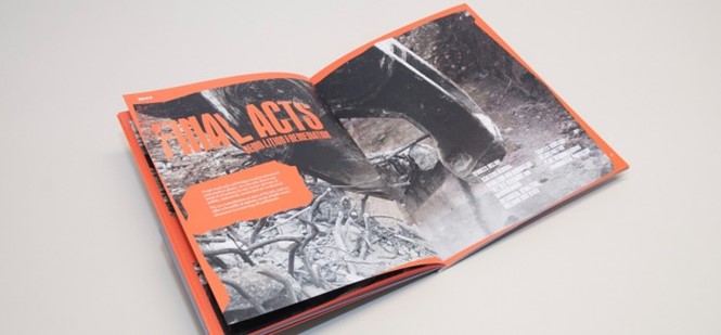
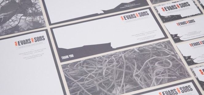
The new visual identity clearly demonstrates the company’s work in demolition. Cojeen says, “We utilised the imagery of wire trellising and meshing to give a unique visual look and feel. We developed this through a bespoke style of typography to be used throughout both on and off-line marketing. This was developed to give the illusion of being formed out of a block of granite that was chipped away as part of the demolition process.”
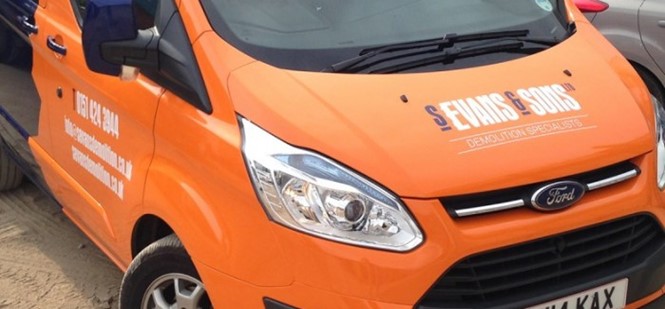
Jo and Co also worked with photographer Dan Kenyon to create images for a bespoke marketing brochure that was distributed during the brand launch. The rebrand was revealed across a fully responsive website, stationery, e-marketing and vehicle livery.

