Wilberforce Chambers rebrands with Jo and Co.
Leading Lincoln’s Inn barristers Wilberforce Chambers has revealed it’s new brand identity by Studio Jo and Co.
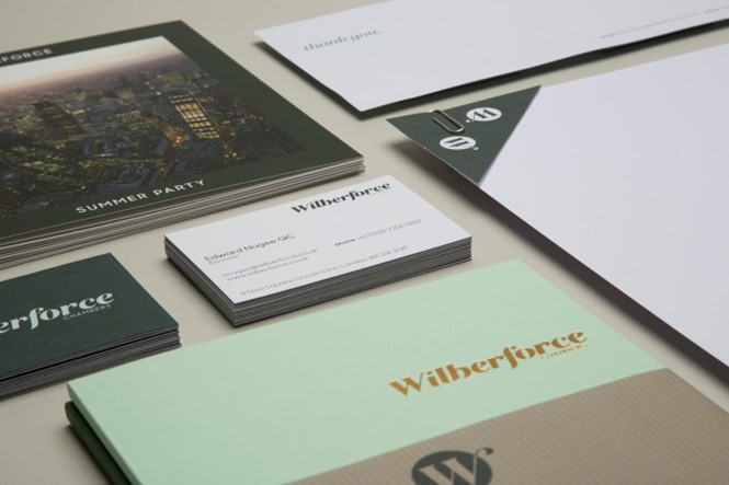
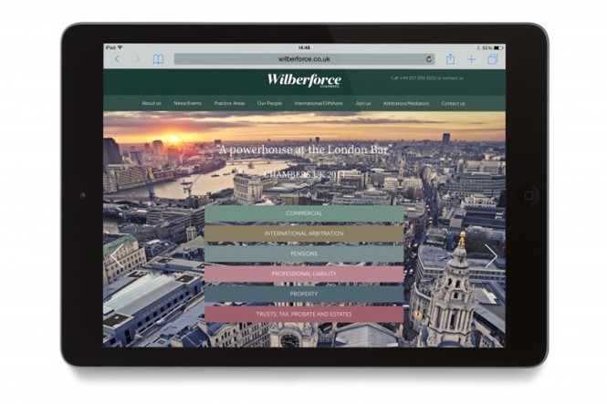
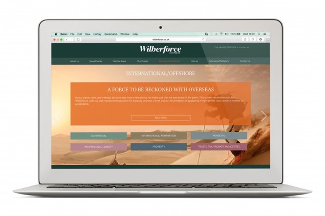
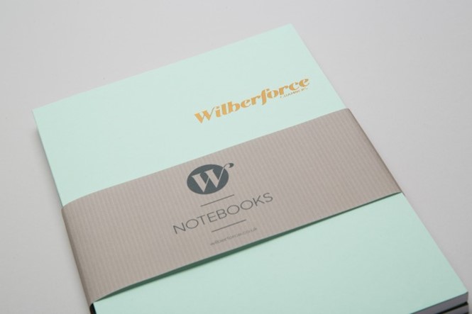
Wilberforce Chambers, as a market leader in a number of practice areas, was delivering on client experience, however there was a misconception that the set was somewhat dry and unapproachable. Studio Jo and Co was consequently tasked with developing a new visual identity, marketing materials and a responsive website.
Gary Wheat of Jo and Co, says, “We worked to develop a fresh visual look and feel that communicated to Chambers clients in a coherent manner and above all in a language they could understand, not clouding the issue with endless text and legalese. We are really proud of the work we have produced and see this as the first step in a long term working partnership with Wilberforce.”
The new look is both classic and modern. It eschews the script tyepface opted for by many law firms and presents a clean, clear user experience across digital platforms.
Naomi Shogbola of Wilberforce Chambers says the agency was able to integrate feedback from the internal audience and from clients in order to make the rebrand a success. The legal landscape has become more competitive in recent years, prompting a number of rebrands of firms.


