Cows, clouds and consistency for Ben & Jerry’s


The two names Ben and Jerry alone evoke a feeling for the look and personality of the popular ice cream brand. It’s iconic Vermont cows roam green New English pastures and its cheery blue skies create a quirky dreaminess fitting for the alternative ice cream duo. But all that had become clouded over by overly complex flavour combinations taking precedence in packaging.
Pearlfisher New York was thus brought in to reaffirm Ben & Jerry’s brand values through packaging design.
Mike Branson, Pearlfisher founder and CEO says, “Premium quality and quirky personality are often considered conflicting equities – we are pleased that our redesign has proved that it’s possible to create utterly ownable and distinctive personality without compromising euphoric taste communication. Add to this global brand desirability and we are incredibly optimistic about this new design for Ben & Jerry’s.”
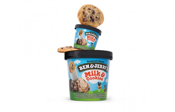
The consultancy sought to make the brand more coherent across all its markets and develop a more consistent way of communicating the brand values. Thus the so-called flavour tower was born. Ben & Jerry’s complex flavours – an asset upon which the brand rests – are no longer muddled, but clearly depicted in both a blocky half-serif and in literal stacks of ingredients depicted on each flavour’s packaging.
With the ice cream market becoming more competitive as young brands are challenging veterans with new flavours, techniques and ingredients, staying modern and clarifying the Ben & Jerry’s message was important. The result, Pearlfisher creative director Hamish Campbell says, is a consistent, unified way of communicating the, “Spirit, joy and whimsical nature of Ben & Jerry’s.”


