Stark storytelling informs The Children’s Society’s new strategy
The charity sector is one that has felt the burden of the recession and has taken active steps to rebound from the downturn. However, in the years since 2008, the third sector has only become more competitive as more charities are competing for a constricted audience of donors. One of the primary means of changing the ways in which a charity communicates with its stakeholders in recent years has been through rebranding.
For an organisation like The Children’s Society, a group founded by the Church of England in 1881 to ensure all children have a childhood free from disadvantage, a new brand is more than just a coat of paint.
Executive creative director at SomeOne, David Law, says, ““It was a key criteria of our work that the new identity had to not only be bold and impactful to recognise the hard truths that The Children’s Society seeks to expose, but it also has to stand out amongst the rest of the charitable sector. The amazing work The Children’s Society does really resonated with us as an agency and our designers worked hard to create an identity that could live up to that. Transformational change comes from within and we see this as a symbol of change, not just a change of symbol.”
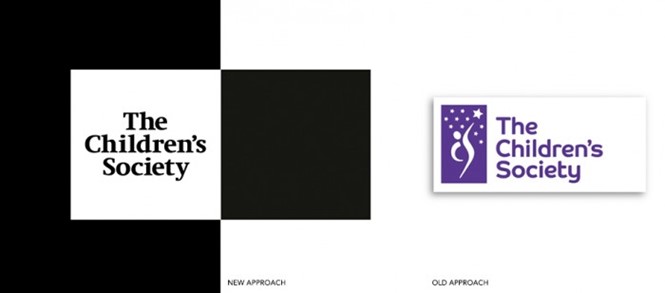
The society’s last brand had been around since 1998 and failed to differentiate the organisation from its peers in the charity sector. Enter SomeOne, a London-based branding agency, to overhaul the visual identity and reposition The Children’s Society’s communications strategy.
“The amazing work The Children’s Society does really resonated with us as an agency and our designers worked hard to create an identity that could live up to that.”
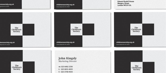
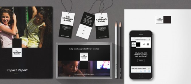
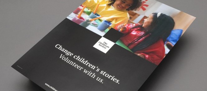
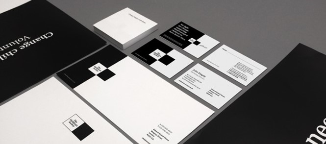
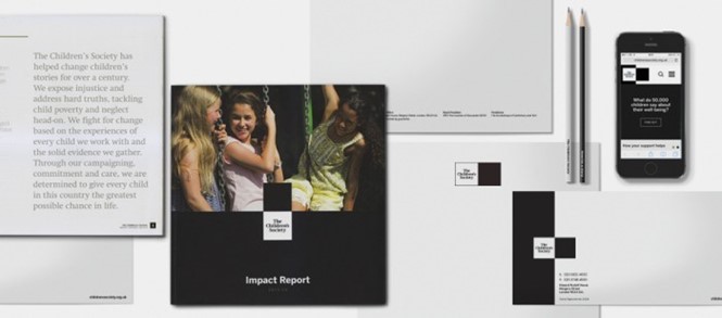
SomeOne infused the brand with a sense of drama and levity, highlighting the stories behind childhood and teenage poverty and neglect to emphasise the serious and important work the organisation carries out. This new communications strategy seeks to raise awareness not only of the society itself but of its work with disadvantaged children. The focus on hard truths allowed SomeOne to implement a stark, black and white colour palette complemented by full-bleed colour photos of some of The Children’s Society’s beneficiaries.
Head of brand at The Children’s Society, Lucie Brown, says, “Our intention now is to place stories at the front of our communications, demonstrating the direct impact that The Children’s Society and all of our supporters have on the lives of children in this country. Our new brand is already supporting us to deliver consistent marketing and communications in all our areas of work.”
The new website has already been rolled out and relies upon tiles and full-bleed photos to tell the organisation’s story while providing a framework for the user experience. The rebrand is set to be implemented in stages in order to conserve costs.
“Although the core brand is black and white, it is supported by a really bright secondary and tertiary palette which we have used to develop branded materials for our centres and programmes. Over the summer we have been testing this creative with frontline staff and families and young people. The first new brand Children’s Centre will be seen in Oldham later this month,” Brown says.


