Charity rebrand has gift of gab
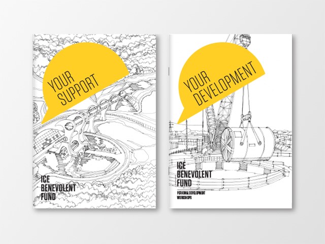
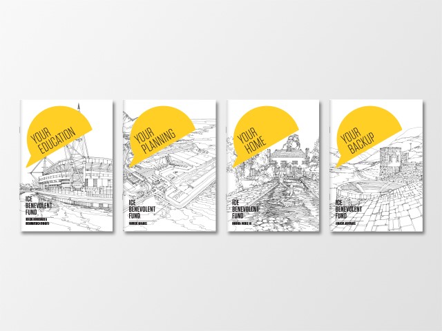
In the latest swathe of charity rebrands, organisations have taken on low brand awareness among target audiences through digitally-friendly, eye-catching design. The Institute of Chartered Engineers Benevolent Fund has rebranded with a vivid new logo, highlighting the service it provides for civil engineers and their families.
Although the fund has been successful in supporting those in need for many years, this work wasn’t reaching or being recognised by enough people within the engineering body. Consequently, a clear and identifiable rebrand was needed to raise awareness of the fund.
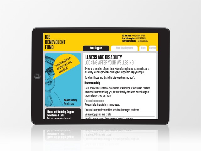
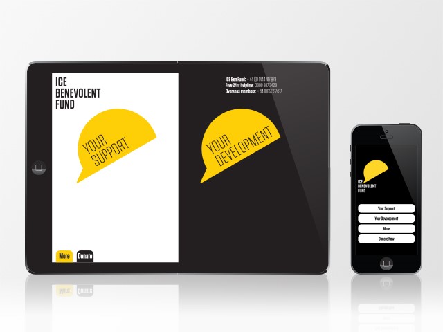
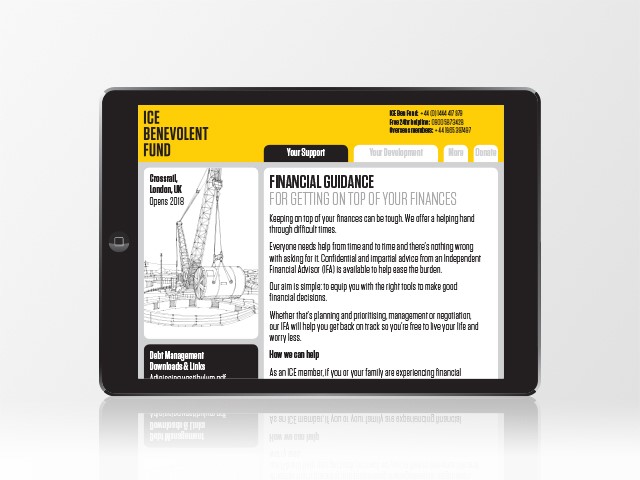
The new, vibrant yellow logo, which incorporates a hard hat and a speech bubble, identifies the target audience, maintaining relevance to the sector whilst highlighting the important services the fund provides.
Christopher Allen, creative director at London-based consultancy Powell Allen, which developed the rebrand, says, “Clear messages and new communications emphasised the services of the organisation and the actions it takes. Our work changed the perception and understanding of the organisation so that more people will support and benefit from its essential services.”
This striking visual identity and powerful tone of voice has helped to make the Institute of Chartered Engineers more human and direct. The clear message and new communications have made a greater number of people aware of the services and will consequently allow more engineers and their families to benefit from the fund.


