The Verdict: Lippincott’s rebranding of Nokia
The work
Having remained largely untouched since the 1960s, Nokia hoped a logo redesign would show off the company’s new presence as a B2B tech innovation leader. Lippincott, the global brand strategy and design company, took on the responsibility of updating the iconic brand’s logo and visual system.
With Nokia still widely recognised as a company which once sold sturdy mobile phones, the Finnish multinational sought the help of Lippincott to use brand as a means of changing this dated perception. Lippincott hoped the redesign would clearly signal Nokia’s newfound purpose as a company that is now a pioneering tech innovation leader.
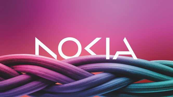
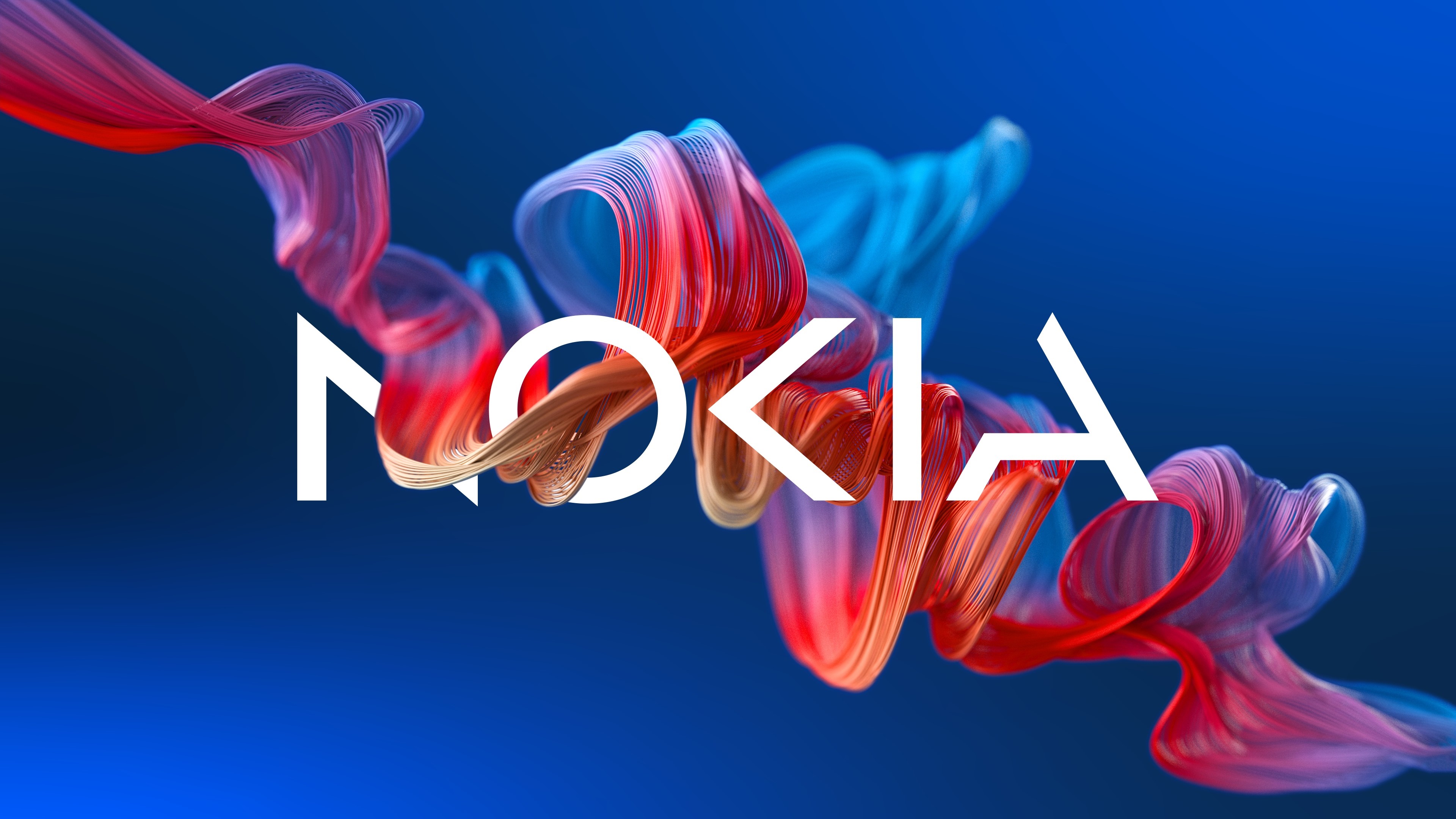
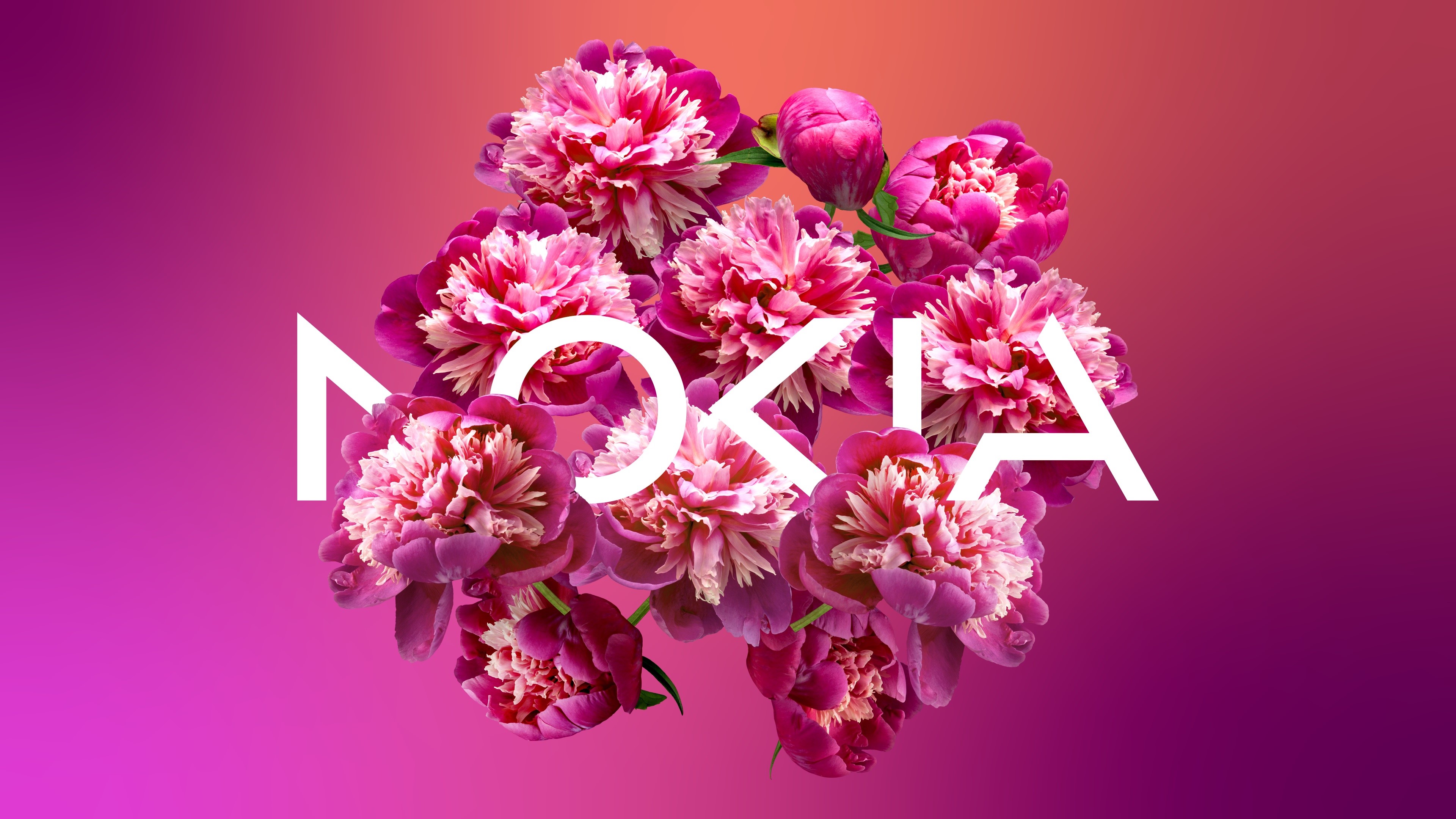
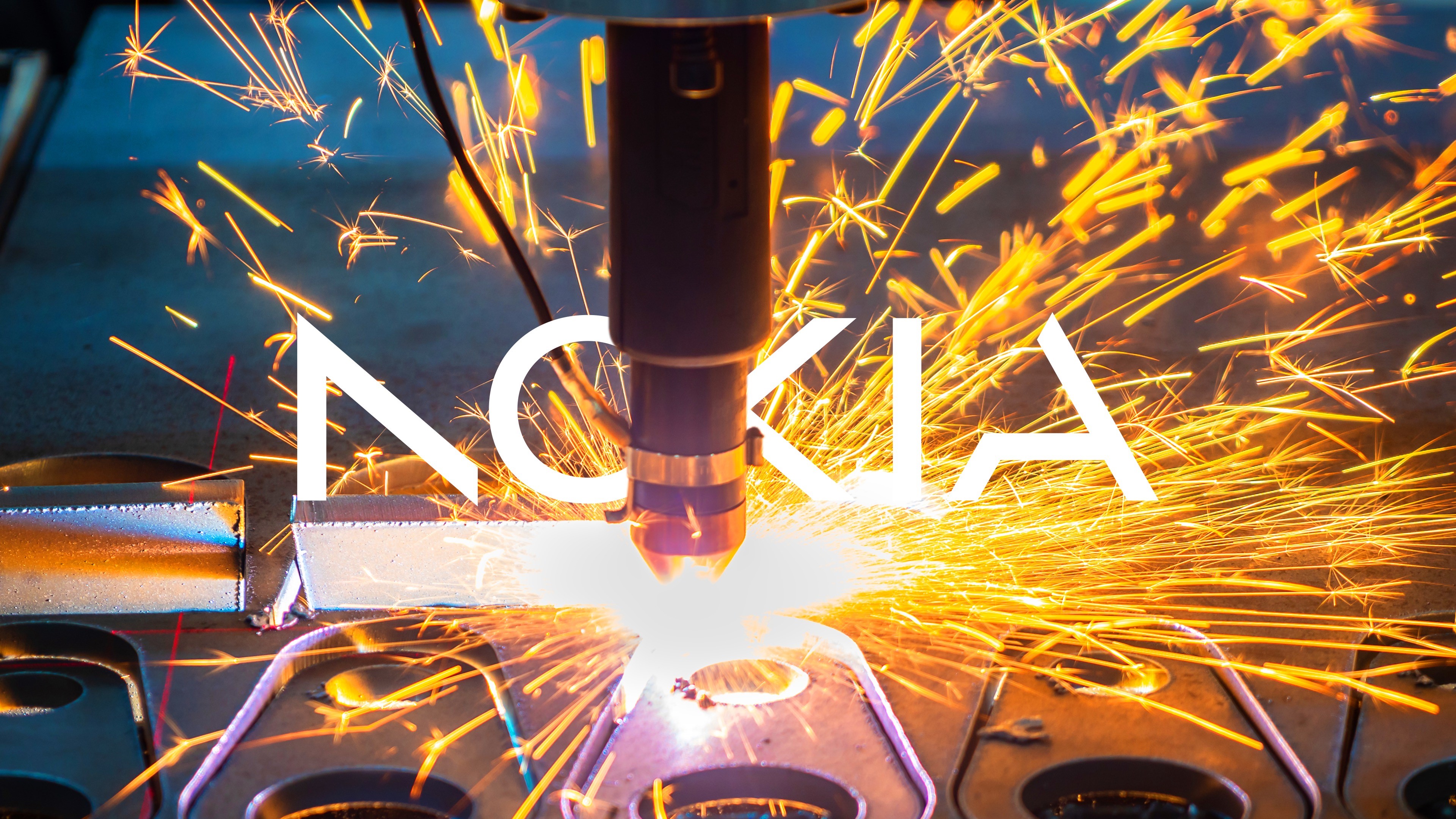
Keeping the new brand intertwined with Nokia’s history, the refreshed logo retains the original sharpness of the ‘K’. However, Lippincott’s work softens the logo’s once heavy, industrial feel by reducing the weight of the letters. Making use of lighter, more dynamic forms, the agency hopes the reimagined logo has a more contemporary look to it, synonymous with high technology.
Lippincott also hoped to demonstrate Nokia’s belief in collaboration. Utilising an optical play, called apophenia, each individual letter was evolved into simpler digital forms where the human eye completes the invisible connections to spell out ‘Nokia’.
Acting as a sharp contrast to the rest of the tech industry, the revised logo will generally be seen as white against a kaleidoscope palette of colours. Its new visual features allow it to be dynamic, digital-friendly and optimised for motion.
Nokia’s chief corporate affairs officer, Melissa Schoeb, says, “This is a bold step in Nokia’s journey – and will help us get recognised by existing and prospective customers for the B2B technology innovation leader we are today. This brand refresh marks a transformative moment in Nokia’s history. Now is our time to step forward confidently, with a brand that represents who we are today, and who we strive to become.”
The verdict
Deva Corriveau, associate creative director at Brandpie
Congratulations to the Nokia team for the bold transformation. It’s not easy to get leadership alignment and buy-in for something as radical as this, so bravo to those involved. Without knowing the brief, taste of the client and the insights they based their work on, we’re being told that Nokia are signalling a pivot (or strengthening) towards B2B, and are therefore changing their appearance to reflect that. But the work appears trend-driven. It has a stylistic, start-uppy feel to it. Of course, B2B shouldn’t be stuffy and corporate, but the new identity feels too consumer-facing. If the intention is to signal and reinforce a focus on B2B, I’d be doubling down on traits and signifiers that I believe the audience is looking for: stature, credibility, reliability and heritage. These are key qualities that aren’t easily replicable by new entrants, and by not differentiating Nokia visually from this competition, I worry they may be losing authority.

Sandra Ferreira, design director at Siegel+Gale
The new Nokia logo is a considerable departure from the logo on my much-cherished Nokia 3210. It's a product of the now, and reflects on how we consume brands – clean, simple but with a twist. It's an ‘expected’ modernisation, but what I personally like about the new design is that it reminds me of Finnish runes. I don't know if that was done on purpose, but the unfinished and angled type has a Nordic touch to it, which is reflective of the company as a Finnish multinational brand.
Sarah Ratinetz, creative director at Forsman & Bodenfors
My very first mobile phone was a Nokia. After all these years, I had no idea they pivoted away from producing phones. From a business perspective, I see this redesign as an example of how design can shift mindsets, create relevancy and signal a new vision for a company.
The minimalist forms certainly feel like they are breaking new ground. Your eye can fill in the subtracted letterforms, but I wonder if that asks too much of us. We’ll likely adapt. We always do. The letter form I am most intrigued by is the ‘N’. Rotate the logo in a certain direction, and it could read as a different ‘A’ form. While I understand the creative intent, I would love to see how a fully or nearly fully formed ‘N’ would support the logo’s overall legibility. A small change like this would still maintain the brand’s massive first step in communicating that it’s ready to reintroduce itself to the world.
Vincent Roffers, partner and head of strategy at Agenda
Certainly it makes sense for Nokia to have rebranded in a fairly dramatic fashion given how different their business is to what most of the world associates with them. They needed to send a major signal of the transformation, and this rebrand absolutely is that.
However, when it comes to actual execution, it would seem that adding a logo that is likely to cause confusion for many, to a company that's already struggling to drive awareness of what they actually do, may do more harm than good. It does dial up the tech and look more modern for sure, but it would likely have been more useful if the logo was leveraged as a more obvious device for telling their new story. Perhaps it's in there, but just easy to miss or be distracted by all the abstraction.


