Location, location, location: How brands conquered the world

One of the great adventures for a modern brand is venturing overseas to be enjoyed by people all around the world. But with a multitude of cultural barriers standing in their way, this is harder than it looks. Jack Cousins explores how to achieve true brand localisation.
In June 2004, the IMF’s acting manager director, Anne Krueger, addressed the Pacific Council on International Policy in San Diego, the US. She discussed the idea of the “Shrinking World” – a metaphor for globalisation – and how it operates. “We are talking,” Krueger said, “about a world benefiting from rapidly falling transport and communications costs, thanks to technological progress, combined with sharply rising trade flows thanks to trade liberalisation.” But while these factors were cited as reasons why globalisation is possible, perhaps these elements ignore why it is palatable.
It would be human nature, surely, to be suspicious of foreign companies transforming the high street of your home town or city. But consider the then-USSR capital of Moscow, for instance, and its people’s immediate acceptance of McDonald’s in 1990. This phenomenon becomes even stranger when you consider the fierce tensions and antithetical ideologies which had plagued the Soviet Union’s relationship with the brand’s country of origin, the US, for nearly half a century prior.
It is estimated 30,000 people were served on opening day in Pushkin Square, a record for the multinational at the time, and in the space of just seven years, a further 20 Russian McDonald’s had been built. General curiosity might explain those initial queues but to say it accounts for sustained demand would be a stretch. Instead, McDonald’s clever brand strategy at the hands of George Cohen, the man who brought the Big Mac to the heart of the Soviet Union, might be a better answer.
For a nation which had practiced intense isolationism for generations, the opening of a McDonald’s offered the average Muscovite an almost unbelievable opportunity to taste life in the west, a theme which the brand leaned into. The restaurant undertook the balancing act of respecting its host nation, as demonstrated by incorporating a hammer and sickle under the iconic Golden Arches logo, while adorning its interior with international motifs. Among excited customers and frantic staff dressed in the classic McDonald’s red uniform, a mini replica of Big Ben could be found. Walls were painted with scenes of figures windsurfing in distant, no doubt warmer, regions.
To locals it must have seemed a distinctly foreign experience, in more ways than one. The company successfully tapped into its audience’s desire for something new and exciting while keeping firmly within the conventional boundaries of what you expect from a McDonald’s. To achieve this degree of acceptance, a brand must transcend language, cultural sensitivities and even geopolitics. This is no easy achievement however, and many brands looking to go global face barriers aplenty.
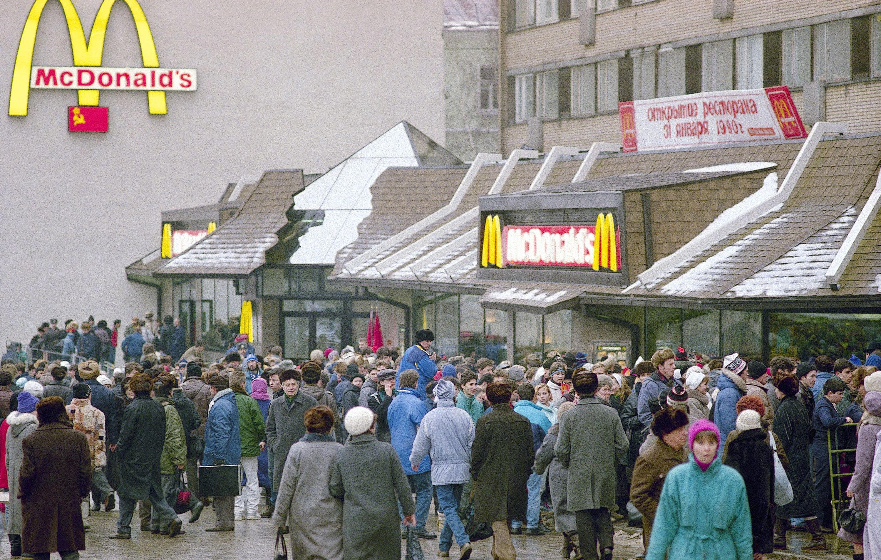
Image credit: Associated Press / Alamy Stock Photo
What brands abroad must overcome
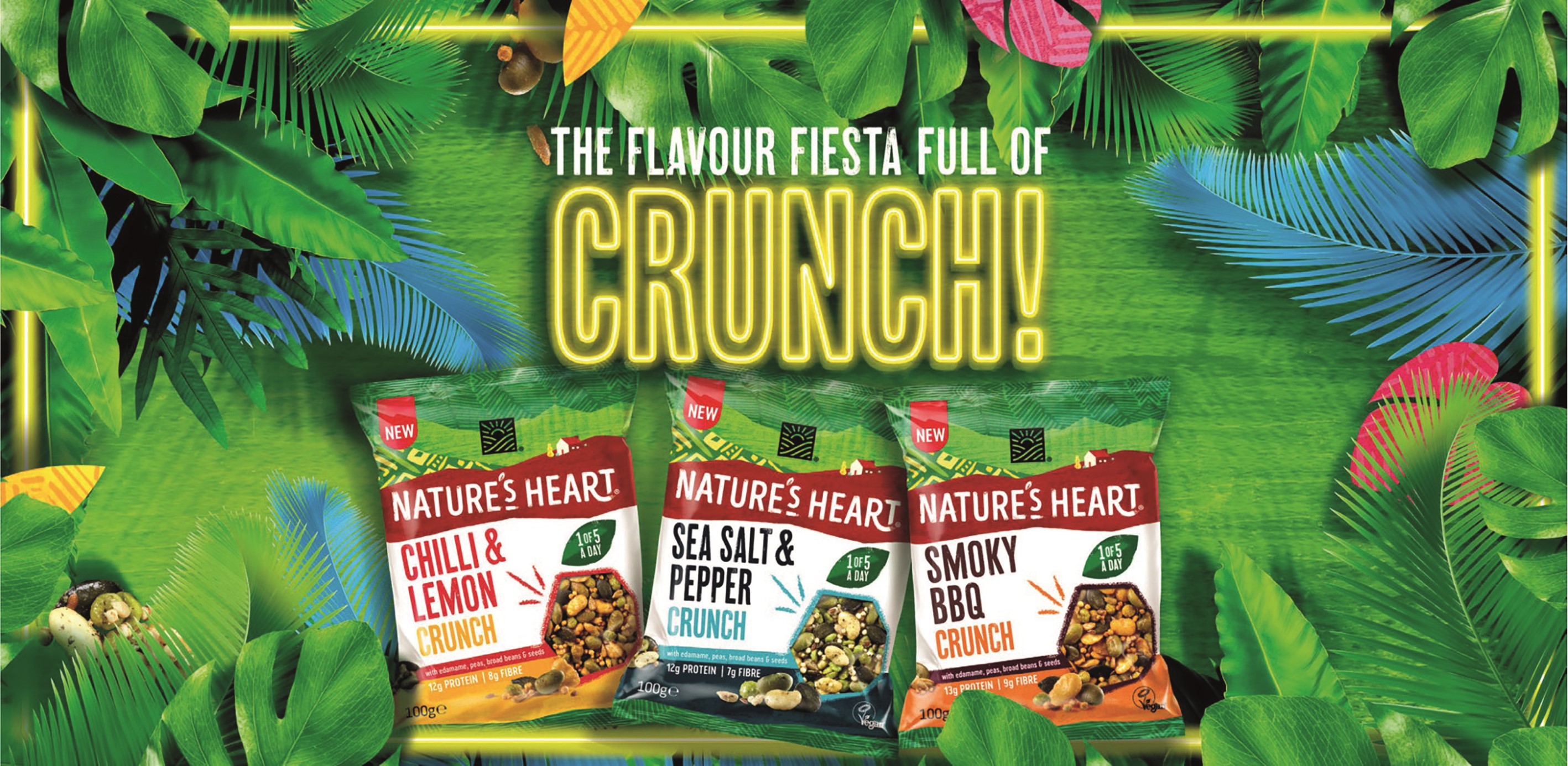
There are numerous ways – both subtle and overt – that brand localisation can go horribly wrong. Most of the time, however, the task of adapting to foreign markets is simpler, and brands entering free nations will not have to worry about the thoughts of commissars. Rather than actively fitting in to a degree, the issue for brands entering markets in the western world might be that of achieving sufficient stand out. This was certainly the issue Nature’s Heart had when introduced to the UK market in 2012.
The South American food brand originated in Ecuador after three brothers decided to share the unique taste of the goldenberry – found in the fertile foothills of the Andes – with the world. After a few years of cultivating a sizeable audience on the continent for the healthy snack brand, a decision was made to expand into Europe, with a particular focus on the UK. But Terrafertil, the parent company of Nature’s Heart, had to turn to 1HQ Brand Agency to devise a new identity for British consumers after struggling to emulate the success found in its homeland.
Katie Johnson, account director at the global brand agency’s Windsor office, explains, “They did some qualitative research and found the UK market didn't get it. There was a complete disconnect between the product experience and the visual identity. There was no clear representation of the brand heritage and the origin story, so people felt this could have come from anywhere!”
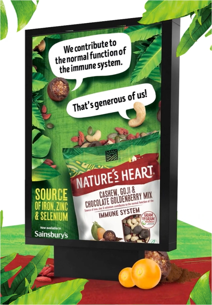
Johnson and her colleagues, following further research, came to understand the unique appreciation UK consumers have for brands which can tell a story, as well as brands which make consumers feel like they’re doing some good when buying those products. Fortunately enough, Nature’s Heart had an excellent but untapped backstory for 1HQ to delve into. The family run business is deeply concerned with the welfare of the local growers who farm its goldenberries, and even set up The Goldenberry Plan as a responsible sourcing programme to improve the livelihoods of Ecuadorian and Colombian farmers they partner with.
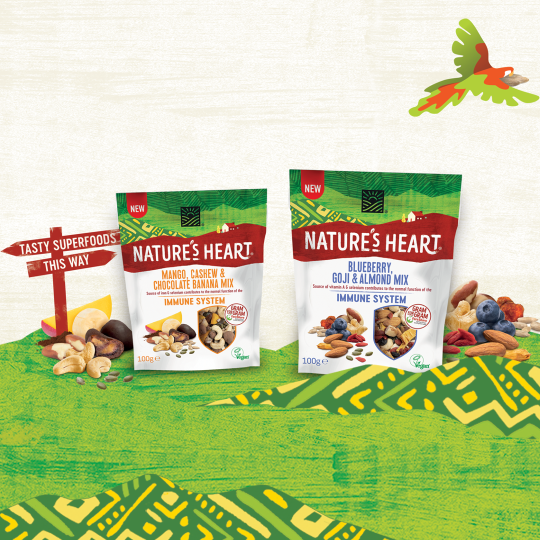
Armed with a strong purpose, 1HQ had to find a way to bake this into the brand’s visual identity. In old packaging designs, goldenberries were depicted dangling from the top of the pack, greens and yellows were highly prominent and a harder typography had been selected. While this bright look worked in Latin American markets, it tended to be drowned out on UK shelves by similar-looking snack competitors such as Pringles and Walkers.
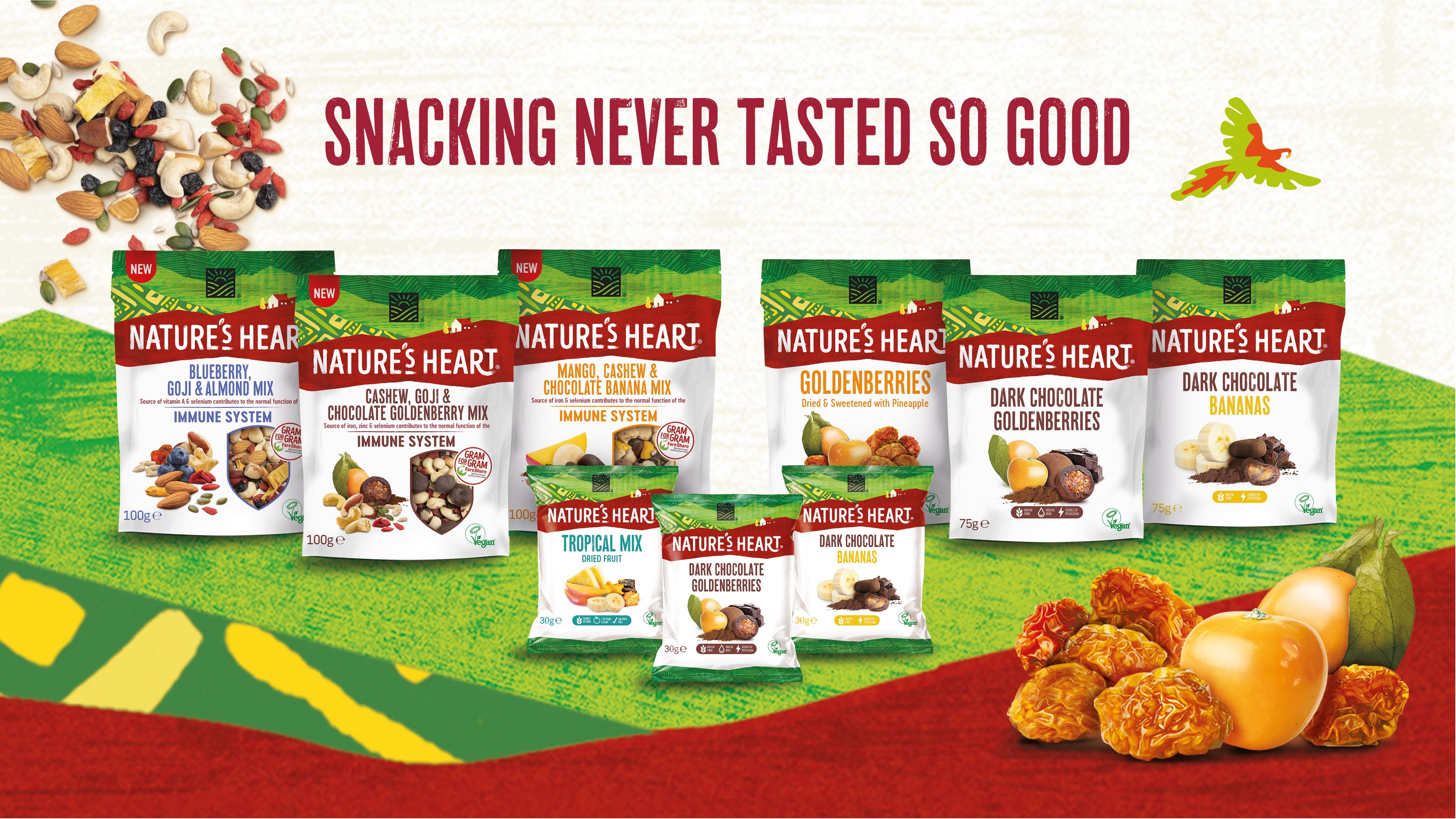
Shifting gear, 1HQ opted to use white, which better represents the brand’s honest and healthy credentials, and red on the revised packaging. Cleaner photography showcases the ingredients used in each product, while adding illustrations of an Andean farmhouse and mountain backdrop allows consumers to hazard a guess at the brand’s South American origin. The packaging redesign was capped off with the introduction of a softer, hand-crafted typography to further convey the brand’s authenticity.
And it worked. “The results have been incredible,” says Johnson. “They had a 340% increase in sales and were listed in 13 new retailers. They've even moved into the savoury category and have a new range out called ‘Crunch’, which is doing fantastically well.” The Nature’s Heart project underlines how an unsuccessful foreign brand, which consumers feel nothing for, can go on to compete with a country’s more established local (and indeed international) brands.
When things go really wrong
Despite some hiccups, the road to foreign success for Nature’s Heart was far smoother than the experience of many of the world’s biggest international brands today. Take KFC, for instance, and its prominence in the now-flourishing Chinese market. The most recent estimates suggest the fried chicken restaurant chain holds 11.6% of market share in the country. This is a monumental success, and the company’s efforts to tailor its brand to the local market, such as curating a larger menu offering traditional Chinese dishes, earnt it a warm reception. But there was one infamous blooper along the way. On opening the brand’s first restaurant in Beijing in 1987, KFC’s iconic tagline, ‘Finger lickin’ good’, was mistranslated to ‘We’ll eat your fingers off’.
In 1997, it was Nike who looked foolish. On releasing its new Summer Hoops line of basketball shoes, the company inadvertently offended Muslims by sprucing up the word ‘Air’ on the trainer’s heel such that it resembled the Arabic word for Allah, or God. If a brand wants its products to be bought by the whole world, including its some-2 billion Muslims, it has to ensure every detail of its brand strategy, including typography, is well considered. Unwilling to learn from its mistake, Nike was pulled up in 2019 for a similar incident where the same word was found on the sole of its Air Max 270 trainers. Muslim civil rights advocates argued the word Allah would literally be trampled on if the product was sold, therefore making it inappropriate.
But if a brand really wants to demonstrate its ineptitude for understanding local markets, then look no further than the Coach and Versace debacle of 2019. The high-end fashion brands decided to sell t-shirts in China which cited cities around the world and their country of origin, including Hong Kong. The problem is that Hong Kong is officially a Chinese special administrative region, but the products insinuated it was not a part of China’s territory. A flurry of apologies followed, along with Versace Chinese brand ambassador, actress Yang Mi, stepping down from her role. Coach went one step further with its t-shirts, also listing Taiwan as a separate country to China, which obviously was never going to go down well with its local audience or the authorities.
Finessing the formula
This shows just how high the stakes are, and how the tiniest of details can be fatal to a brand’s reputation. But PepsiCo, which has been selling its products overseas since its formation in 1965, has become the master of localisation. There are few examples in recent years that better demonstrate its prowess for pleasing local markets than Pepsi’s two Egypt campaigns with the nation’s premier football superstar, Mohamed Salah.
The launch of Pepsi x Mo (2021) and Pepsi MO Can LTO (2022) sought to strike at the collective heart of what matters most to modern day Egyptians. As Gianmauro Vella, PepsiCo’s head of design for APAC and AMESA, says, “Salah actually took part in the Pepsi Football Academy programme when he was a youngster, so there’s a beautifully romantic story behind this. But the reason he was chosen is also because he embodies – for the majority of Egyptians – the achievement of a dream: someone who is far from anywhere and then, through his passion, his ambition and his discipline, becomes one of the top footballers in the world.”
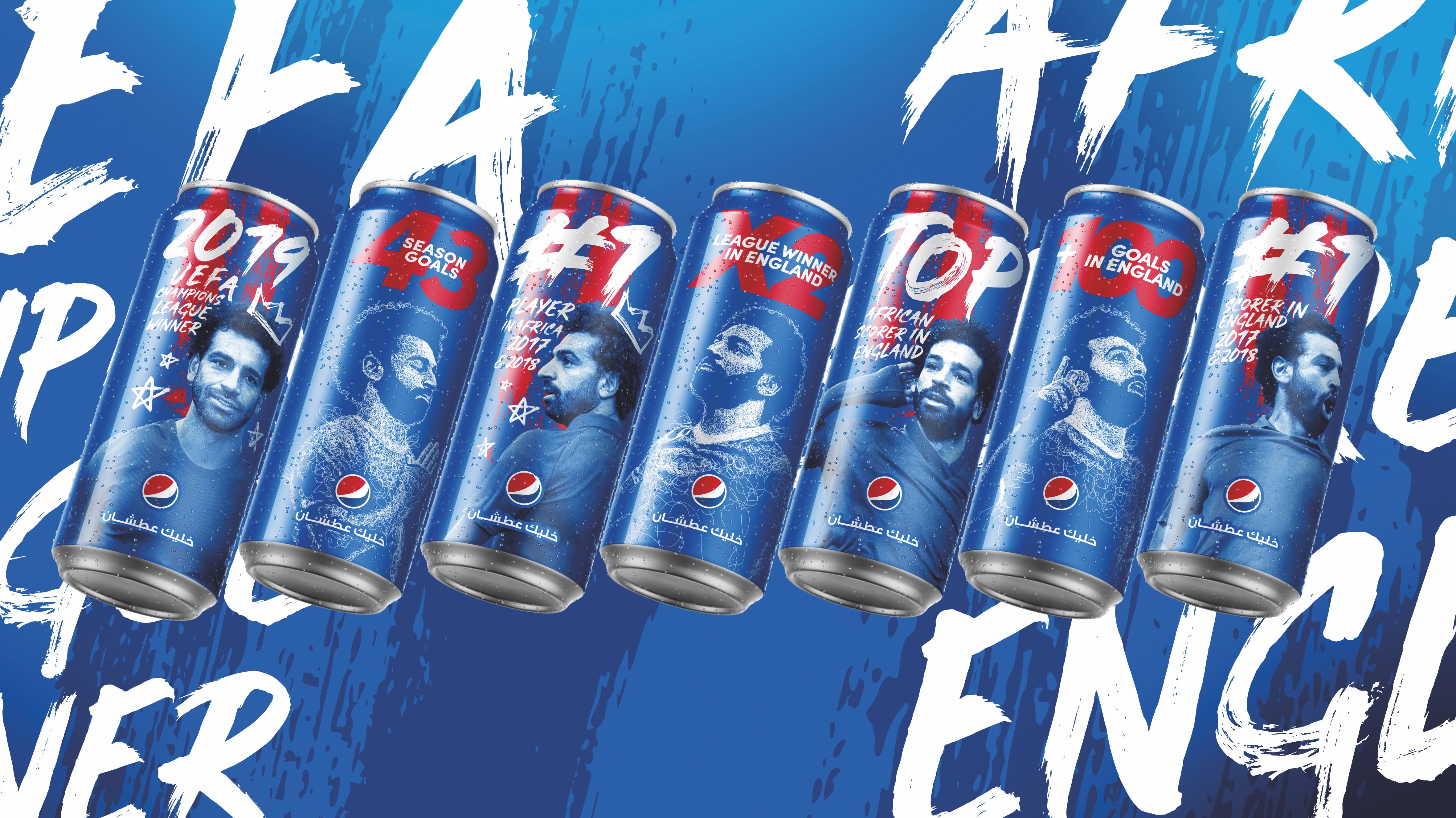
For PepsiCo’s in-house design team, the Pepsi x Mo campaign was an opportunity to truly celebrate the player. The various doodle illustrations on the can depict Salah’s iconic goal celebrations, such as closing his eyes and forming a prayer gesture with his hands or cupping his hand behind his ear. Meanwhile, a large, bold typeface is used to describe the footballer’s greatest achievements, and heavy red brushstrokes aim to reflect Salah’s dynamism, power and passion.
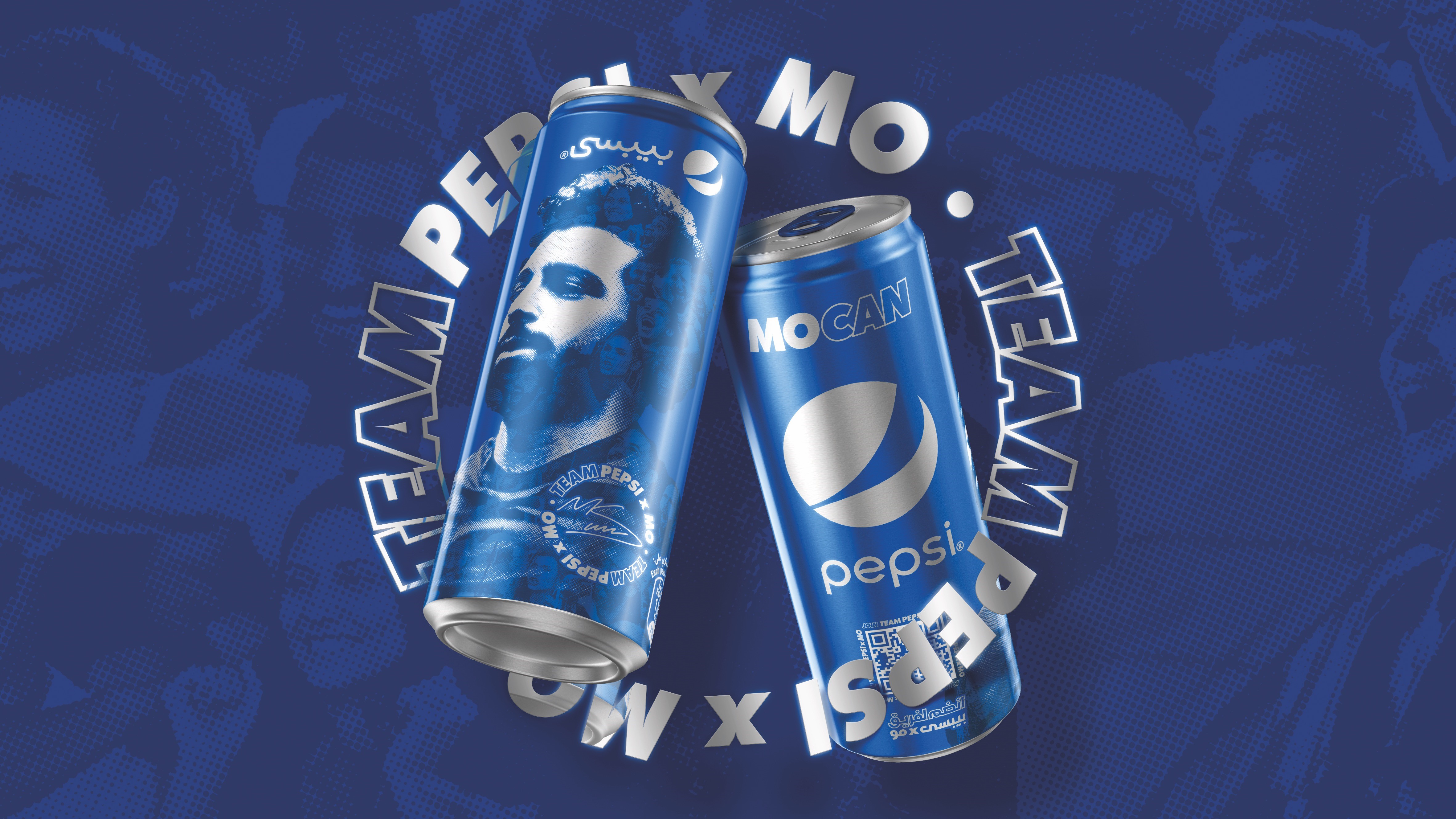
As for Pepsi MO Can LTO, the campaign differed slightly by being more fan orientated. The Everyday Thirsty can design featured a collage of the faces of Salah’s biggest fans, and the clever use of QR codes offered consumers exclusive behind-the-scenes content of the ‘Egyptian King’. The 11 people who tallied the most code scans won the opportunity to meet Salah in-person. The design took a classy feel with its silver Pepsi logo and Salah signature at the bottom of the can, further adding to its collectability. With over 100 million unique QR code users, the project was an undoubted success. Subscriptions even broke the 165 million mark, the most ever in Pepsi’s history.
For Vella, brand localisation is just the “output”, and adopting a “human-centric” mindset is the real starting point of achieving design cut through in specific markets. He says, “By starting from that principle, you need to take into consideration the first aspect: empathy. Then you have to understand the strategy; who is the brand you are representing, and who is the brand you're trying to bridge with consumers? The last one is prototyping and bringing all the ideas you have in mind in front of consumers to really gauge their reaction.
“So, if you start by taking those three aspects – empathy, strategy and prototyping – as a starting point in everything you do, you clearly understand how localisation is simply an output. No matter how global your brand is, you need to be relevant to the local consumer, to be believed, understood and loved.”
Despite the plethora of technological advancements that have been made in the past 70 years, cultural restraints remain a real difficulty to overcome when attempting to convey the soul of a brand. Yet tailored branding still seems to be the best way of breaking down scepticism. And while we have seen many brands successfully navigate the ever-globalised world, the new challenge may be the precise opposite, and calculating how best to proceed in a deglobalised world.
War in Ukraine, the difficulties of operating in an illiberal China and the demands of western consumers to boycott certain nations have all proven reasons for brands to pull out of markets in recent years. The historical target has generally been to dominate as many foreign markets as possible, but the future may come to ask which foreign markets are really worth dominating.
This article was taken from Transform magazine Q3, 2023. You can subscribe to the print edition here.


