Isle of Wight Tomatoes rebrand promises ‘More Sunshine, More Flavour’
Having operated for over 15 years on the English Channel island, the brand formerly known as The Tomato Stall has undergone a major update in order to elevate its identity. The tomato growers turned to London-based design firm B&B Studio to design a new brand positioning, identity and packaging design.
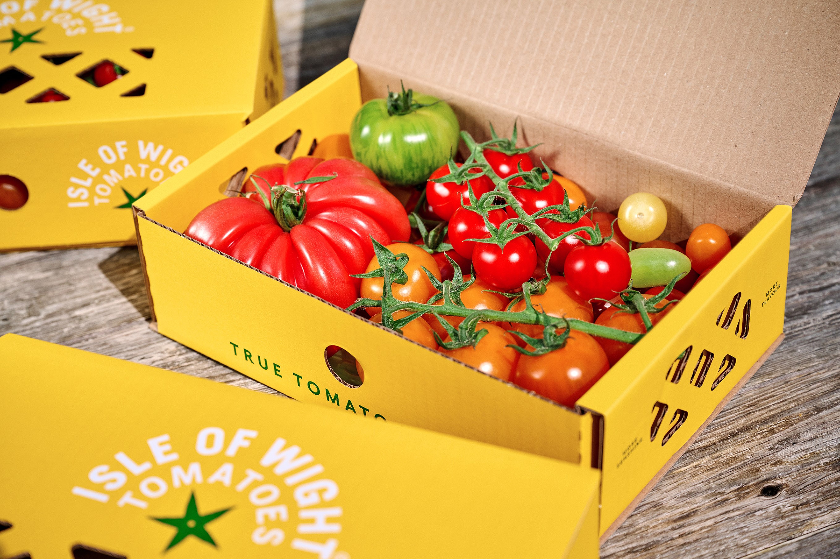
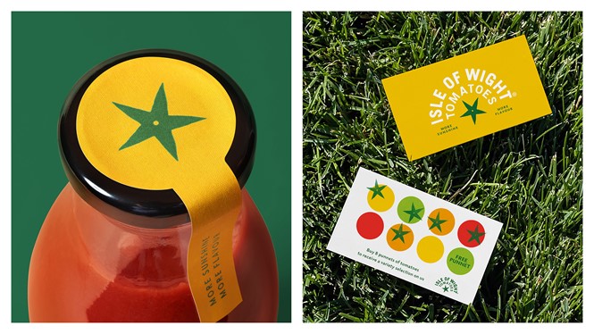
Bidding to differentiate itself from competitors, the new Isle of Wight Tomatoes brand specifically references its home island. With The Isle of Wight offering more hours of sunshine than anywhere else in the UK, the revised brand was constructed around the idea of ‘More Sunshine, More Flavour’.
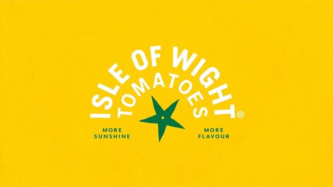
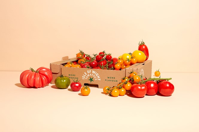
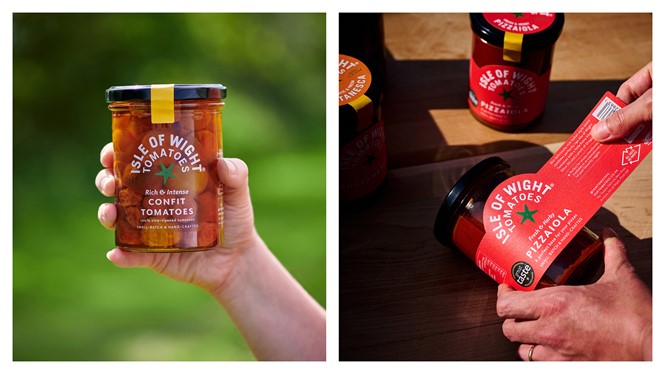
In order to add greater standout, B&B Studio’s work includes an alteration to the colour palette, which ditches a predictable red and green for an unexpected yellow. This extends to the brand’s packaging which introduces a new flavour-led colour palette to demonstrate the broad range of products. In addition, the new identity utilises a star logo which evokes a tomato calyx.
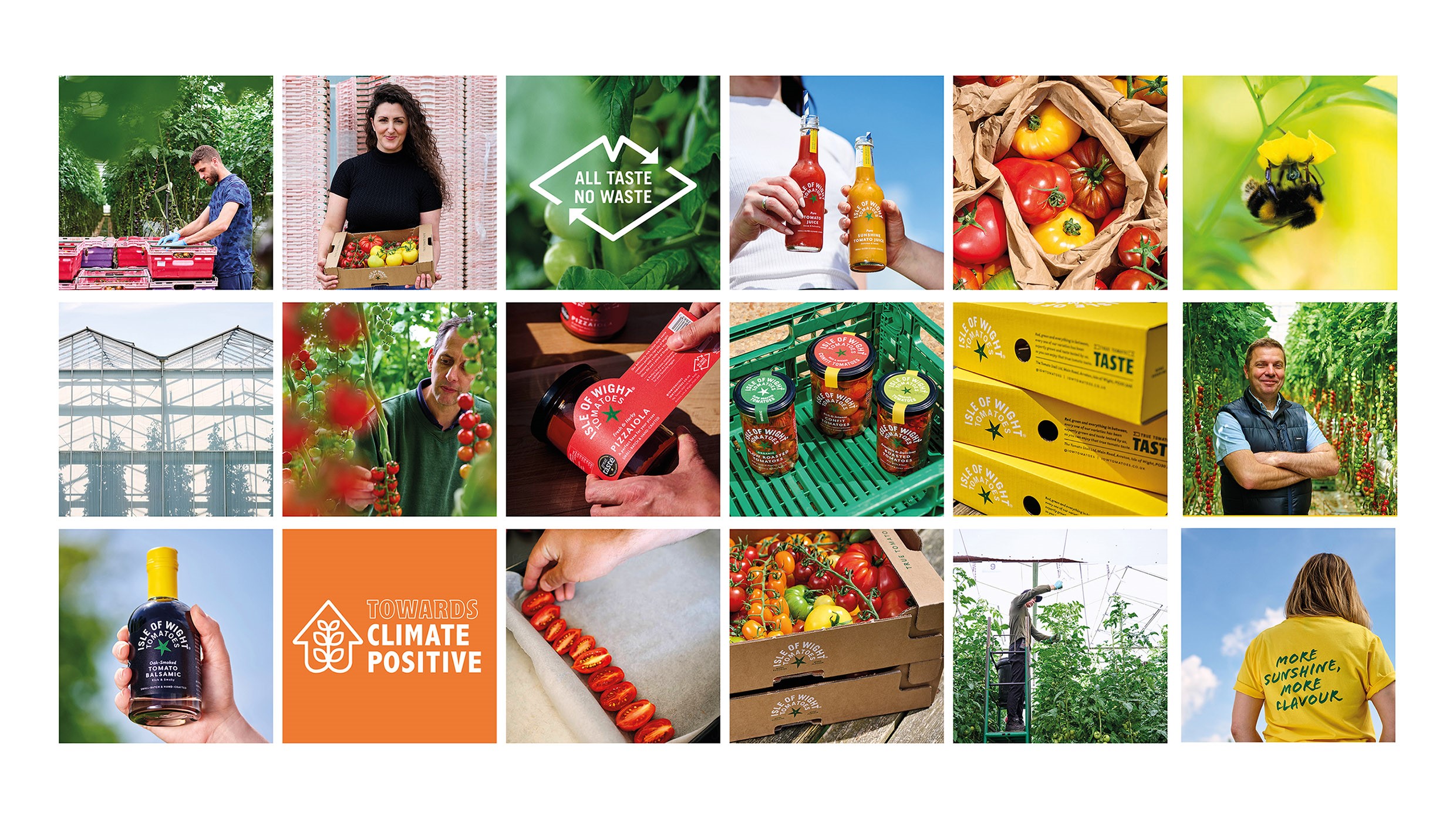
Elsewhere, Isle of Wight Tomatoes has adopted a playful tone of voice and messaging that shows off the brand’s sustainable growing expertise. The naturally lit photography – used across social and digital channels – further adds to its sunny personality.
B&B’s associate creative director, Jennie Potts, says, “Working with the amazing team at Isle of Wight Tomatoes has been a real eye-opener, and I hope that the new identity helps capture the genuine passion, purpose and perfectionism that goes into growing this exceptional product. We're really proud of the new visual identity and the bold approach it takes within the produce category."