Visa introduces new brand identity
With 3.7 billion credentials in the world, both in digital form and physical such as cards, the Visa brand is recognisable to nearly everyone in the world. Yet to most people, Visa has been synonymous with credit and debit cards. It was important for the brand to ensure it is seen as more than a credit card company and understood as a network that empowers people and businesses to participate in the global economy.
Global design studio Mucho, was tasked with creating a new brand identity system to change this paradigm and re-position Visa as the network that enables the movement of a transaction. It was also important that the new Visa visual identity system represent the brand purpose and overall mission of the company at large.
One of the most important aspects for Mucho to consider was to make the brand consistent worldwide, and develop a holistic identity. This would require taking Visa , a 60+ year old company and modernising its look for a digital-first world, while maintaining its brand recognisability and equity.
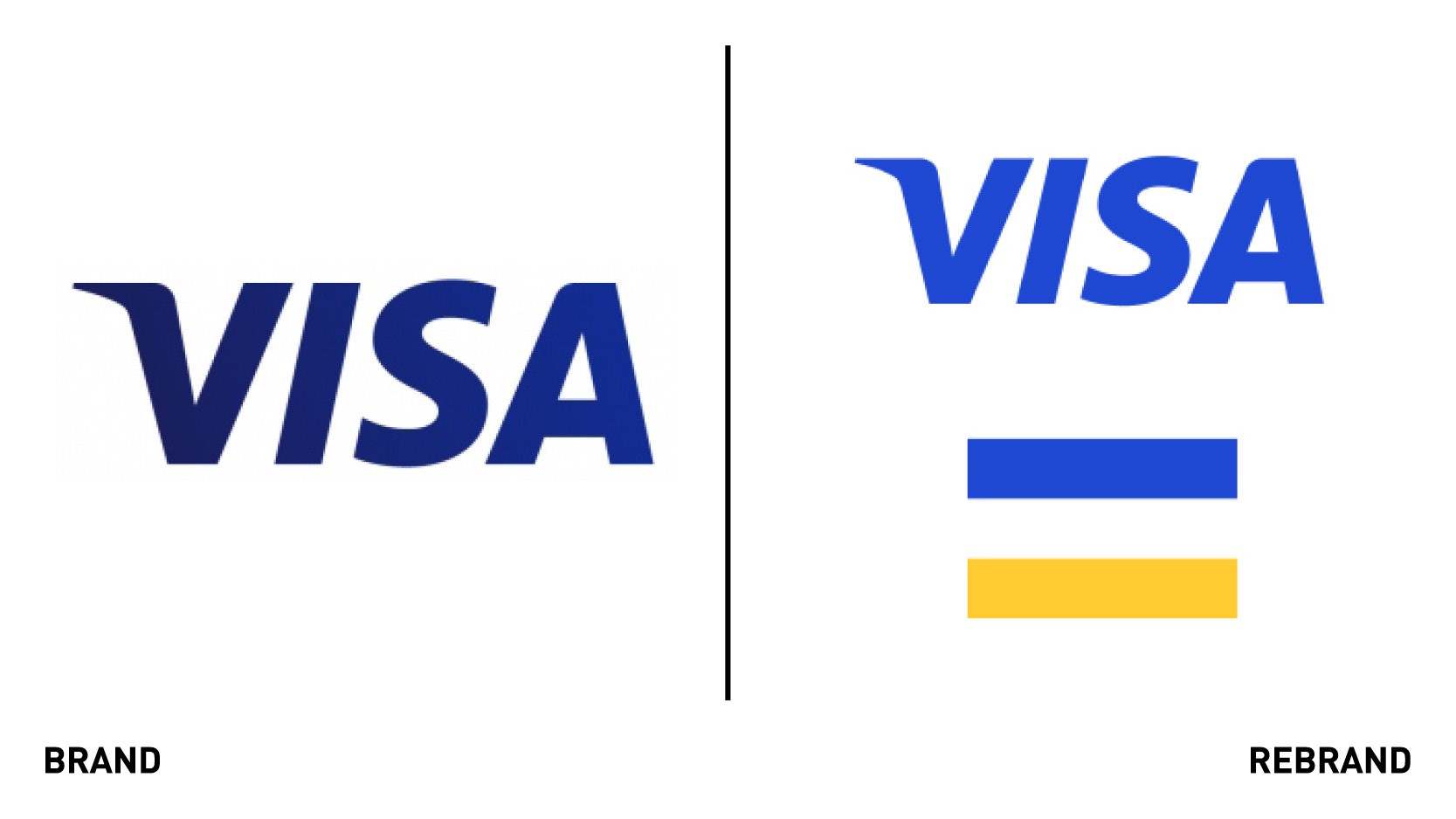
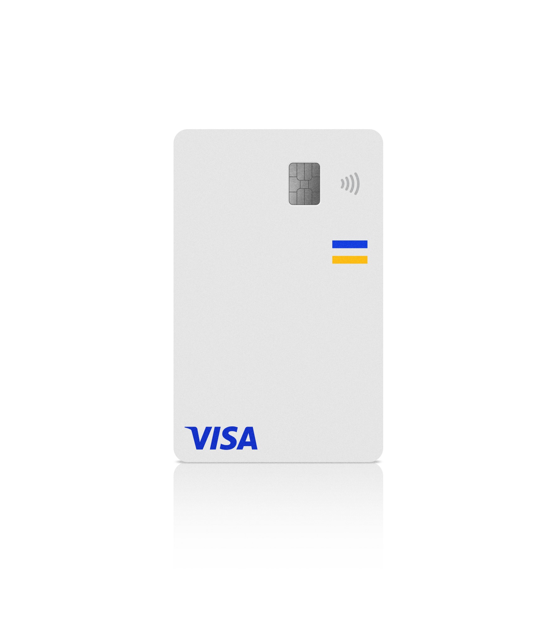
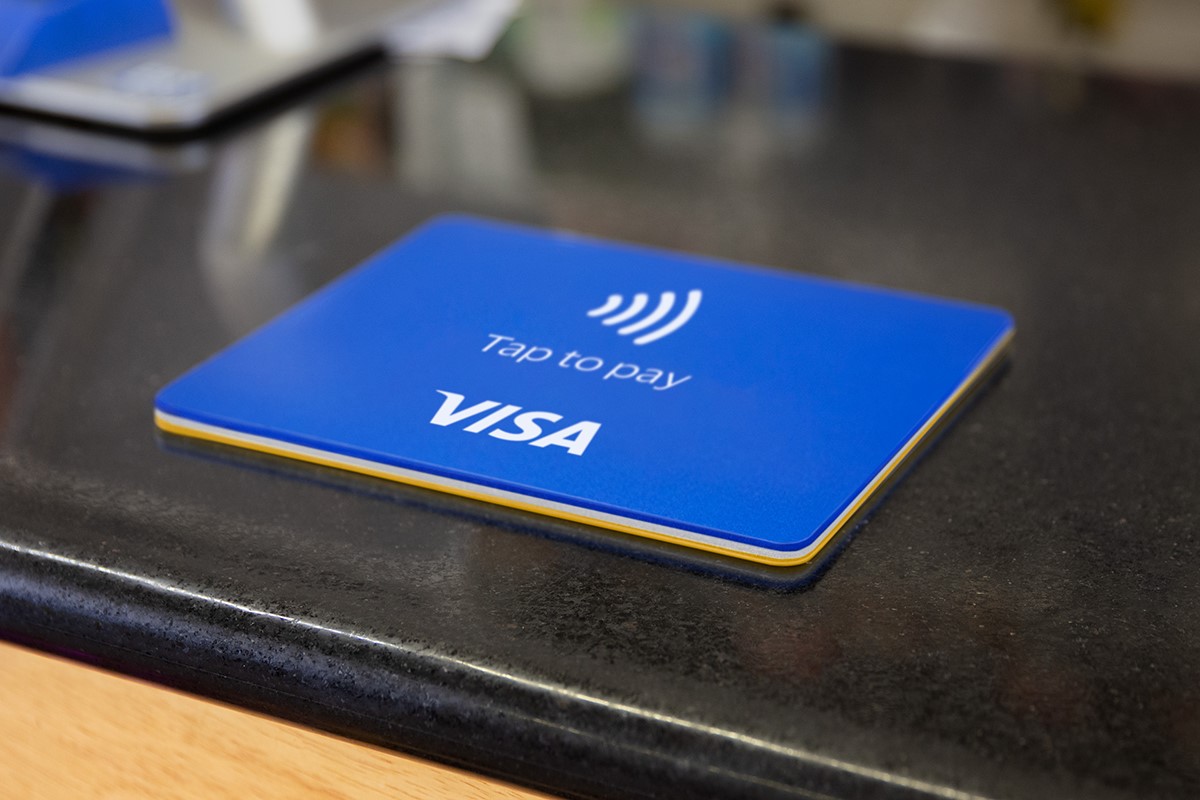
To do so, Mucho paid particular attention to the Visa brand mark, which for the brand symbolises security, trust and financial access. Whilst the brand mark design didn’t change, to maintain recognisability, Mucho updated the colour to capitalise on Visa’s heritage and tell a new story about the brand. The new brand mark, brighter and more dynamic, was developed with the aim of being more visible in the digital world and in smaller mobile platforms. The logo also aims to reinforce Visa’s heritage and equity, whilst also representing the brand’s belief mission statement, that economies that include everyone everywhere, uplift everyone everywhere.
“A core part of the new identity was honoring the visual heritage and past that Visa has, as a 60+ year-old company. The new brand symbol brings the heart of the brand to the forefront. The symbol has always been there – we just dialed into the opportunity to use it in a creative way,” says Rob Duncan, creative director and partner at Mucho.
The Visa brand mark and brand symbol work together to build equity in the heritage and elevate the brand purpose. From the brand symbol, Mucho derived a rule of thirds. The thirds-based grid system is designed to flex across any shape or size canvas, providing flexibility, while always anchoring down the different elements.
Mucho also developed a one-colour system for everything Visa, which includes blue, white and yellow as core colours, with a supporting secondary palette to add flexibility. The palette can be dialled up or down, working across various audience channels and initiatives. The brighter core colours aim to reinvigorate and modernise the brand. The palette can be dialled up or down, working across various audience channels and initiatives.
“The ratio of colour is iconic and feels intrinsically Visa,” says Duncan.
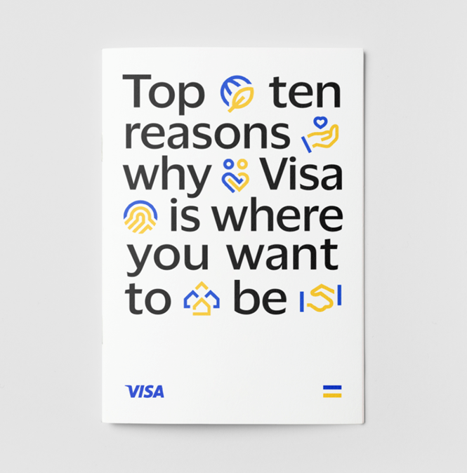
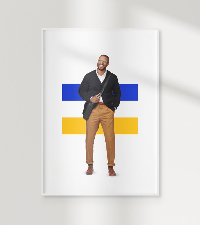
Mucho extended the colour ratio into a unique icon and illustration system, using the brand symbol as the foundation. The modular system, in which icons and enriched icons can scale into illustrations, provides a platform through which to tell engaging stories. The agency also developed new photography for different communications outlets. Mucho built on the cut-out style of portrait photography established for the initial Meet Visa campaign, augmenting it with authentic photography. The editorial-style images aim to offer deeper details and insight into the Visa ecosystem stories and characters.
The new identity system is completed with a Visa Dialect, a new humanistic typeface, designed specifically to drive brand awareness, increase recognisability and improve legibility across platforms. Rather than adding a superfluous graphic language to the identity system, Mucho focused on implementing creative uses of the new typeface. By using Visa Dialect very large and cropping into the letterforms, the agency aimed to create a confident, bold expression for the brand. The new typeface builds a more youthful and dynamic expression of the brand that can be used to create a unique look and feel for the sporting and sponsorship events that Visa supports.
“The Visa brand touches billions of lives around the world as people connect and share on our network. The updated visual brand identity had to express the essence of the Visa brand and convey its human, dynamic nature. We wanted to evoke a sense of access and our belief in economic inclusion to underscore that Visa is so much more than a credit card company. The Mucho team understood the assignment and created a modern and dynamic visual brand identity that is engaging and visually compelling,” says Freddie Covington, SVP chief global brand at Visa.


