SomeOne creates broader rebrand for British online retailer Very
The London-based branding agency sought to change perceptions of Very being a female-focussed fashion retailer by widening its attraction to a more digitally savvy audience. By distilling the identity down to its iconic pink square, the agency used this to create a coherent set of brand principles.
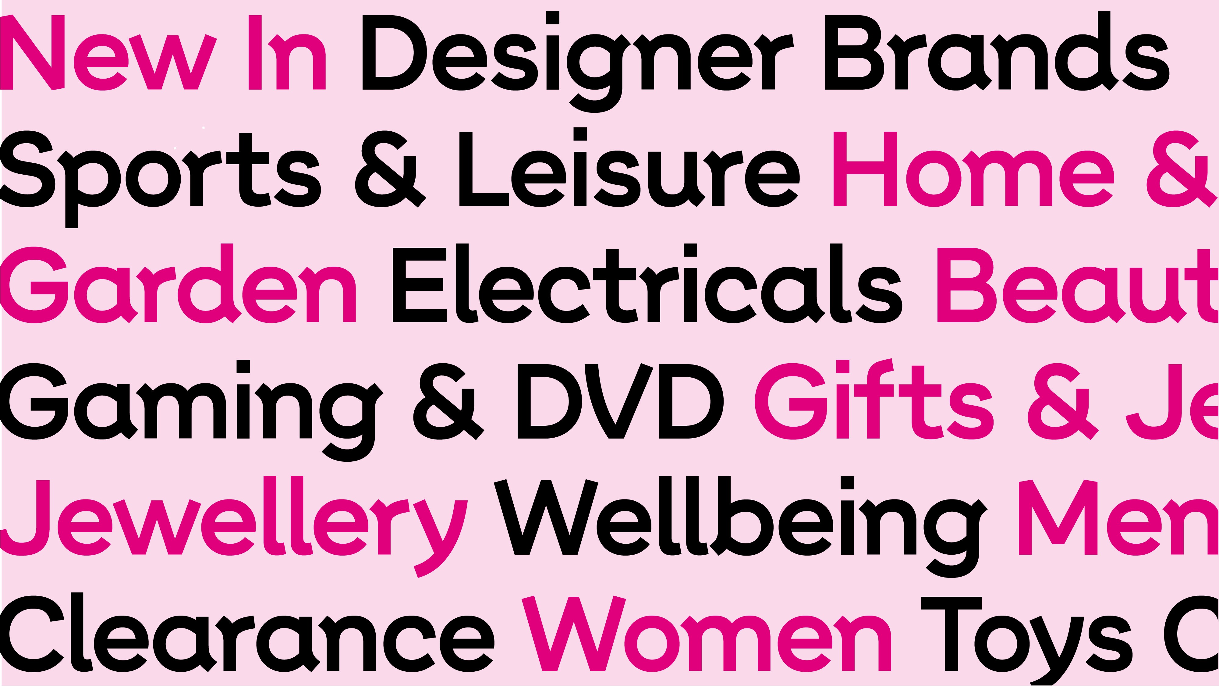
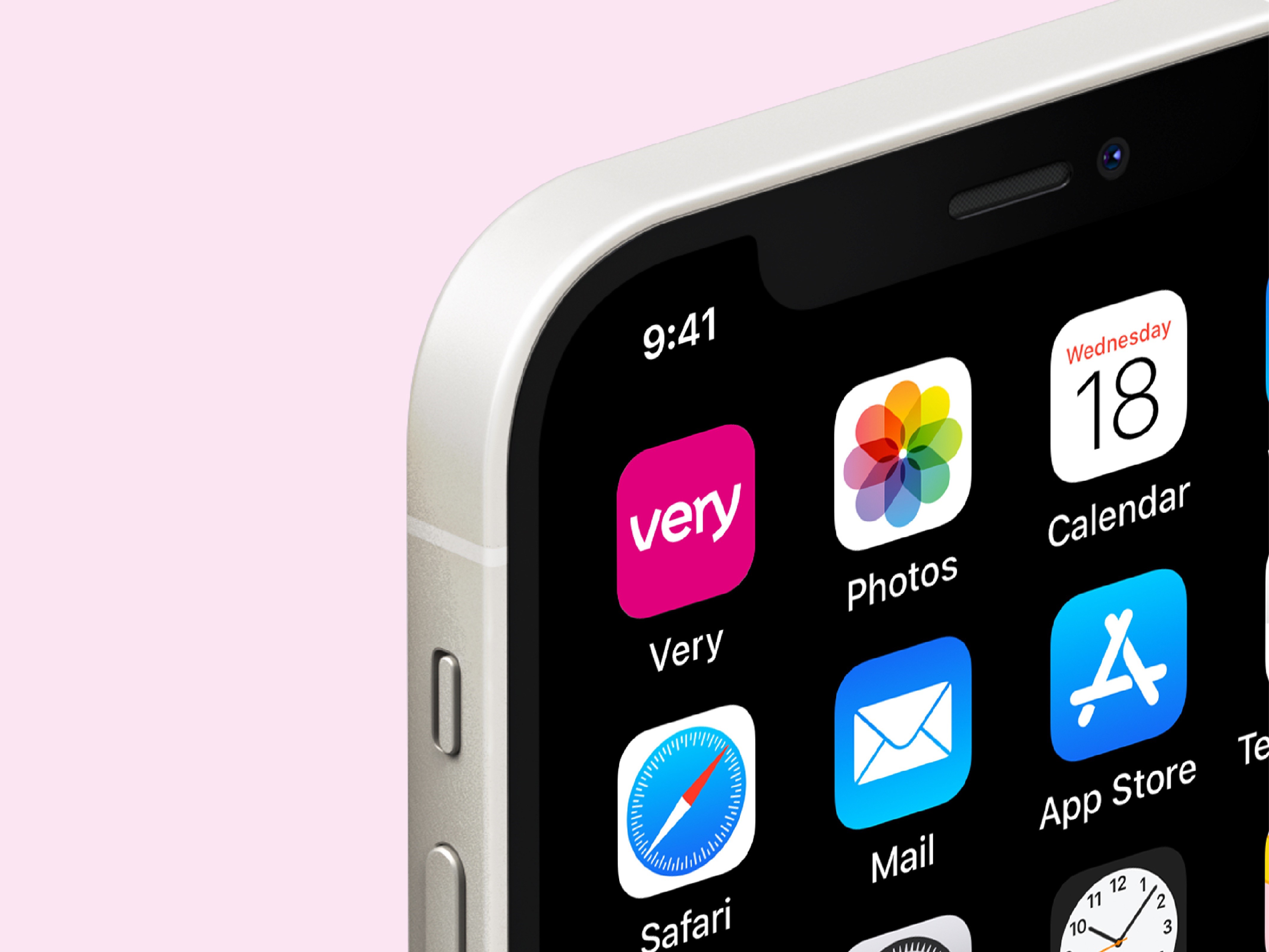
Despite the success of the old logo, a large part of this digitally focused rebrand relied on creating a new logo and typeface that was not tricky to read at small sizes. With 82% of Very’s sales coming from mobile, the functionality and accessibility had to improve to match the customer’s evolving purchasing behaviours. Additionally, the style of lettering had strong associations with female fashion.
The global agency’s collaboration with type foundry F37 resulted in the creation of a bespoke typeface, Very sans. Designed with the brand’s pink square at its heart, it utilises quirky letterforms to be distinctive and effective.
Ian Dawson, senior designer at Someone, says, “Using Very sans allowed us to appeal to a broader audience, feel more contemporary and ultimately speak in a more ownable voice.”
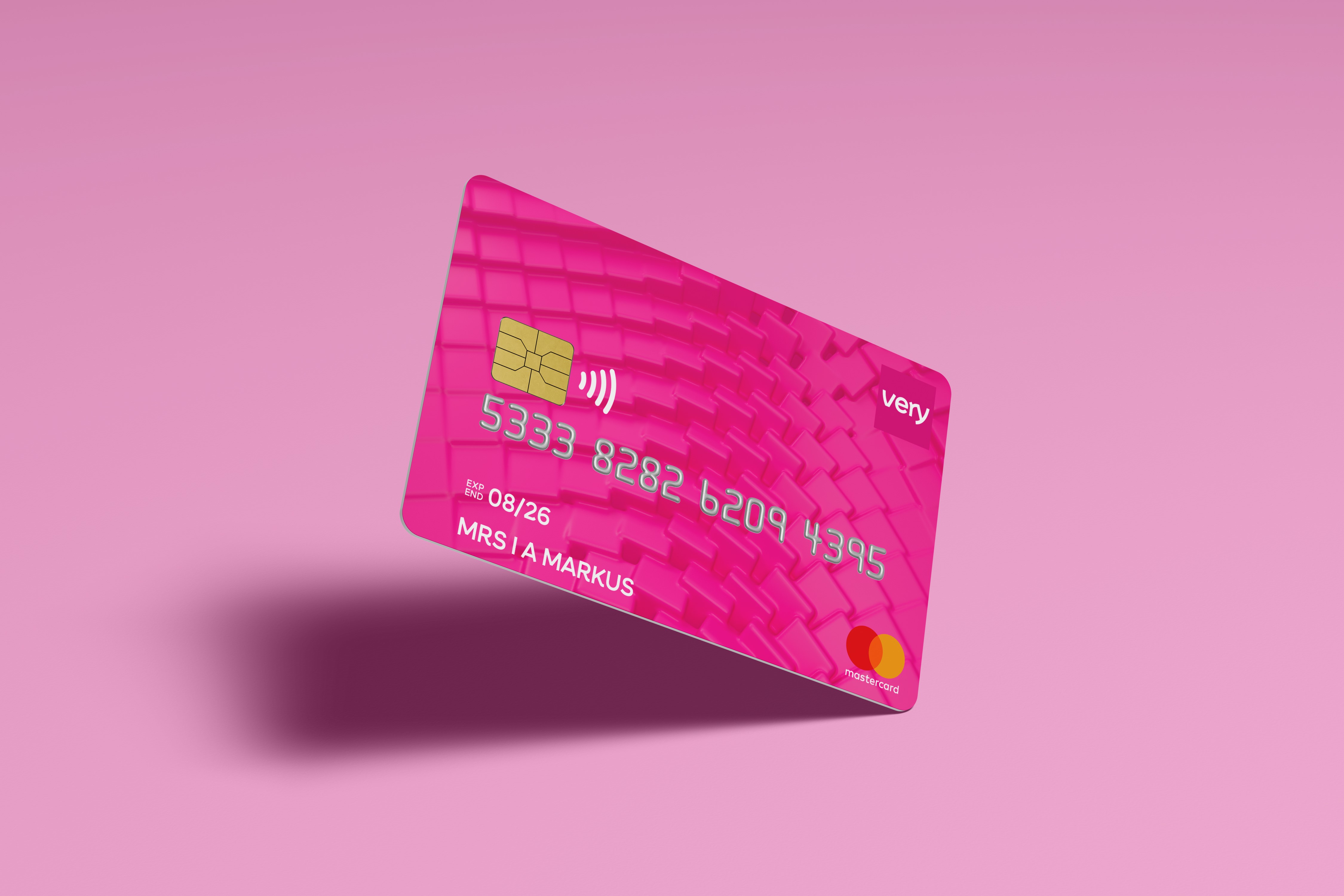
A suite of graphics was also designed by SomeOne in collaboration with WR17 which can be used by Very throughout its physical and digital touchpoints. Including the pink square, the graphics attempt to add more emotions and feelings to the brand’s online shopping experience.
While the pink used will continue to appeal to its female audience, a monochromatic palette was also designed by the agency to appeal to its more masculine audience.
Julie Phelan, head of creative at Very, says, “We’re at a moment of opportunity and expansion for The Very Group and with that we needed to build on the strength of the current brand, as well as be truly digitally focused. This enhanced visual identity sets us up for an exciting future ahead.”