Ragged Edge rebrands nutrition programme Zoe ahead of UK rollout
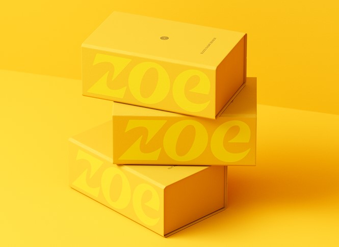
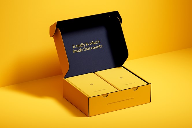
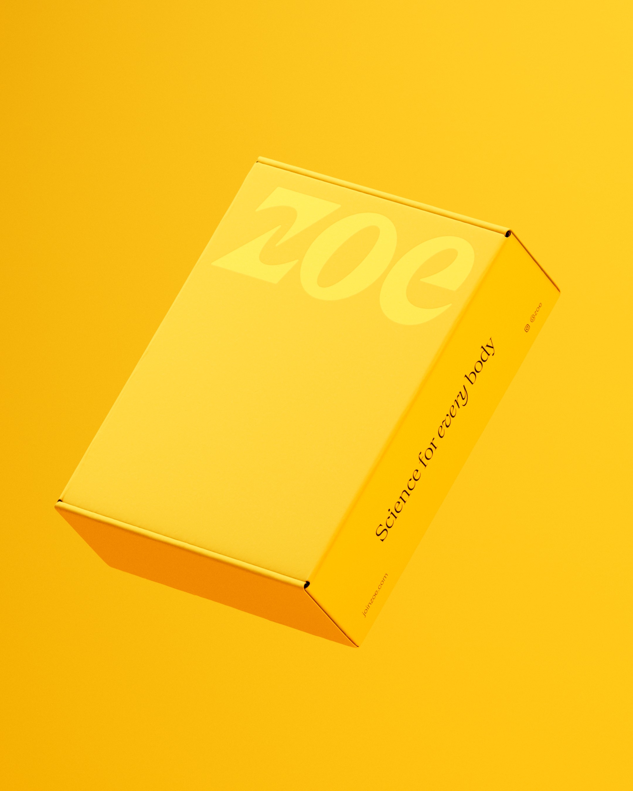
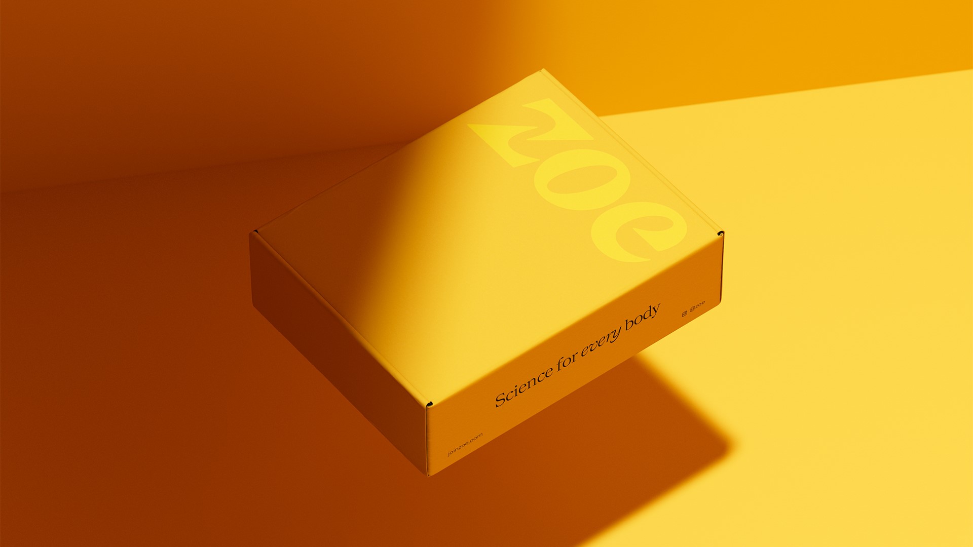
A refreshed visual identity by the London-based branding agency aimed to create a brand which fundamentally changes how we think about food. Ragged Edge updated Zoe’s logo and created bespoke packaging in this global rebrand.
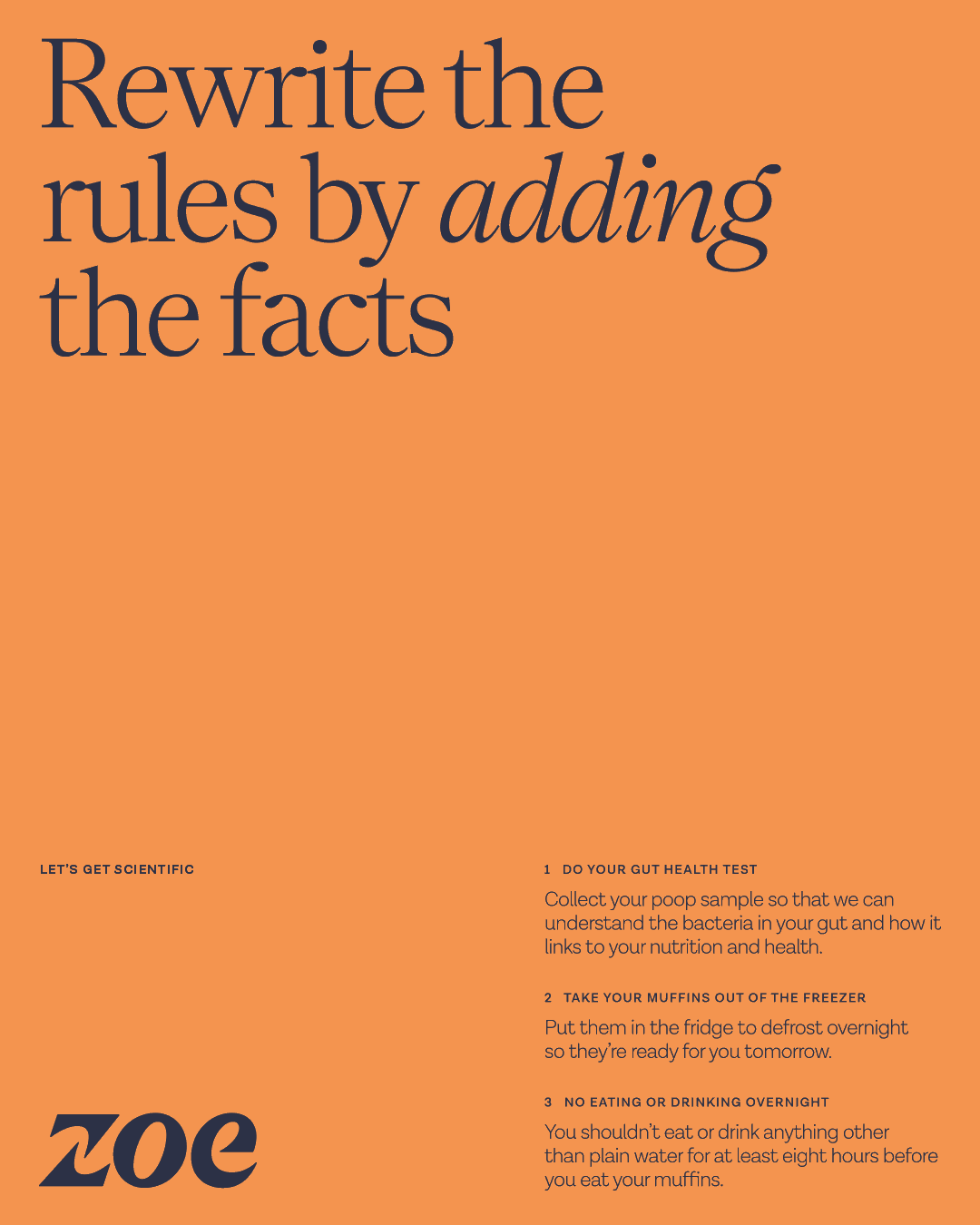
Zoe is a personalised nutrition company founded by leading epidemiologist Professor Tim Spector, and claims to be the most scientifically advanced nutrition programme in the world. Members complete at-house tests to help them understand how foods affect their bodies, the results of which can then be viewed in the Zoe app.
Ragged Edge’s role was to rethink the brand so Zoe would then have the tools to redefine an industry in which outdated thinking around calorie restrictions and fad diets still existed. The new Zoe identity is now defined by the idea of ‘Progression through personalisation’.
Max Ottignon, co-founder of Ragged Edge, says, “One-size-fits-all advice doesn’t work for everyone. That’s because your body is unique, which means how you eat should be, too. We needed to inspire an audience in search of answers who have been let down by pseudo-science and outdated advice. That meant surfacing Zoe’s game-changing science in a way that felt accessible and empathetic. The brand needed to invite people in.”
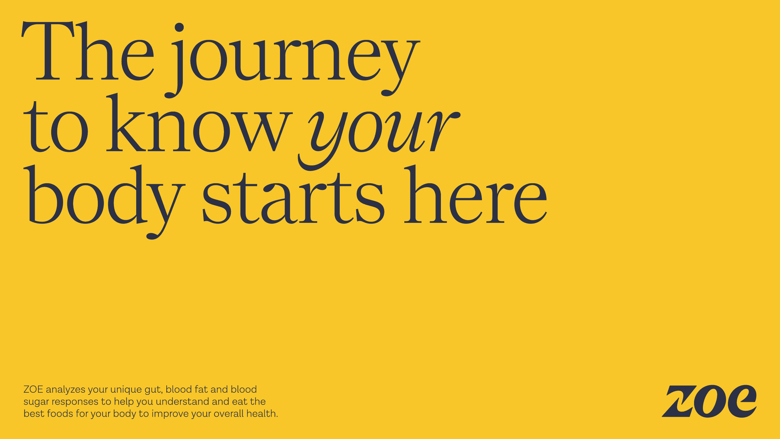
The new logo design and art direction sought to capture the idea of advancement, also represented through the introduction of bespoke packaging. Meanwhile, an adapted, light-hearted tone of voice tries to ground the brand in personalised science, using copy like ‘Advancing our understanding of every body’.

Ottignon adds, “At the heart of the identity sits a single idea – progress through personalisation – a direct contrast to the one-size-fits-all quick fixes of the category. It’s encapsulated in the negative space that flows through the ‘Z’ of the logotype, and in the data visualisation style and tone of voice grounded in personalised science.
“The identity’s scientific precision is balanced by an all-enveloping warmth, exaggerated by the art direction, the bold use of yellow, and a joyful unboxing experience.”