New Toblerone brand identity not for squares

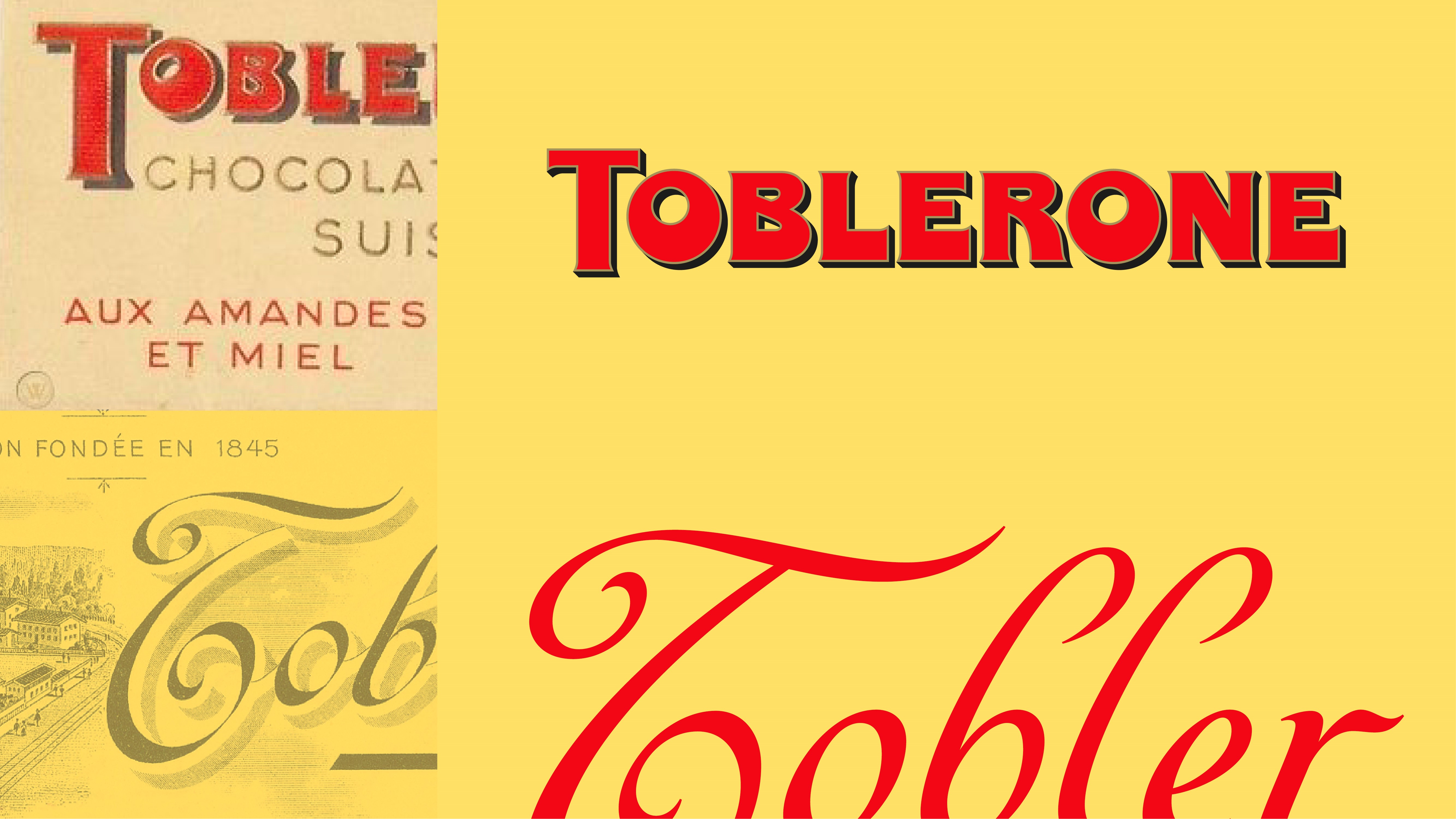
Global creative agency Bulletproof designed the new brand story and visual identity for the Mondelēz-owned brand to encourage uniqueness in all its forms. Paying tribute to the importance of being stubbornly triangle in a world of squares, the project involved work to the wordmark, typeface, and colour palette.
Much of the brand remains the same, such as the shape of the chocolate and packaging along with its iconic taste, but Bulletproof’s rebrand seeks to bring a new relevance and appeal to Toblerone fans through its creative execution and tone of voice. ‘Be More Triangle’ – the brand’s new call to action – informed much of the development of the Toblerone brand world.
Nick Rees, chief creative officer and partner at Bulletproof, says, “Theodor Tobler broke the mould in his time – when others were creating squares, hemmed in by the refinement and rules of Swiss chocolate production, he went off on a tangent. Delving into the archive and the founder’s story informed the new brand purpose. Toblerone champions the triangles: those who dare to be different, to be themselves, who have the courage to stand against conformity and unleash their ingenuity.
“Looking back into a brand’s archives usually uncovers a world of craft and lost nuance. But we uncovered something much more powerful. Mr. Tobler was way ahead of his time, an activist, a maverick and a true disruptor yet he never once took his eye from his driving ambition: to make high quality, deliciously surprising chocolate experiences.”
The design principles of ‘defined by our edges’, ‘strikingly different’ and ‘vibrantly positive’ heavily impacted all visual executions as well as supporting the brand world and digital communications.
The brand’s rejuvenated wordmark was inspired from Toblerone’s history, and sees bold quirks added like an off-centre counter in the ‘O’ and an unconventional thickness to the ‘E’. A modernised and streamlined mountain logo is also included while its famous hidden bear is retained.

Meanwhile, the new colour palette makes use of a more modern approach of ‘eye catching bursts of contrasting colour’, demonstrating a bold move away from the chamois and gold of the past.
Bulletproof also collaborated with Media Monks to create a new e-commerce website which moves the brand’s conventional online gift shop towards an unexpected user experience. The website will also focus on creating much more personalised products that make use of Toblerone’s new visual identity.
The new brand is set to be rolled out in full over the coming months.

For more Transform content, you can subscribe to our quarterly magazine here.


