London-based agency Fellow Studio creates brand and visual identity for Mahn House
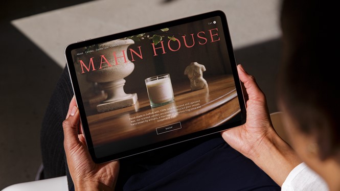

The premium candle company partnered with Fellow Studio, whose work was designed to show off Mahn House’s appreciation for traditional candle making methods. Creating a holistic brand identity which focused on the craft and raw materials used, the agency wanted the brand to stand out against mass-produced alternatives.
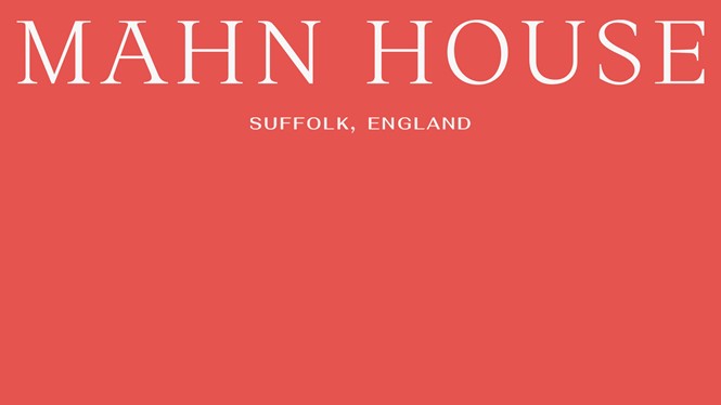
Fellow initially researched the brand’s heritage, noting the significance of its studio – located in the English county of Suffolk. Having once been a bed and breakfast, the studio was also home to the brand’s founder, adding to the heritage of the story Fellow tried to tell. The name ‘Mahn House’ was decided upon as a homage to the studio’s history.
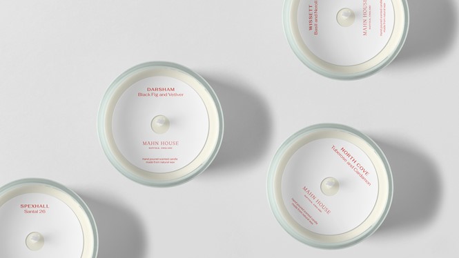
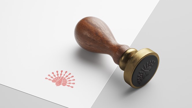
The typography of the brand’s new marque was settled on after the agency revisited old print collateral from Mahn House’s days as a bed and breakfast. By mixing visual characteristics from the original logo with a silhouette illustration style, which mimics the shadows of a flame, Mahn House had a distinct marque to represent their brand.
Wary of some of the ‘colder’ tones used amongst fellow luxury candle brands, Fellow opted to use a ‘striking’ red for Mahn House. The colour used was inspired by a sign left on the side of the old bed and breakfast by the building’s architect, adding to the sense of brand heritage.
For consistency purposes, Fellow tried to translate the warmth of Mahn House’s visual identity onto paper stock and production methods for the candle labels and boxes. Transitioning this to marketing, social and digital brand assets then followed.
Paul Crump, Fellow Studio’s co-founder and creative director, says, “It was great to work closely with the founder to design the visual identity for Mahn House. With the brand adopting the name of the founder's childhood home, it gave a rich heritage that we could draw upon – taking visual cues and inspiration from the original signage of the house from when it was a bed and breakfast to influence the candle brand’s logotype.”


