Fit for a queen
To mark Queen Margrethe II’s golden jubilee, the Royal House of Denmark and Wonderful Copenhagen commissioned Kontrapunkt to design a new logo that reflects and celebrates the monarch’s eclectic life. Elettra Scrivo reports
Colourful, flamboyant, glamorous, dazzling, stylish. These are not the first words that come to mind when thinking of a queen. Margrethe II, Queen of Denmark, however, fits this description well. There are few people as eclectic as the queen of the oldest European monarchy. Once described as an “unsung style heroine” by Vogue, Margrethe II’s identity extends far beyond that of the monarchy.
Before becoming the first female sovereign of Denmark since 1412, Margrethe II designed illustrations for the 1977 Danish edition of The Lord of the Rings under the pseudonym Ingahild Grathmer. Since becoming queen she has fulfilled her royal duties alongside being a professional artist, illustrator, production designer, and costume and set designer.
To celebrate her Golden Jubilee, the Royal House of Denmark wanted a visual style that would encapsulate the character of its unique leader. Bo Linnemann, founding partner of brand design agency, Kontrapunkt, took inspiration from Queen Margrethe II’s personality to develop the digital-first Golden Jubilee logo. The new wordmark, in fact, designed to celebrate the 50th anniversary of the queen’s ascension to the throne in January, had to combine the queen’s status with her artistic nature.
“When was I first commissioned to develop the logo, I couldn't help but consider the language that the Queen uses in her own work, which is very lively and organic. She’s not a typical Danish artist who heroes minimalism. She is expressive in everything she does,” says Linnemann.
The queen’s florid style doesn’t stop at her artwork. She resides in the Amalienborg Palace, one of the most striking examples of rococo architecture in Copenhagen and spends her spring and autumn holidays in the Fredensborg Palace, which was built using the Dutch baroque style.
The rococo style was a great source of insight for the design of certain elements within the jubilee logo, Linnemann says. The bespoke typography, for example, was inspired by the acanthus leaf, an ancient Greek architectural design element first used in Corinthian columns, and other rococo details found in both palaces. The outline of the leaf is clearly visible on the stems of the letter M, which, together with the crown, makes up the core of the logo.
“She is a bit abstract in how she creates her art and conducts her job, and I hope this is expressed in the logo. The visual identity, particularly having the number 50 at the centre of the logo, aims to reflect the queen’s modernity and tap into her creativity"
“The whole project for me began with the idea of creating a bespoke typography for the queen. The font was designed with the shapes and forms of the queen’s work in mind,” Linnemann says. Every detail, from the typography to the colour palette, was also designed to be an ode to the queen and her artistic side. The typeface looks as if it was painted in steady brushstrokes, reflecting the heritage of the crown. However, its use across digital applications has ensured its contemporaneity and readability. The colour palette is comprised of the four colours – blue, hot pink, orange and green – the queen uses most in her artwork and personal style. While monochromatic, the palette allows for flexibility, as the colours can be alternated to create different logos, each with its own festive appeal.
The rich colour palette is not only reflective of the queen’s art, but also of her modernity and progressiveness. The bright colours, most of them edging on the flashy side, almost have a pop-art feel to them and would not be associated with an 81-year-old monarch at first glance. However, the Queen of Denmark, who Linnemann describes as an “extremely remarkable person,” is different from other monarchs because she is, first and foremost, an artist. “She is a bit abstract in how she creates her art and conducts her job, and I hope this is expressed in the logo. The visual identity, particularly having the number 50 at the centre of the logo, aims to reflect the queen’s modernity and tap into her creativity,” Linnemann says.
Christian V’s crown, found at the very top of the logo like a ‘cherry on a cake,’ was also redesigned to fit into the modern logo. Initially dating back to 1671, the crown was refreshed to appear more contemporary, transparent and legible. “All the elements in the logo are harmonised. The royal crown was created to fit with the type design and lettering so it’s bespoke and customised for the queen,” Linnemann adds.
Given its flexible sizing, the new crown can be used in everything from small stationary and large flags to digital platforms, making it fit for the modern era. The logo as a whole was developed to be digital-first, with an animated version complementing the static one. It eliminates the restrictive guidelines typical of these projects, and it is free to use, allowing anyone to download it for use in shops, TV programmes or magazines.
“There are only three different formats and versions of the Golden Jubilee logo. We’ve done this purposefully because people should use it the way they think is appropriate for their needs. It's almost bulletproof in the way it’s been thought out,” Linnemann says.
The logo’s easy application and accessibility, which makes it seem as if it was made for the people, rather than for the queen herself, was a deliberate decision. It is deeply reflective of the monarch’s close relationship with the Danish population. The perception of the royals in Denmark is different than in other constitutional monarchies, including the UK, Linnemann says, “There is a very small gap between the power of state and the citizens here. The queen is almost everyone’s friend, and I felt the logo should, above all, reflect that. It needed to be festive and dignified but also unceremonious and not too majestic to represent the flat Danish hierarchy.”
The design style has been so effective, it was adapted to celebrate Mary, the Crown Princess of Denmark’s 50th birthday as well. The adapted crown is present at the top of the logo, linking it to Queen Margrethe’s jubilee badge. The crown princess’ name takes pride of place above the ‘50' numeral. The subtle changes indicate the nature of Crown Princess Mary herself, while still retaining a similar style and formatting to align it with the queen’s jubilee logo.
To celebrate the Golden Jubilee, a series of events have been planned including art exhibitions, a celebration at the Tivoli Concert Hall, a commemoration of past monarchs, a public reception, galas and more. Though some events have been postponed due to Covid-19, 2022 will prove to be a celebration of the Royal House of Denmark’s connection with its people and with the country itself.
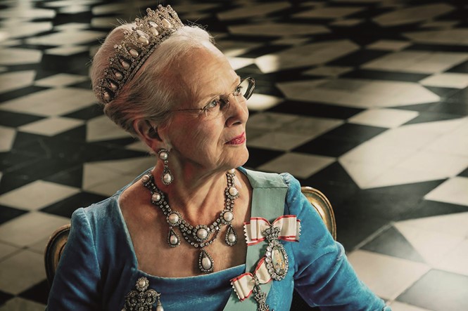
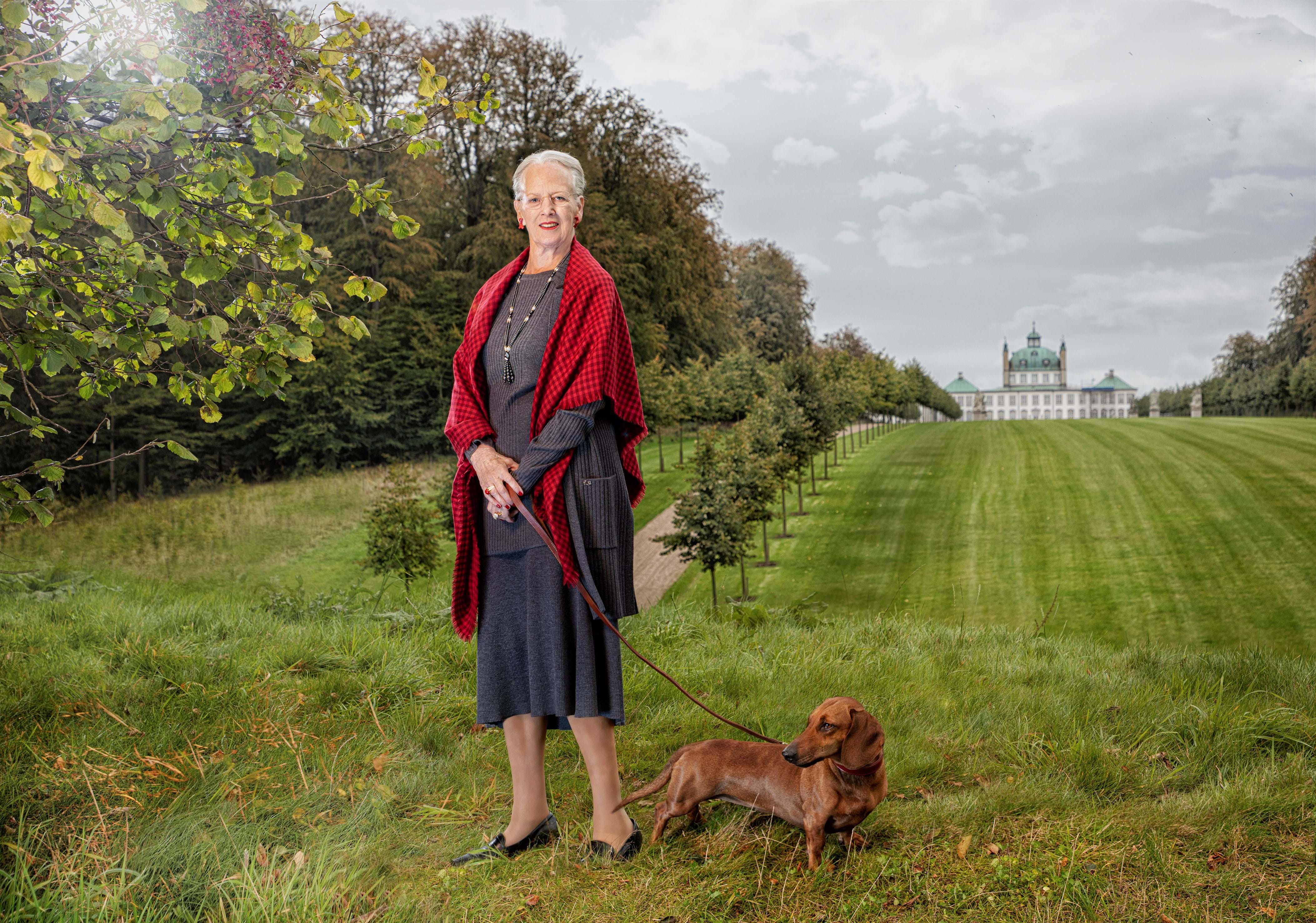
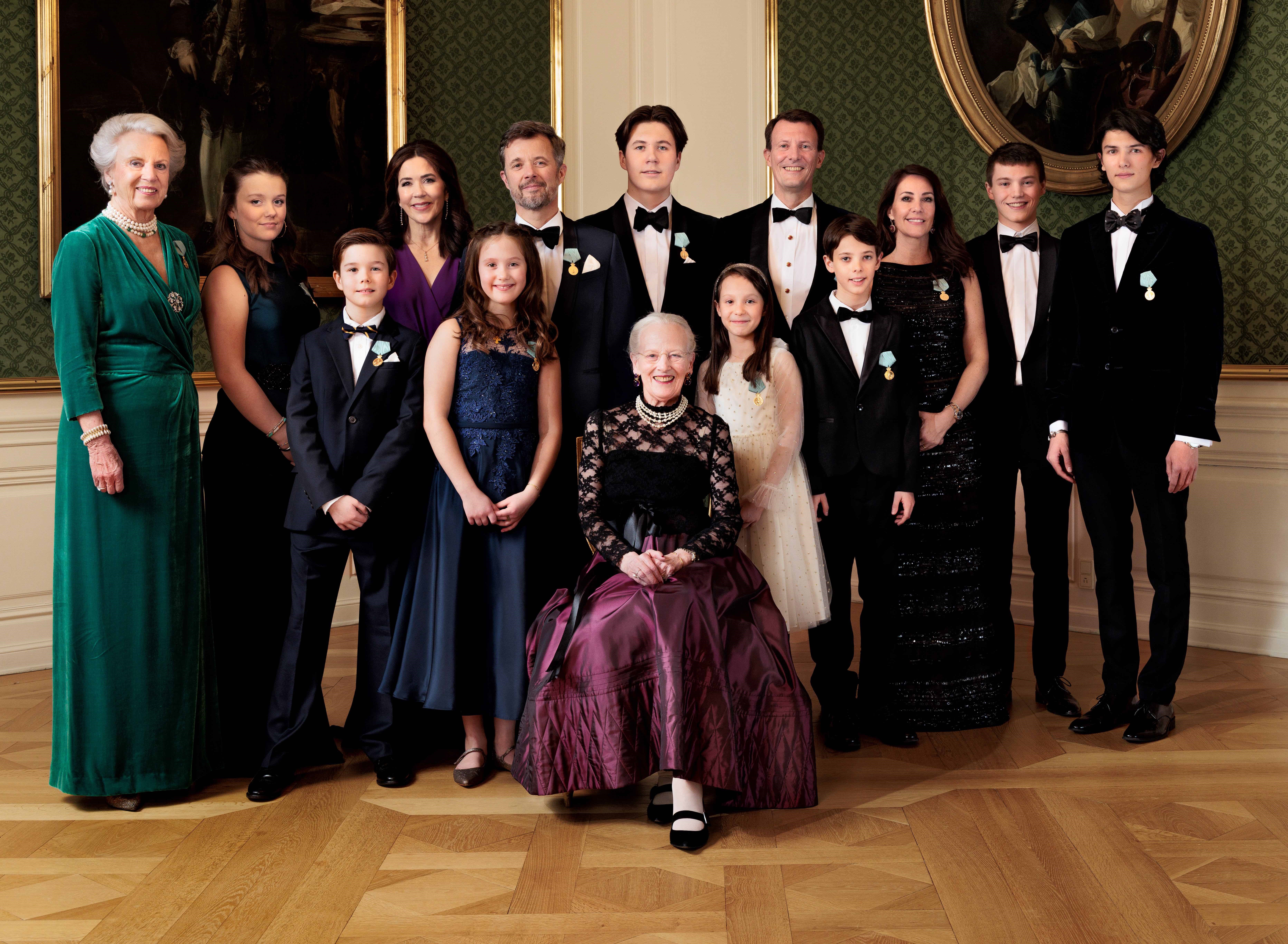
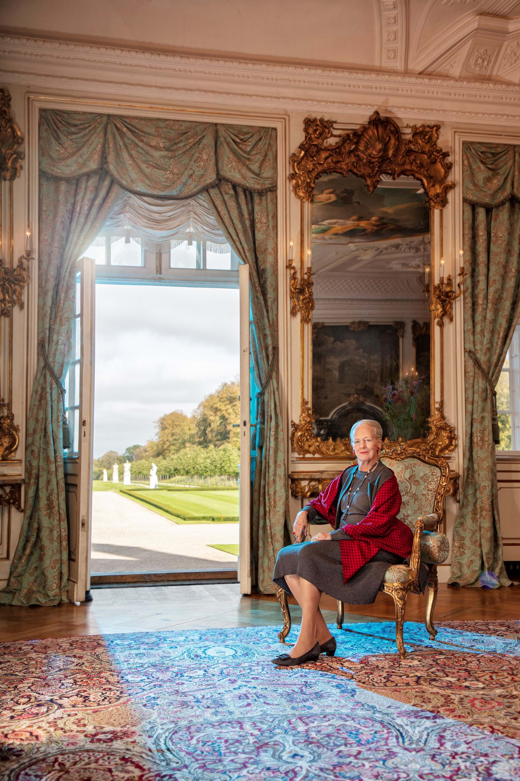
The jubilee logo is supported by a series of official portraits of the queen, which capture her at home and surrounded by family and pets. The portraits are warm and friendly, aligning well with the modern typeface and brand design by Kontrapunkt.
The logo, simple and accessible, yet colourful and artistic, is an all-round portrayal of the queen’s multi-faceted identity. Whilst it celebrates the queen as one of the most loved monarchs in Denmark’s history, the logo also epitomises Queen Margrethe II’s artistic, progressive and creative side. By combining bright colours, a baroque-inspired typeface and a contemporary crown, Linnemann was able to pay tribute not only to the queen’s 50-year reign, but also to the artist that lives within her.


