Fellow Studio designs goodcarbon Capital’s identity
Goodcarbon Capital (GCC) develops and provides investment solutions for large-scale, environmentally friendly projects around the world. London-based branding agency Fellow Studio sought to breathe new life into the financial sector by demonstrating the company’s focus on humans and the planet.
Fellow was relieved in the research phase to realise GCC has a positive outlook, with the company having adopted more of a ‘doer’ than a ‘thinker’ mentality. The identity Fellow pursued was a premium feel which attempted to strike a balance between ‘financial vehicle’ and ‘conscious entity’. The digital elements would also need to demonstrate the company’s tech foundation.
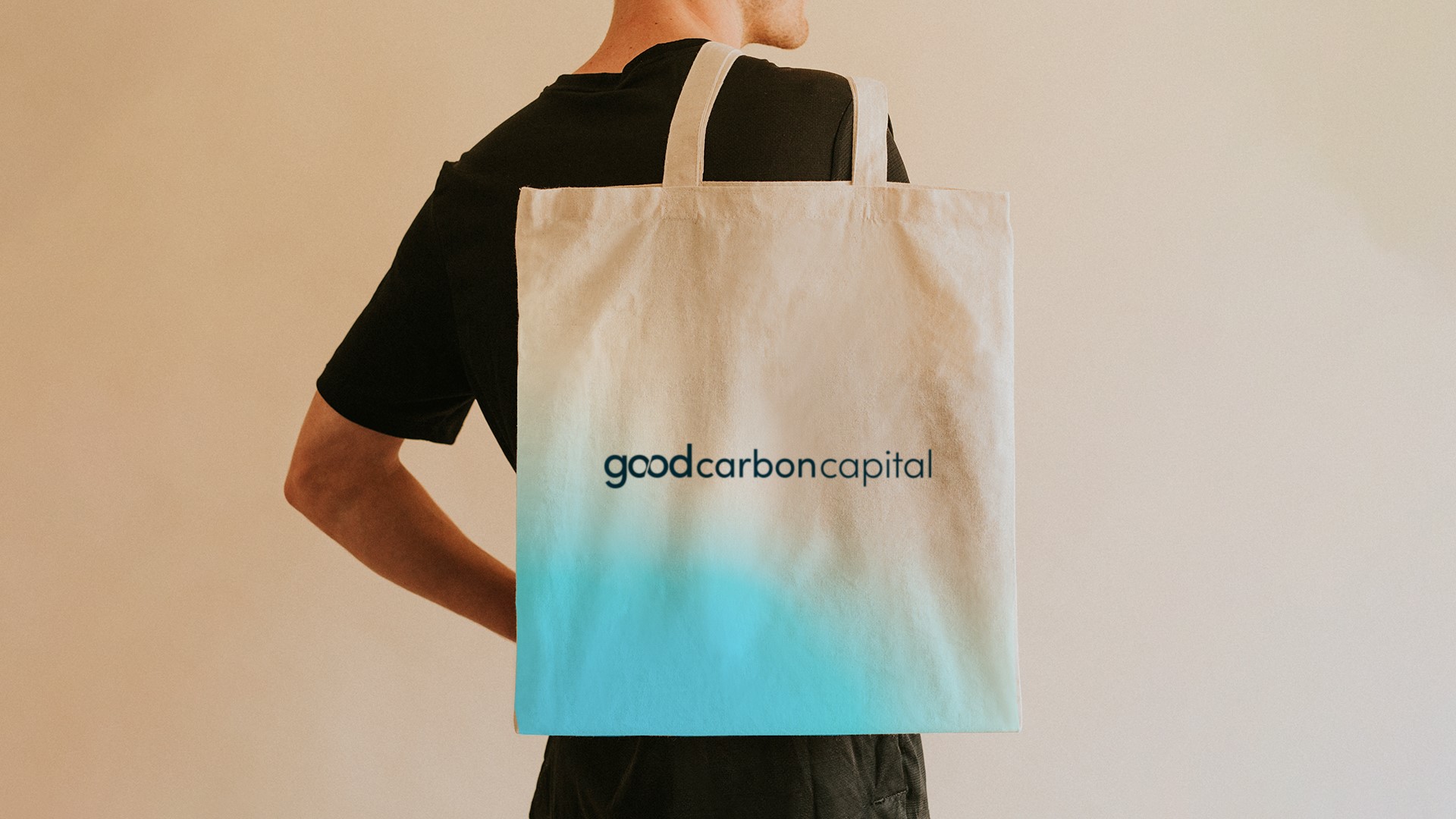
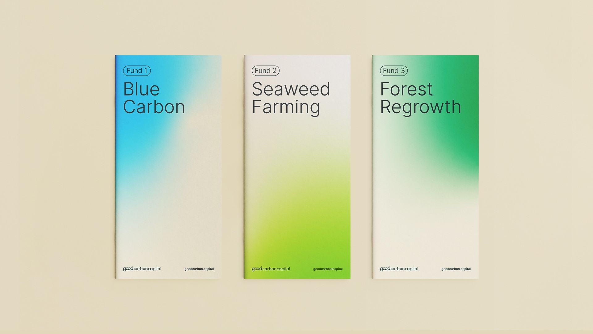
A central concept of ‘Connected Components’ was settled on by Fellow in which ‘button-style’ graphics were utilised. Meanwhile, gradients were also used to demonstrate the connection between nature’s interconnectivity and the web of transactions GCC facilitates.
Paul Crump, co-founder and creative director at Fellow, says, “Goodcarbon Capital is a global financing solution for climate impact. They help high-impact Natural Climate Solutions to scale, by providing access to sustainable investors. The new brand identity enabled the brand to be seen as more human and breathe life into the financial sector. Positioning goodcarbon Capital within the sustainability space, whilst avoiding cliché tropes, this brand matches the innovative mindset of the business–cutting through the clutter of venture capital.”
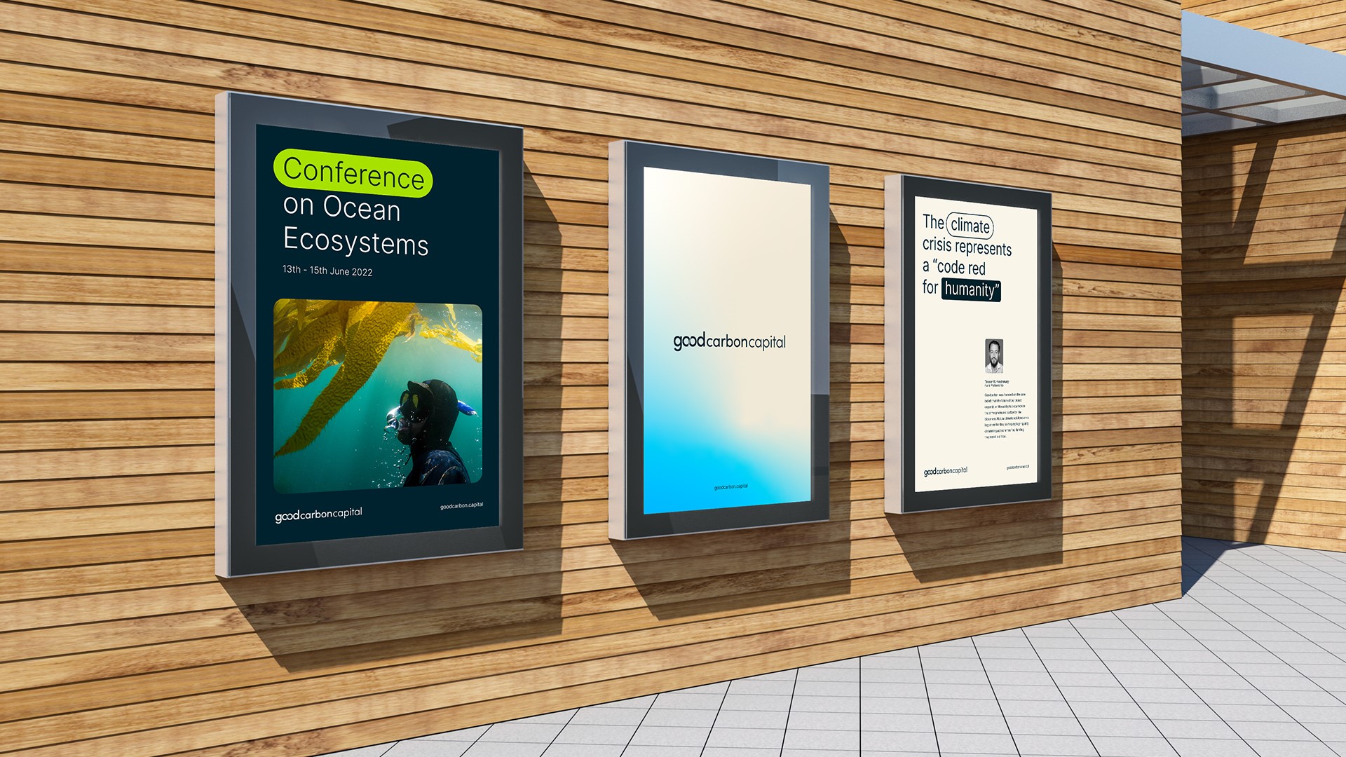
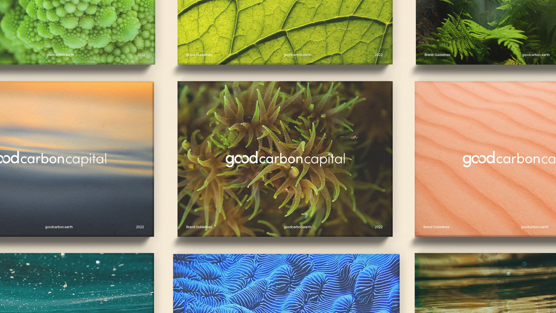
With sustainability deeply embedded within GCC, the agency used colour and photography to represent this theme. The scaling of photography, from showing off macro areas of landscapes and human action to micro details of natural textures, allows sustainability to be signposted. The predominantly blue colour palette (a nod to the brand’s Blue Carbon initiatives) was initially comprised just of natural colours before Fellow adjusted it to add greater vibrancy and vitality, thus making it more tech appropriate.
Crump adds, “To navigate the tonal balance, we combined two sectors that have strong colour associations to work harmoniously, introducing a vibrancy that relates to the tech sector whilst remaining natural in the base tones. We provided a modern aesthetic for the brand that has character and personality. With the brand supporting ocean and land initiatives, it was important that the photography visually represented the sustainable funds and their actions, highlighting the good that is being achieved.”
Fellow, who was also responsible for then rolling out the key marketing and communication collateral, additionally supported GCC by producing messaging and writing guidance in an attempt to ensure its brand launch is human and relatable across all visual and verbal communication.