Design agency Fellow creates brand for language learning app
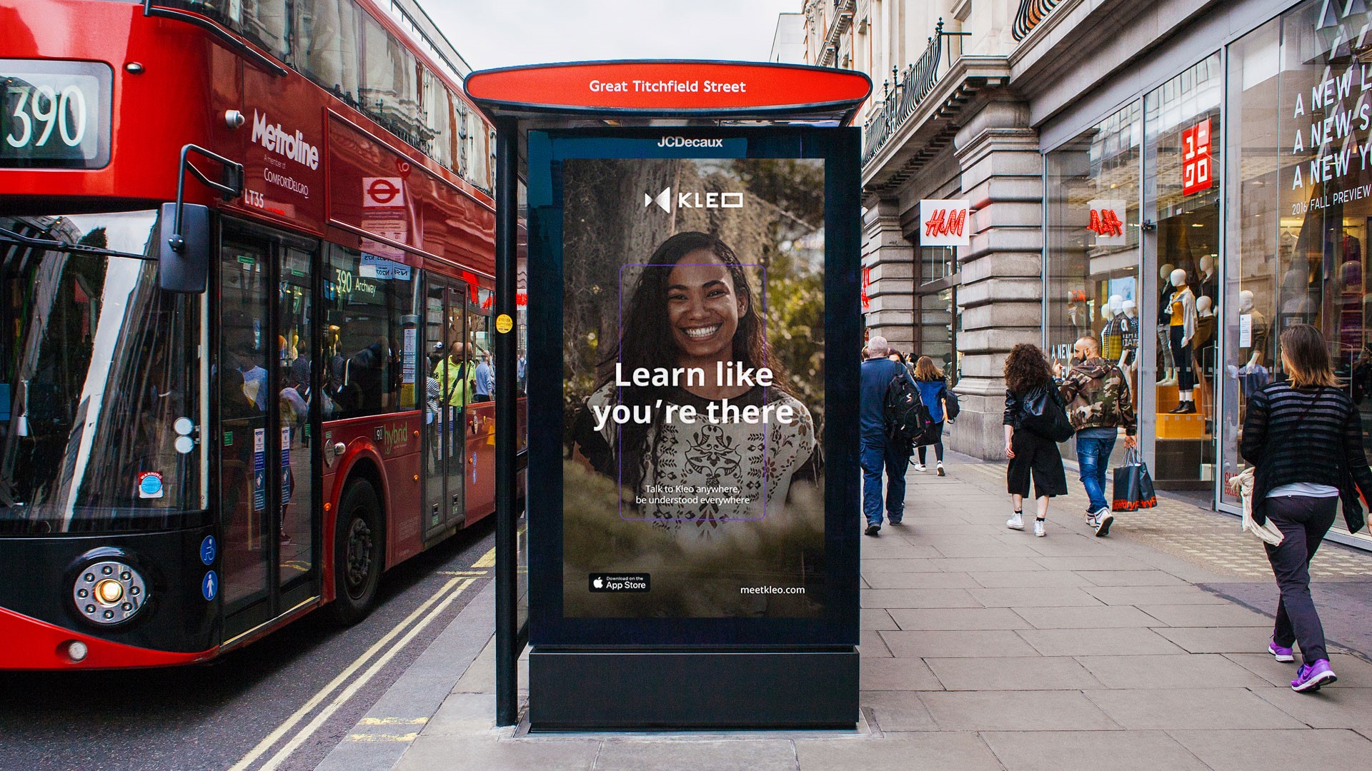
Recognising the crowded nature of the language learning services market, London-based Fellow attempted to create a brand identity which was compelling and inspired audiences to ‘be anywhere.’ The design agency imagined the visual identity, along with determining the colour palette, typography and social media assets.
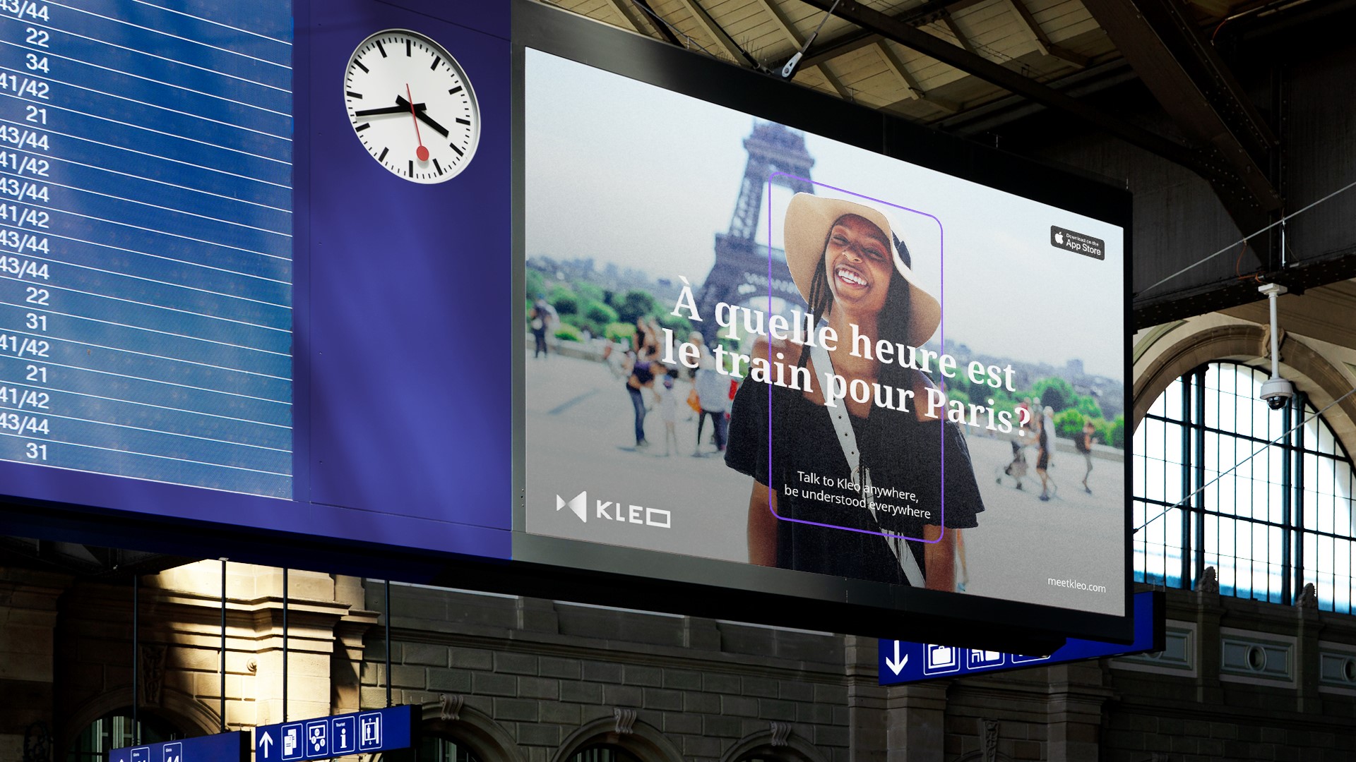
Initial research conducted by Kleo indicated one of the reasons its audience – mainly a mixture of males and females aged between 25-44 – would choose to learn a new language is because they want to have the skills to speak to locals when travelling. The agency’s strategy was based around immersion, ensuring users could feel like a local when using the app.
Fellow therefore utilised the ‘portal’ concept – the idea of transporting the app’s users to the country of the language they wished to learn – by creating a strong and consistent visual language.
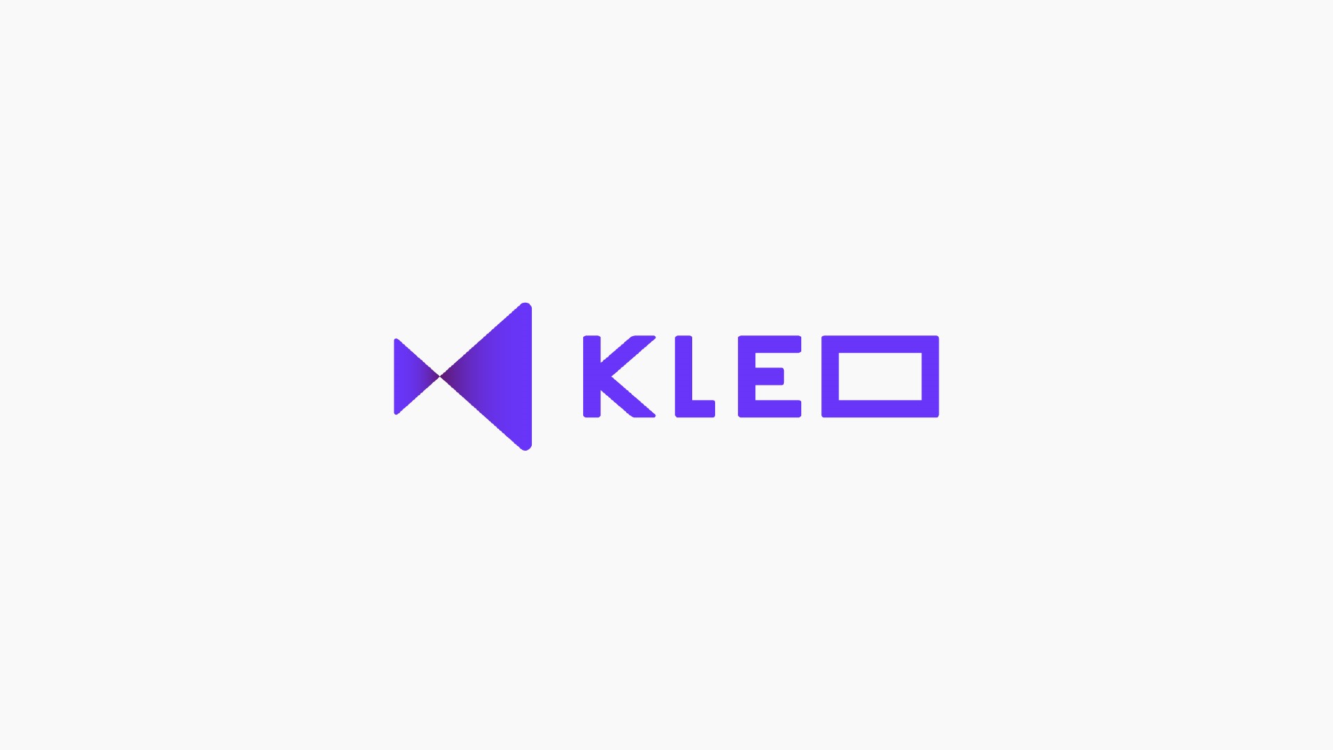
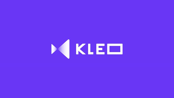
As it was not a colour utilised by direct competitors, Fellow opted to use purple as the brand’s primary colour. Seeking originality and ownership, the agency believed the decision opened up the possibility of the brand being associated with a sense of intelligence and expertise, while retaining warmth. A secondary colour palette is also utilised in the app to indicate the performance level of the user.
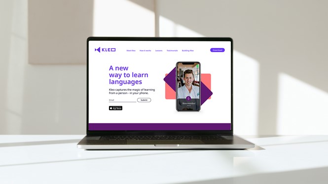
A sans and a serif font are used throughout Kleo’s app user experience respectively to indicate the English term and its translations. The fonts are also retained for the company’s marketing communications.

Paul Cramp, co-founder and creative director at Fellow, says, "Being that Kleo is an e-learning language app, we had to make sure that the fonts used had the ability to accommodate for the brand's future growth. This led to choosing Noto, a font collection that is perfect for global communication with up to 1000 languages and over 150 writing systems. We utilised both sans-serif and serif to highlight the conversation between the expert and the learner, making it easier for the user to understand when engaging with the product’s interface."
With the heart of the brand experience centred on learning through real-life video conversations, the logo takes cues from camera iconography, along with the letter ‘K’ in Kleo. Fellow’s simple and functional iconography design was drawn in a 3D perspective. Keeping with portal concept, this allows the user to feel as if they are transported to another country.
The Kleo app is currently in Beta and available for download in the Apple store. More can be found about the project at fellowstudio.com.