Contino rebrands NYC restaurant Yankee Doodle Dandy’s amid political polarisation
Adding to their three food trucks operating on the streets of New York, the all-American brand opened its first restaurant. Against a backdrop of political divisions in recent years, Contino designed the new brand identity, as well as the restaurant’s space.
Yankee Doodle Dandy’s identity was characterised by its patriotic visuals and chicken tenders. The brand believed that in order to grow it had to shed some of its ‘kitschy, throwback, Americana’ characteristics while also being sensitive to new, negative connotations of the American flag.
There was even the possibility that the brand’s name and aesthetics would be completely amended. This idea was subsequently scrapped after considerations were made of the strong brand equity, which had been accumulating since the business began in 2013.
The brand had experienced large growth following its most recent project with Contino in 2016. The agency was tasked back then with redesigning Yankee Doodle Dandy’s sole truck, but on this occasion the ambition of restaurant owner Josh Gatewood was to transition the chicken brand to bricks and mortar.

Jon Contino, founder and CCO of the New York-based agency, says, “The initial idea was just to apply the food truck designs to the new location, but that swiftly turned into a wider brand refresh.
“The original truck wrap design was very gritty and illustrative, and it didn’t feel right, especially not if we wanted Yankee Doodle Dandy’s to compete with similar businesses. In order to grow the brand and give it legs for the future, we needed to simplify and allow the product to take centre stage.”
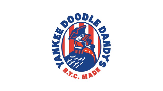
Contino’s reimagining of the marque includes retaining mascot General George Cluckington (a steely looking chicken who dons an old-fashioned general’s outfit) front and centre.
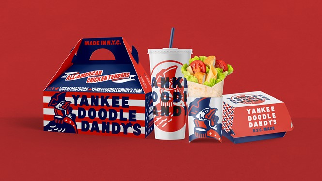
The American flag, which features in the background, has had its stars removed. This leaves a simpler design of purely red and white stripes. Additionally, the tagline ‘Life, liberty and the pursuit of chicken’ is gone, with the phrase ‘N.Y.C made’ taking greater prominence.
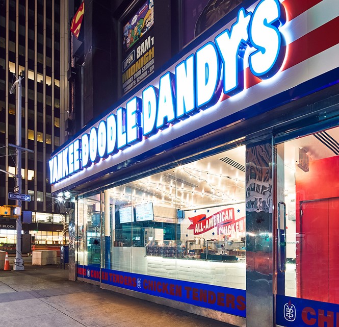
Adjustments to the packaging and collateral designs include a simplified, bolder typography. With Contino also designing signage and murals for the restaurant space, this update aims to increase legibility.

Contino explains, “The need to stand out was a big factor in how we conceptualised the space with huge lighted signage, uninterrupted glass windows and an added canopy of twinkling lights on the restaurant’s entire ceiling.
“We wanted to bring that backyard BBQ, food truck community vibe to the space, making sure everyone felt welcome, while still giving customers a bit of an elevated experience. And because of the pandemic, we also allowed for social distancing and a frictionless experience that let customers move in and out pretty freely.”


