Clean, green branding machine

There has been a renewables revolution brewing over the past 20 years. You won’t hear the words ‘oil’ or ‘gas’ anymore as fossil fuel firms have repositioned themselves as the leading players in the energy sector. But how do brand agencies communicate these ideas across to the public? Jack Cousins investigates
The energy industry’s relation with its brand is often different to other sectors. The stakes are high and public trust is substantially lower, so the reputation of oil firms and their creative agencies can be on the line. Take the infamous rebranding of BP, for instance.
At the beginning of the millennium, Landor undertook one of the most ambitious projects in branding history. BP is believed to have forked out as much as $7m in research alone, giving the agency ample resources to take the company in a new, progressive direction.
Dumping the recognisable shield design, which had been used in various guises since 1930, Landor completely refreshed the logo with a Greek god-inspired ‘Helios’ symbol to represent the new and dynamic energy embedded in the firm. The underlying philosophy was made clear with the new name: to take British Petroleum beyond petroleum.
However, after an initial increase in global retail sales, BP changed its focus. A couple of record oil spills later in Alaska and the Gulf of Mexico, a new CEO with a new corporate strategy and the shutting down of its London-based alternative energy headquarters meant the once-promising rebrand was in tatters. No evidence of the ambitious project exists on Landor & Fitch’s website, with the focus instead being on its client’s latest green pledge of operating ‘For people and the planet’.
Perhaps the agency had been let down by BP’s inability to meet the vision that had been so meticulously curated. While this story serves as a cautionary tale for agencies willing to work with the energy industry, it must also be recognised that times have changed. Energy companies have set themselves more realistic targets and government action has become stronger in some countries.
One of those countries is France, home to the headquarters of recently rebranded multinational energy company TotalEnergies. New laws introduced in April this year mean companies accused of supplying misleading information about sustainability, otherwise known as ‘greenwashing’, may be fined up to 80% of the false promotional campaign cost. The disincentives for energy sector companies not following through on environmental promises have never been greater.
Total’s project with Paris-based agency Carré Noir possessed all the characteristics of a rebrand that had the potential to be a greenwash. From the outside this was a huge multinational energy company which had predominantly traded in petroleum its entire history and, in the past few years, had felt a sudden change of heart before beginning to invest in renewable energies. But Reza Bassiri, vice president and chief creative director at the global agency, saw something different.
Carré Noir holds certain values when it comes to choosing clients. The cigarette industry and the weapon industry are unequivocally ignored, yet Bassiri regards the energy industry as necessary and is therefore willing to help improve it. He says, “If they come to us and say, ‘We’ve got a mission on this planet, we want people to understand that we can help them and we can do [energy production] in better ways. Can you help us with that?’ The answer, of course, is yes.”
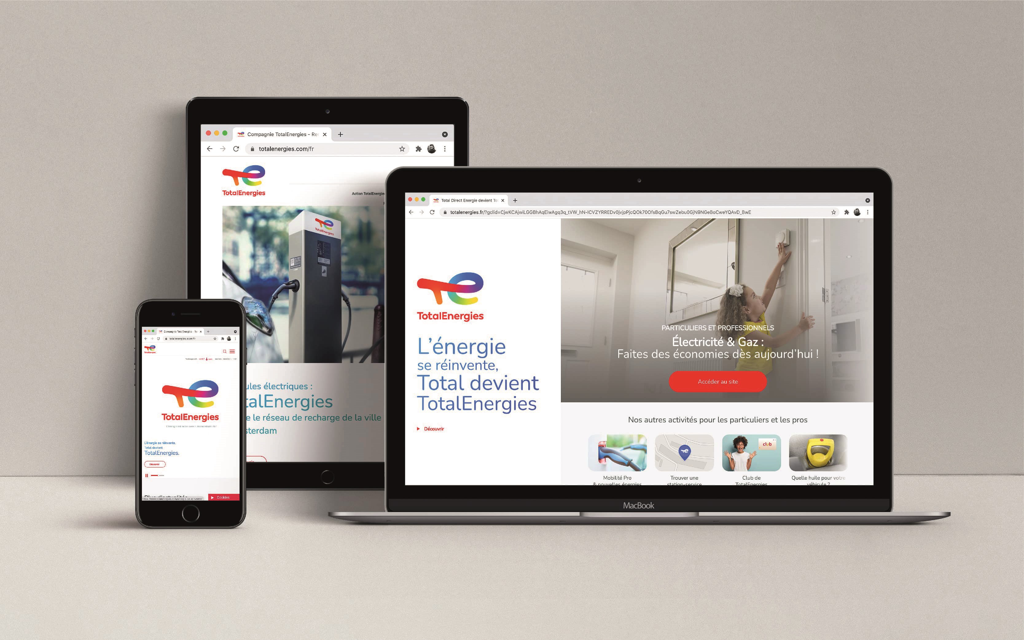

Impressed by the vision of CEO Patrick Pouyanné, Bassiri’s agency concluded Total’s commitment to a long-term project of progressing from petrol-only to a diversified portfolio of energies was genuine. Backed up by French law, newly named TotalEnergies’ goal is to rank among the top five global producers of solar and wind-generated electricity by 2030, and to become carbon net zero by 2050.
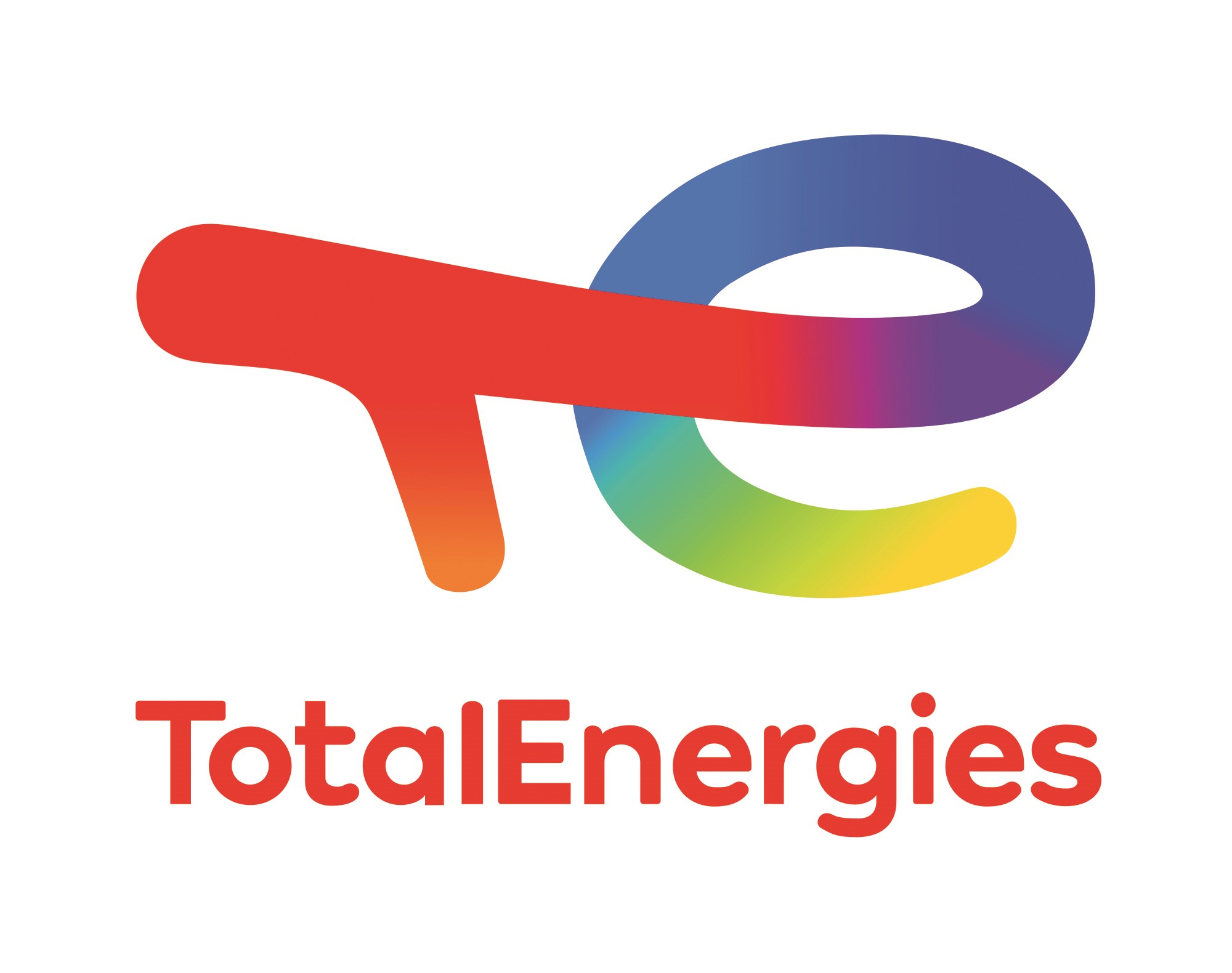
For Bassiri, an audacious change at Total required an audacious rebrand. Generating a one-name brand, TotalEnergies, was an important creative decision because it informed the public that many energies are intertwined with the contemporary Total. The new logo extended this theme further with the colourful combination of all its seven energy sources, starting from red (petrol) in the ‘T’ and winding fluidly across the ‘E’ into yellow (solar). The logo depicts a visual progression which the company hopes to match over time.

“We're positive thinkers,” adds Bassiri, “and we can only hope TotalEnergies will take the future in its hands. They've been investing more on sustainable solutions than any other competitor, so that's something they need the world to know. There's pride in this company but, at the same time, people are looking at it in a very suspicious way.”
These suspicions extend beyond the western world, with the Indian energy industry being no different. Landor & Fitch India was able to receive ample evidence from CLP India that it was committed to environmentally friendly energy production, even before the rebranding project began.
Manil Dodani, business and marketing director at Landor & Fitch India, says, “We had seen that the solar and wind farms existed. While we were pitching for the project, they finished up two more deals to acquire solar and wind farms, so we knew it was obviously a serious investment.”
Part of Dodani’s respect for CLP India is derived from its honesty about not targeting net zero. The company, buoyed by new financing from Canadian investment group CDPQ, sought a new, greener direction while also keeping its supercritical coal-fired power plant in the northern state of Haryana operating. The transparency of CLP India’s energy portfolio would inform much of the agency’s work, as would the idea of diversity.
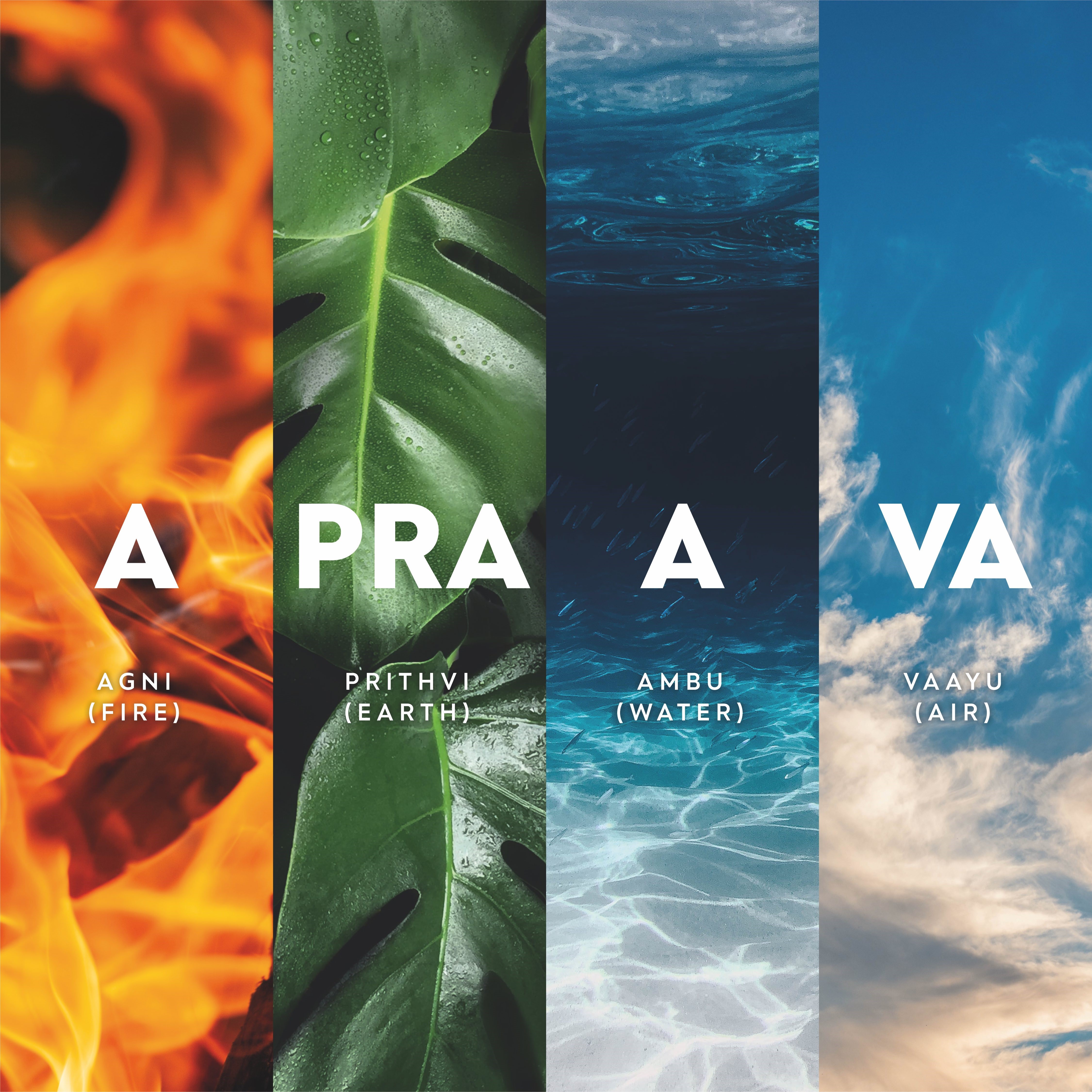
The unusual Sanskrit-rooted name describes all four areas of the company’s energy production. Agni (fire), prithvi (earth), ambu (water), and vaayu (air) merged together to form ‘Apraava Energy’, representing a radical shift from its corporate-sounding predecessor. A linguistic check later and the name was found to be easily pronounceable across different cultures.
The greatest risk in the project, however, was opening up Apraava’s bonnet for the whole world to see. Questioning whether an energy company’s visual language should be static, Landor & Fitch India’s creative director, Arnab Ray, was responsible for constructing the ‘generative design system’. With the help of a creative coder, Ray broke rank amongst competitors by imagining an algorithm that combines real-time data from the firm’s plants with weather data.

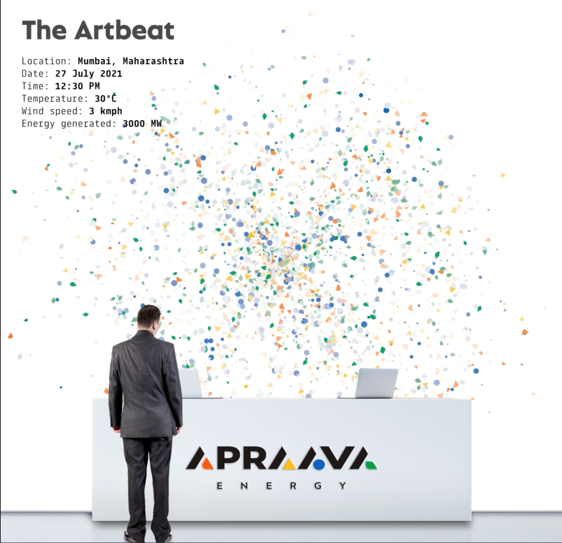
From there an ‘energy signature’ is generated for thermal, solar and wind which moves in a way that is inspired by the natural element itself. For example, should the wind speed pick up at the Changarh wind farms, the circular blue graphics representing wind power will speed up and become more intense. “Even the system became very open,” says Ray. “It's based on top of a white grid which [represents] honesty and transparency, and then these generative graphics are layered to tell these narratives.”
The modern era of branding the energy industry has brought about a new lease of life to tired companies. Once opaque and one-dimensional visual identities have been opened up to the world by putting the diversity of the brand’s energy production front and centre in a way that would have been self-abasing previously.
As time goes on though, and more energy companies move away from fossil fuel production in an honest fashion, it seems likely the next step for brand agencies will be calculating how to truly differentiate themselves from fellow green-minded competitors. Be it Apraava Energy, TotalEnergies, Enel, or BP, the brand design similarities, such as using logo colour schemes to show off eco credentials, could quickly wear out.
While many energy companies are jumping at the prospect of sustainable energy production, the long-term challenge for them might be creating an identity which doesn’t merely resort to brand recycling.


