Carne Group receives full visual update from Cardiff-based Clout Branding
The Welsh agency recognised the global asset management firm's brand and communications, which operates throughout eight countries, had become overcomplicated and difficult to navigate. Clout sought to simplify the brand by introducing a new strapline, visual language, marque and colour palette in order to make the world aware of the asset management firm’s capabilities.
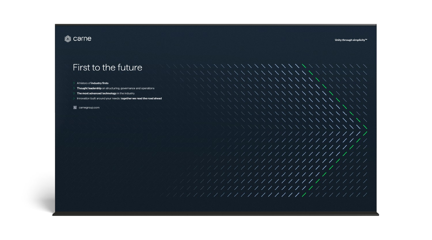
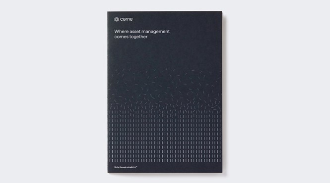
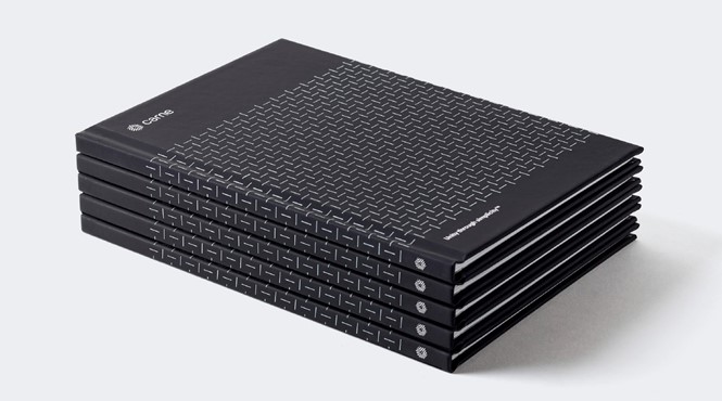
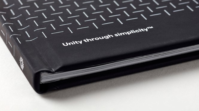
‘Unity through simplicity’ was used as the core brand idea and subtle strapline by Clout throughout the project. The lead headline, however, became ‘Where asset management comes together’, inspiring the formation of a new visual language which used lines as simple metaphors.
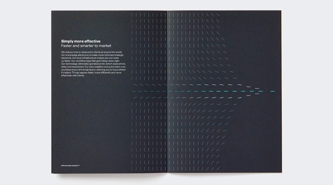
Mike Smith, Clout’s creative director, says, “The start-point for the visual elements of the brand began with the simplest expression of that core idea of unity through simplicity: a line which connects two points.
“This evolved into a ‘line language’ that could instantly communicate how Carne unites an industry of many disconnected parts. This visual style allowed us to build the story across all communications in a way that would help position Carne as leaders in the field.”
The new marque was heavily influenced by a visual style of using subtle analogies, in which a series of lines can be seen pointing to a unified centre. To differentiate the Dublin-based asset management brand, which operates amongst a ‘sea of blue brands’, Clout created a new colour palette of greys. Ranging from lighter to darker shades, the visual identity also features brighter accent colours which contrasts with the greys.
Smith adds, “The aim here was to strike a balance between a brand that felt solid and credible but that had a modern, digital edge.”
Other additions included the creation of a sub-brand identity for Carne’s technology platform, Curator, designed to improve its link with the masterbrand. Furthermore, the firm’s digital platform was renamed from CORR to Curator to represent Carne’s clients being given the power to curate and control their fund universe. A strategy-based decision also saw Carne’s 40 products be simplified to three clear service lines.
Clout partnered with Scott Perry of Bard of Bray on the brand strategy and writing and collaborated with Hambly Freeman for the website build. They worked with Rob Clarke to refine the logotype.