Brand Oath designs ‘clean and contemporary’ new look for Scottish Cycling
Opting to break away from the cliché of Scottish thistles and Saltire flags, the Edinburgh-based agency updated the 15-year-old Scottish Cycling brand so it could be easily applied across a variety of contexts, from motion graphics to kit.
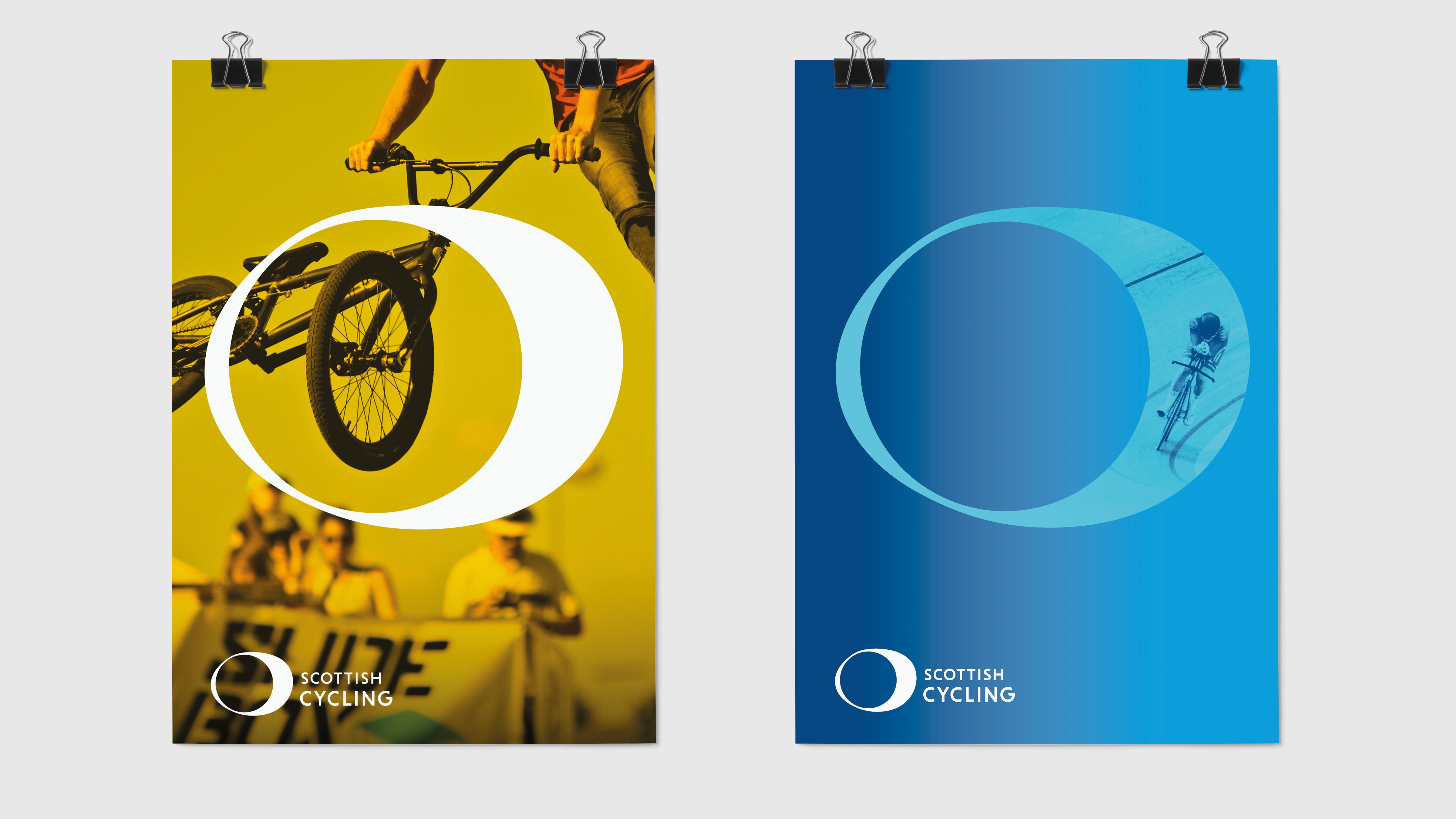
In a bid to produce something bolder than the previous brand design, Brand Oath undertook a visual exploration before finding a power diagram which shows how the human body connects with the bike and transfers power to it through the circular motion of the pedals. The commonality of this circular motion – whether you are an Olympic champion or an amateur – provided the bedrock of the rebranding project.
The importance of finding commonality was paramount due to disparate disciplines in the world of Scottish cycling – from mountain bike to track to BMX – all needing to be represented. The agency’s idea of playing on what all cyclists held in common was cemented when someone from a consultation exercise said, “I don’t care what shape your handlebars are or how thick your tyres are; if your legs move in circles, you are a cyclist!”
Now at the beginning of the implementation phase, the new Scottish Cycling logo will be active in time for the inaugural UCI Cycling World Championships, which is set to be held in Glasgow and throughout Scotland in 2023, and offers a unique opportunity for brand exposure.
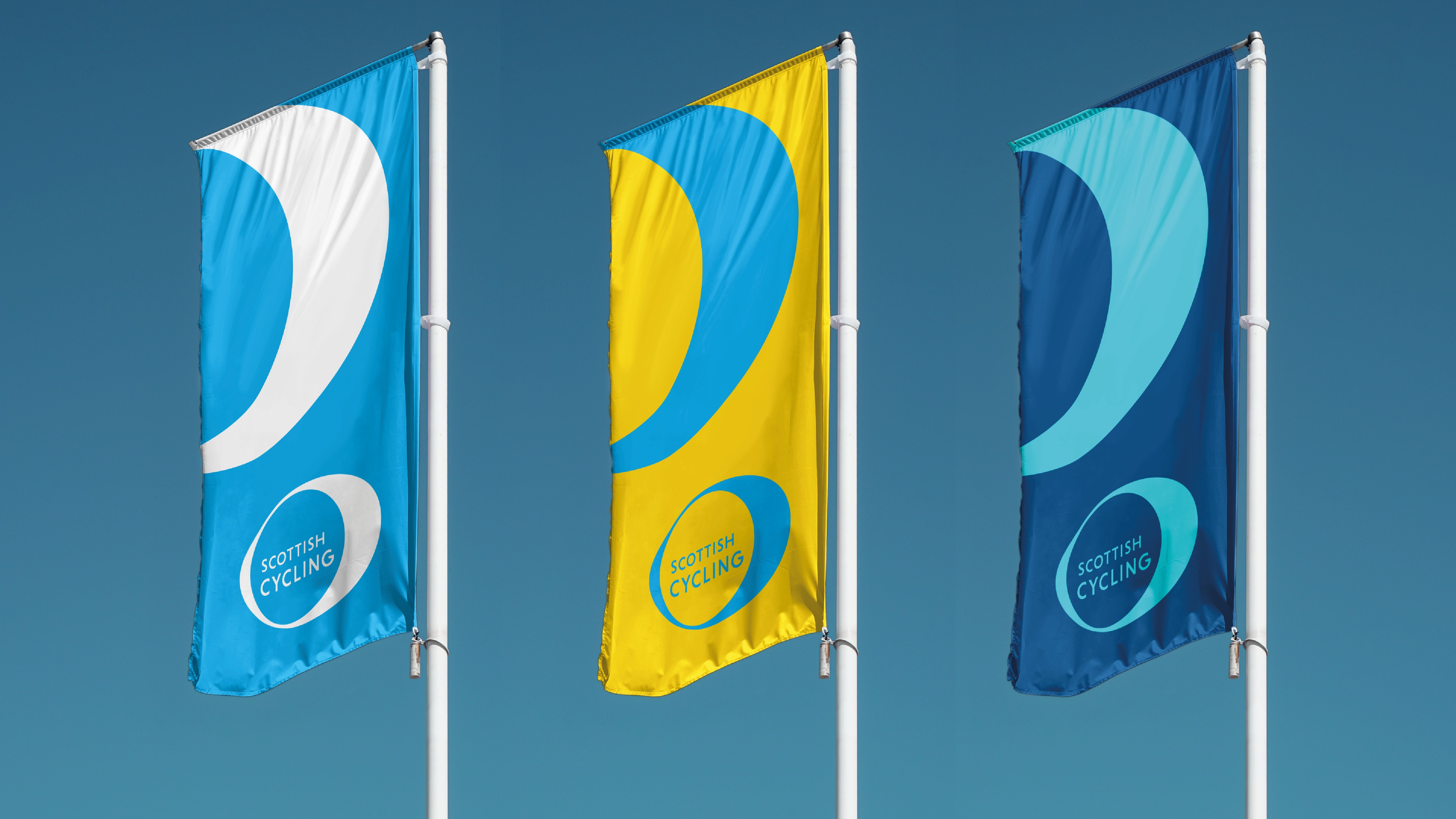
Scottish Cycling’s colour palette also saw an update. While Brand Oath recognised it had to embrace the typical Scottish colours of blues, purples and greens, it also attempted to inject brightness and vibrancy which better represents the bright and dynamic wider cycling colour palette. Meanwhile, the strong and clear existing font was tweaked to become more dynamic.

Pete Matthews, Scottish Cycling’s head of marketing and communications, says, “Our new look is modern, bold and a breath of fresh air, breaking the mould on what a governing body’s logo should look like, but with a rationale that is extremely strong and something everyone in our diverse community can relate to. I look forward to rolling it out over the coming weeks and months.”


