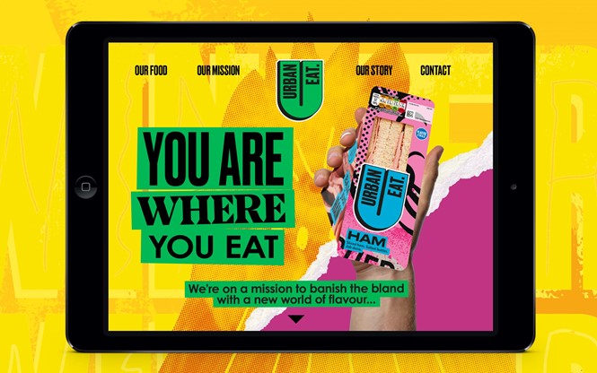
Urban Eat new identity ‘infuses excitement’ into grab & go
Leeds-based branding agency, Robot Food, developed a new brand identity for the food-to-go range, Urban Eat.
The rebrand aims to ‘implode’ the sector with bold designs that infuse excitement into the grab and go and challenge the preconceptions of the sector.
“Everything we did from the visuals and tone of voice is about breaking people out of lunchtime zombie mode and their regular habits,” says Robot Food creative strategist, Natalie Redford.
The new Urban Eat design, in fact, seeks to shake up people’s routine while keepings things uncomplicated. “It questions the previously unquestioned by providing exciting, always delicious options—whether you’re looking for something familiar or something new,” says Simon Forster, founder and ECD, Robot Food.
To do so, Robot Food looked to establish a more emotional connection with Urban Eat to bring the brand story, articulated by the agency as ‘you are what you eat,’ to life. The visual identity tries to translate how eclectic people are in cities and harness that dynamism to represent everyone who buys Urban Eat.
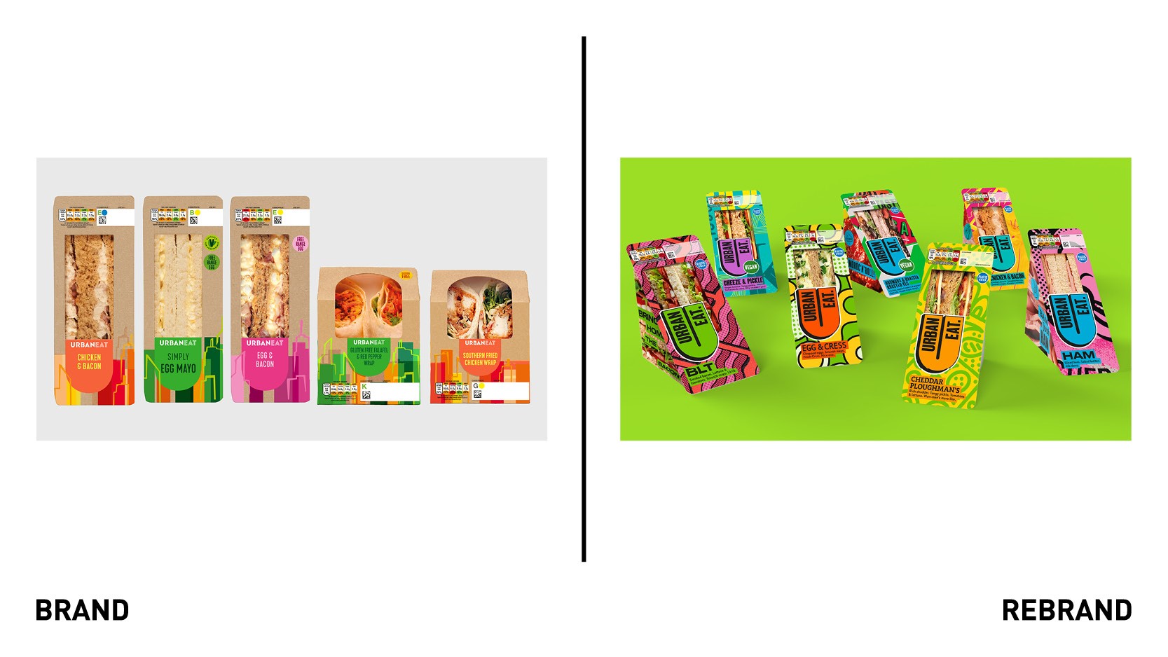
The new master logo is set in a bright yellow tone with a dramatic drop shadow, while secondary logos can be used in any colourways. Ten different fonts further amplify the sense of eclecticism and can be used in any combination across packaging and branding applications. Robot Food designed the fonts with legibility in mind, so they could allow for easy navigation across the range whilst also achieving on-shelf standout.
While Robot Food was keen to look at how the brand design could look on new products coming to the Urban Eat range, it was also vital to amplify the existing and familiar flavours. “The ambition was to become this really exciting, innovative brand. But in the short term, they still have to big up a cheese sandwich—sometimes it’s the only thing that hits the spot,” says Redford.

The main design challenge was to harness vibrant colours, intricate pattern designs and illustrative elements but without alienating anyone. “Colourful and crazy but tasty and approachable,” as senior designer at Robot Food, Chris Shuttleworth, who helmed the creation of all illustrations in-house, describes it.
The different range of illustrative styles are central to the Urban Eat brand, used on-pack to heighten the sense of excitement and dynamism of the range and create a memorable brand world. They aim to nod to elements from across art history as well as the sandwich aisle. They also help navigation of the range, leaning on traditional conventions such as pink for ham or yellow for chicken, adding a unique spin to help elevate flavour cues.
The side of the packs use vibrant pop-art style photography of key ingredients with punchy slogans to “add a touch of the unexpected,” says Forster. Through this, Robot Food developed a design that is more akin to a craft beer brand than a sandwich one. The straightforward tone of voice, which matches the graphics, results in some tongue in check phrasing and punning.
“The copy needed attitude but without feeling forced or cliched: getting rid of all those empty adjectives that don’t mean anything, being foodie in a way that feels down to earth and real and approachable. It was about being celebratory around the food and giving people permission to explore,” says says Lizzie De Jong, Robot Food copywriter.
“This new chapter and identity will allow us to build brand awareness, grow into new listings, and inspire consumers looking for unique and exciting lunchtime offerings. It’s been a pleasure partnering with the Robot Food team and we’re so excited the vibrant new look has hit the shelves,” says Ali Johns, head of brand development at Urban Eat.


