#TransformTuesday: 5 January
Here is this week's selection of rebrands from around the world, from Asian football to British media and Irish crystal. For more from #TransformTuesday, follow @Transformsays on Twitter.
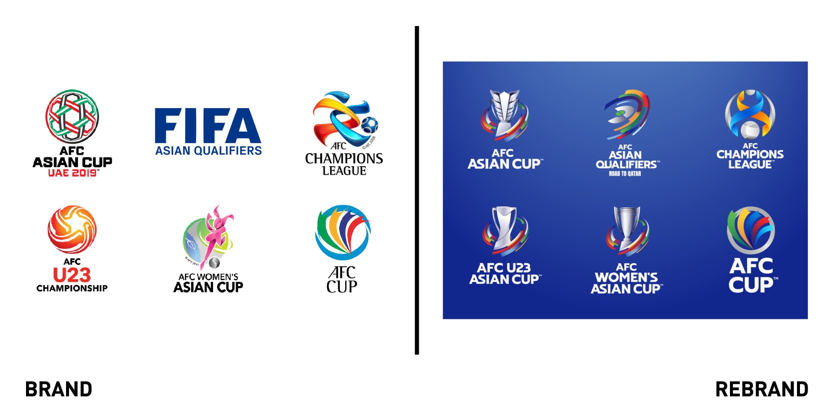
Asian Football Confederation
The Asian contingent of Fifa, the Asian Football Confederation (AFC) governs association football in Asia and Australia. To start the new year off in good fashion, the AFC has announced a rebrand of its major national team tournaments, including the AFC Asian Cup, the AFC Women’s Asian Cup and the AFC Champions League. Carried out alongside Football Marketing Asia (FMA), the new brands will be rolled out across all touchpoints including broadcast. The new approach was inspired by football stadiums and the colours worn by Asia’s football teams. Visual coherence was introduced to unite the AFC Women’s Asian Cup, AFC Asian Cup and AFC U23 Asian Cup. Consistency is also apparent the suite of new visual identities as a silver cup colour unites each logo with similar geometric shapes and common colours across the portfolio. Patrick Murphy, board member and CEO at FMA, says, “Today is an important day from various perspectives: fans of Asian football can enjoy and experience the new AFC competition brands, while sponsors and broadcast partners, as well as clubs and member associations will start to actively use the exciting new visual identities to promote AFC competitions to their audiences. A proud moment and a major milestone as we are moving into a new era of Asian football.”
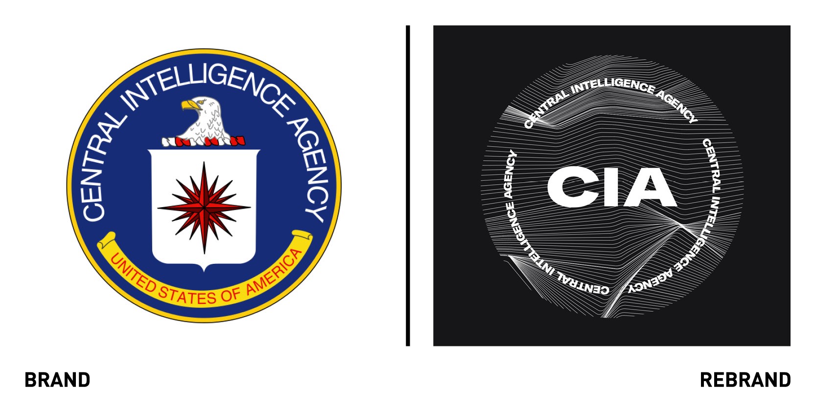
Central Intelligence Agency
“We’ve come a long way since I applied by simply mailing a letter marked ‘CIA, Washington, D.C.,’” says Central Intelligence Agency (CIA) director Gina Haspel. “I’m proud to share our new website and hope it piques the interest of talented Americans, giving them a sense of the dynamic environment that awaits them here.” Haspel discussed the value of the CIA’s new brand, targeted at the recruitment audience. The fresh look is designed to entice the best possible candidates into the organisation, positioning it as a cutting-edge aspirational and confident employer. Rather than simply listing vacancies, the careers portal highlights the opportunities available to CIA employees throughout their careers. The visual identity itself is a vast departure from the previous look. The official seal is retained, but a new logo has also been introduced which renders more simply in digital applications. Gone is the official blue on white website. In its place is a dark navy, white, black and red site that draws the user through it in a coherent fashion. The content is straightforward, uncluttered and largely geared toward recruitment across the site. The change is drastic, but comparatively, offers the CIA a more modern face to put forward to employees and prospective employees.
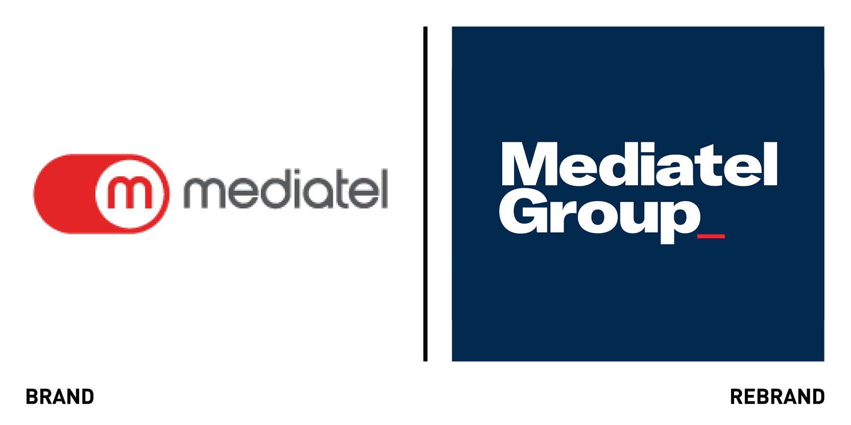
Mediatel Group
Media research, data and events company Mediatel Group works with media organisations across the UK. But, its previous brand – an on/off icon – was tired and unable to expand across all of the group’s activities, from audio to events to OOH advertising and more. It worked with London-based agency Studio Blackburn on a rebrand. The centrepiece of the new brand is a gif version of the logo that includes a blinking cursor. The wordmark itself is visually simple – capable of adapting across the group’s operations – but the cursor acts as an indication of readiness; of an always-on, ready-to-go attitude. The wordmark is complemented by a simplified M_ logo, which stands confidently on its own but can also be used across digital applications. The visual identity is rounded out with a grid pattern that recalls columns in a newspaper or blocks of digital content. The grid can adapt across applications, working in large and small formats with ease. Paul Blackburn, head of Studio Blackburn says,“Mediatel is an organisation with its finger on the pulse of all that’s happening across the media landscape. We wanted to create a group feel for the brand that allows for instant recognition in today’s marketplace, whilst still providing scope for individual elements within the group to develop their own character. I hope we’ve achieved that, I think we have, and hopefully this will support [CEO] Greg [Grimmer]’s mission to make Mediatel the ‘Bloomberg of the media world.’”
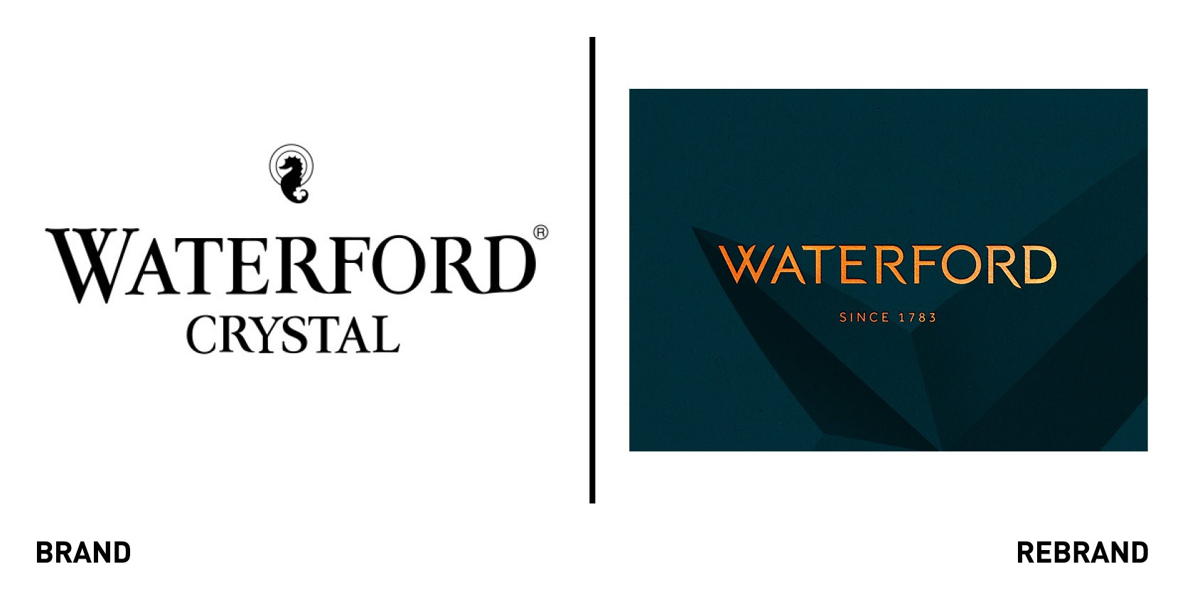
Waterford
Despite a long heritage and the strength of its brand awareness, Waterford needed to cut through to a younger audience. It turned to London-based agency Identica, which introduced the strapline, ‘crafted since 1783 for this very moment,’ to introduce a sense of experience and occasion to the brand. The logo and visual identity take their cues from Waterford’s crystal cutting heritage. The Lismore cut – based on the windows in Lismore Castle in Waterford – inspired the typography and texture of the wordmark. A strikingly rich colour palette has been introduced, with a deep green and ‘molten orange’ representing the brand’s Irish heritage and its crystal-making tradition. The new photographic style showcases Waterford’s products alongside unexpected and everyday objects. In one, a crystal tumbler is home to a handful of coloured pencils. Liquorice sweets fill a crystal candy dish in another image. This approach was intended as a shift away from the luxury lifestyle photography common of the category, to link Waterford to special moments everyday. Richard Clayton, creative director at Identica says, “The brief was one that many established brands have faced; how do we retain the essence of Waterford’s rich history, craftsmanship and Irish heritage but ensure that these feel relevant, compelling and desirable for a younger audience? I was hugely inspired by walking around the workshops, in awe of how the craftsmen were shaping the molten crystal using simple wooden paddles, how the crystal cutters manipulate small and huge crystal pieces over the diamond cutting wheels creating complex and delicate patterns. And the new identity was born from these moments in the workshop, with the glowing amber of liquid crystal becoming one of the new brand colours and the intricate crystal cuts inspiring the shape and forms of the new logotype.”
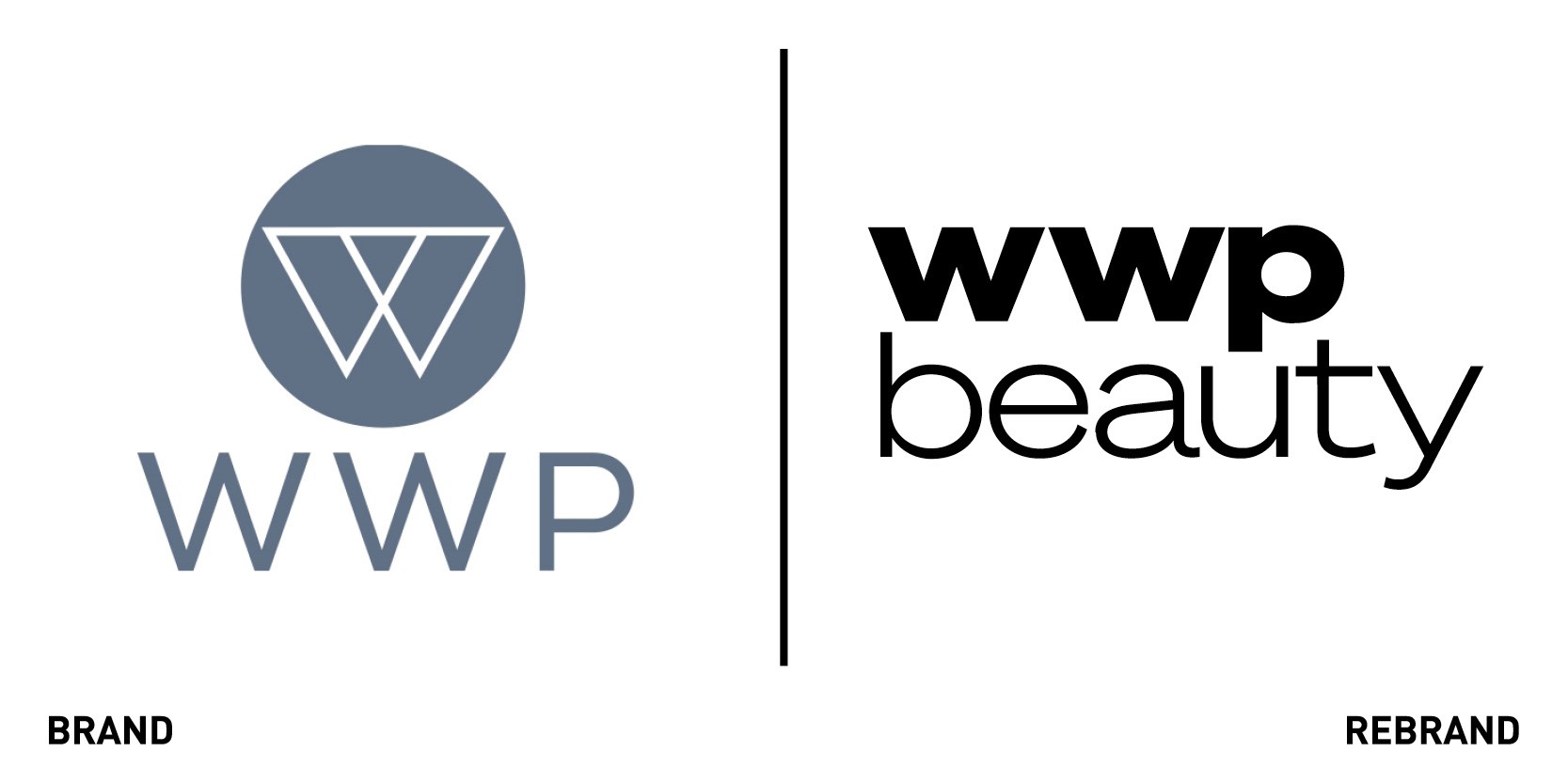
WWP Beauty
WWP Beauty may be the face behind some of the world’s most prominent cosmetics brands, but that doesn’t mean it can’t powder its own nose. Its previous website was at home among cosmetics and styling brands, with a sleek image style and a focus on the corporate story. But, with its own role expanding beyond its traditional remit of developing packaging as it works from end to end with cosmetics companies, it needed to take a different approach. The new brand transforms the company’s structure into a tripartite system, focusing on what WWP does, how it brings value to customers and how it supports its customers – including the likes of Benefit, Mary Kay and bareMinerals. That brand simplification means the new website is cleaner and clearer. The fresh look is friendly. It uses youth-oriented colours still at home within the cosmetics landscape, but divergent enough to stand out. Imagery and gifs are youthful and approachable. Josh Kirschbaum, CEO of WWP Beauty says, “With this rebranding and launch of WWP Beauty, we are redefining who we are, the value we bring to our clients, and the purpose we stand for. We’re incredibly proud and thankful for our employees, collaborators, and clients that have accompanied us in our growth. Together, we have made WWP Beauty the source for everything beauty.” The new site adds more than a dash of lipstick, though, as it clarifies the user journey and indicates WWP’s value and operations in straightforward language.


