Siegel+Gale unveils new visual identity for chip-production company

Specialist chip-production company, GlobalFoundries (GF), worked with branding agency, Siegel+Gale, to launch a new visual identity and brand story. The new brand identity aims to capture the essence of what GF is as a company while honouring its heritage.

Siegel+Gale began its work by recognising that GF had a unique opportunity to transform its brand from an ingredient brand to a challenger brand, explains Katie Conway, senior director of strategy at Siegel+Gale. The team focused on GF’s innovation-driven approach, its customer-centric view and its inclusion of a global footprint to come up with the idea ‘Delivering a new era of more.’
The strapline was “designed to convey that GF is a catalyst for change that maximizes the impact of semiconductor technology to deliver more capabilities, efficiencies, intelligence and participation,” says Conway.
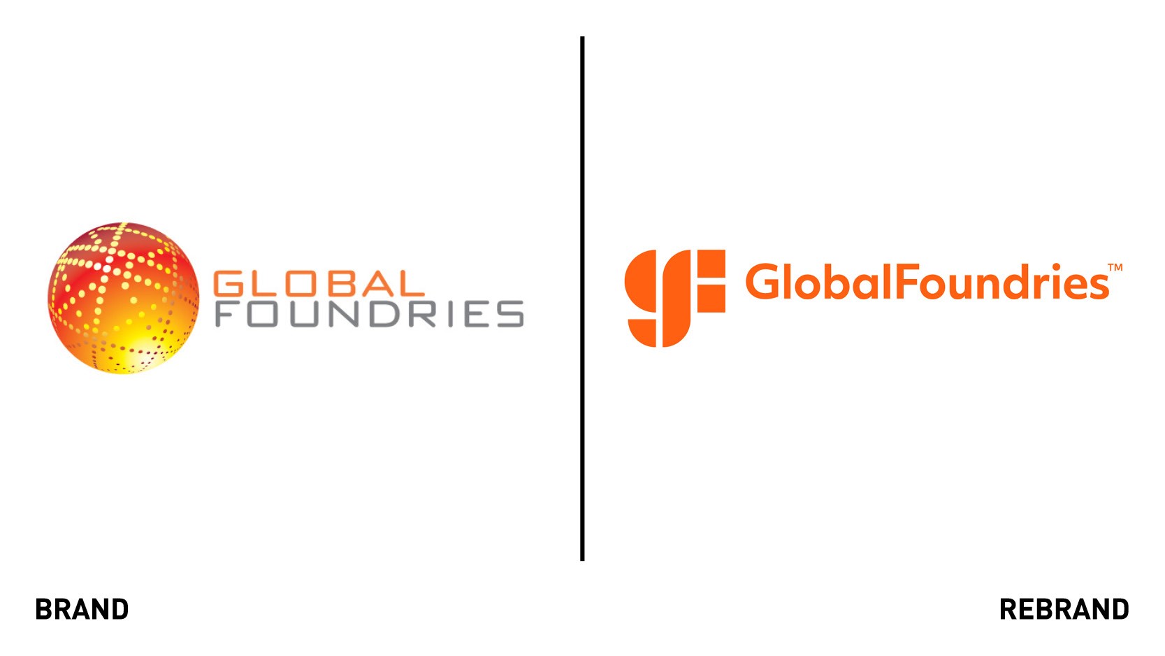
The new logo is the combination of a logomark and a word mark. “We designed the logo on the foundation of the colon symbol, allowing GF to connect words and images that communicate the cause and effect of their technology and its outcomes,” says Maureen Perry, senior designer at Siegel+Gale.
The left-hand side of the "G" in the logomark is fashioned using a half circle and a quarter circle.
The circle shapes are representative of a globe, which aims to highlight GF’s global footprint as well as a semiconductor wafer. The middle shape is shared between the “g” and the “f,” representing partnership and collaboration, indicators of the relationships GF has with its customers. The two squares that define the remainder of the “f” signify the chips, and stacked one on top of the other make an equal sign that GF uses to communicate its brand story.
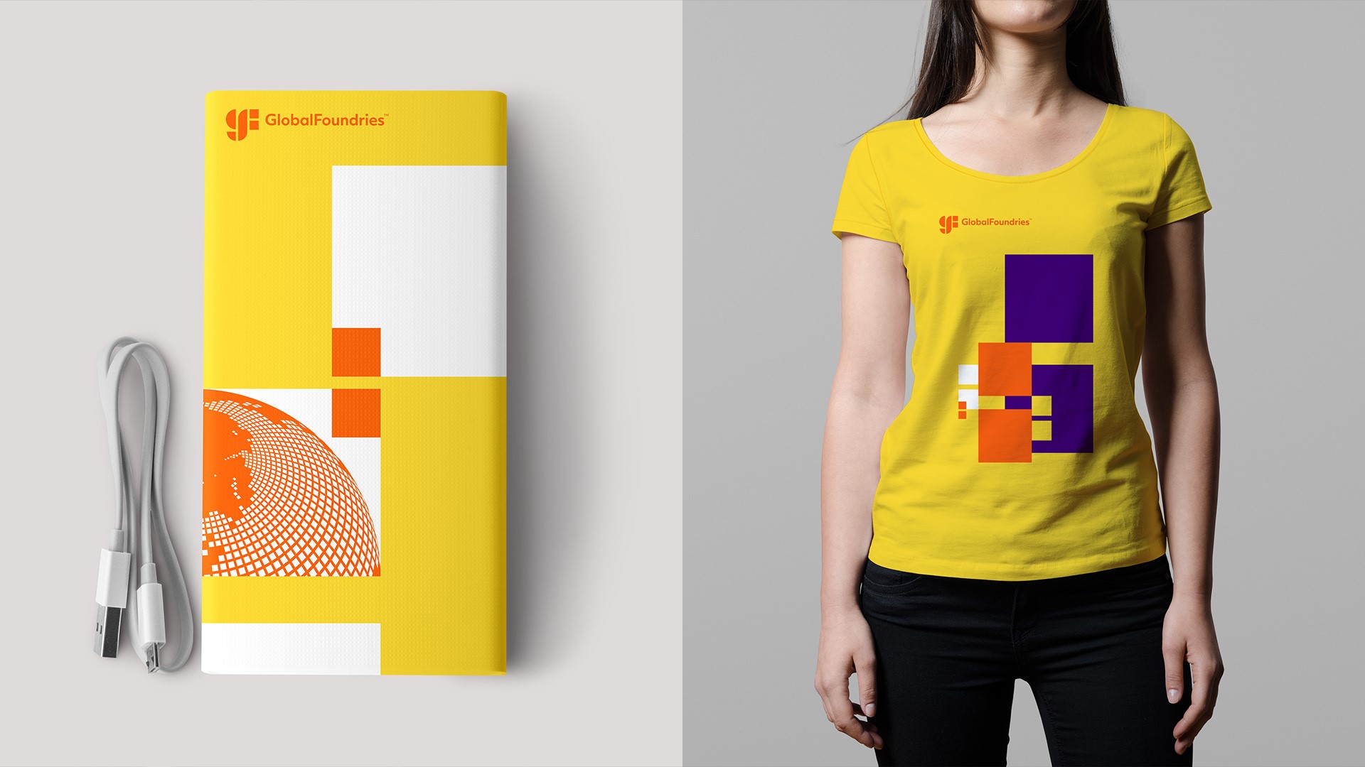
The new visual identity retained the use of the colour orange, which aims to reflect bold personality and optimism, to maintain brand equity. Yellow and purple are added to the colour palette to communicate warmth and boldness, while a clear typography was chosen to mirror the geometry of the logo mark.
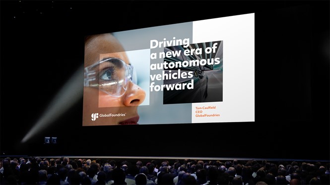
The rebrand steers away from the industry norm of graphic abstract images, and instead aims to focus on the scope and humanity of GF. The global, people-centric images were chose to reiterate the company’s global footprint and presence.
“All these elements work together to create an identity that communicates GF’s impact, captures their challenger spirit, and visually expresses the strategic positioning of delivering a new era of more,” says Perry.


