PRO14 rebrands to United Rugby Championship with design by Thisaway
The PRO14, the professional rugby union league containing the top clubs from Ireland, Scotland, Wales, Italy and South Africa, has rebranded to the United Rugby Championship. By revamping its format and adding more teams, it aims to increase audiences and build a truly world class sports and entertainment brand.
The League turned to creative agency Thisaway to design its new look and feel. Thisaway was tasked to develop a brand that had the confidence to stand on its own in the world of sport and entertainment, whilst also giving it a feeling of authority as the governing body of the league.
To have a clear understanding of the brand as a whole, Thisaway spoke to all five countries represented in the league, who are also shareholders, and realised that it was the diversity of the teams that made it distinct from any other league in the world. With this in mind, the agency developed the brand positioning ‘A different league,’ a statement of intent to be unlike another rugby competition.
The positioning aims to reinforce the diversity of the teams and supporters within the league and sets an aspirational challenger mindset to the overall brand to be bold and different from other rugby brands.
The new name needed to reflect the brand positioning and be future-proof to allow for the league to grow even further at a later date. This meant that using number in the name (e.g PRO16) was off the table. The new name aims to have a gravitas, which is easily abbreviated and has the potential to work well in future commercial discussions.
The new name aims to speak to the idea of a league that is unified not uniform; a place where different teams, clubs and fans come together in one league to celebrate rugby and take the game forward.
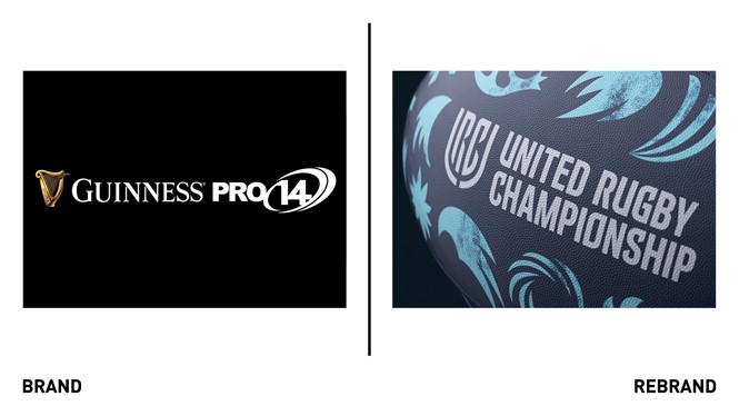
The brand positioning is embodied by the new logo, a graphic monogram using the letters U, R and C that was made to work with the team crests rather than fight with them. The shield-like nature of the logo communicates the ‘united’ aspect of the new name by having the ability to separate into two parts to reveal type, club crests, and other brand assets, before uniting to form its solid state.
To reflect the tribal head-to-heads of the different teams battling against each other on the field, Thisaway created patterns loosely based on the team crests and colours, with the aim of making them feel more celebratory rather than agressive.
“Thisaway’s interaction and handling of the respective stakeholders involved in our league was first class. They have used this knowledge and insight to develop a positioning and identity that we hope is going to be a game changer for the game of rugby,” says Tom Lister, director of marketing at United Rugby Championship.


