Pentagram designs new identity for TradingView
TradingView, a trade market tracker and social network for traders and investors, approached London-based creative agency, Pentagram, to create a new brand identity that would distinguish it from its competitors.
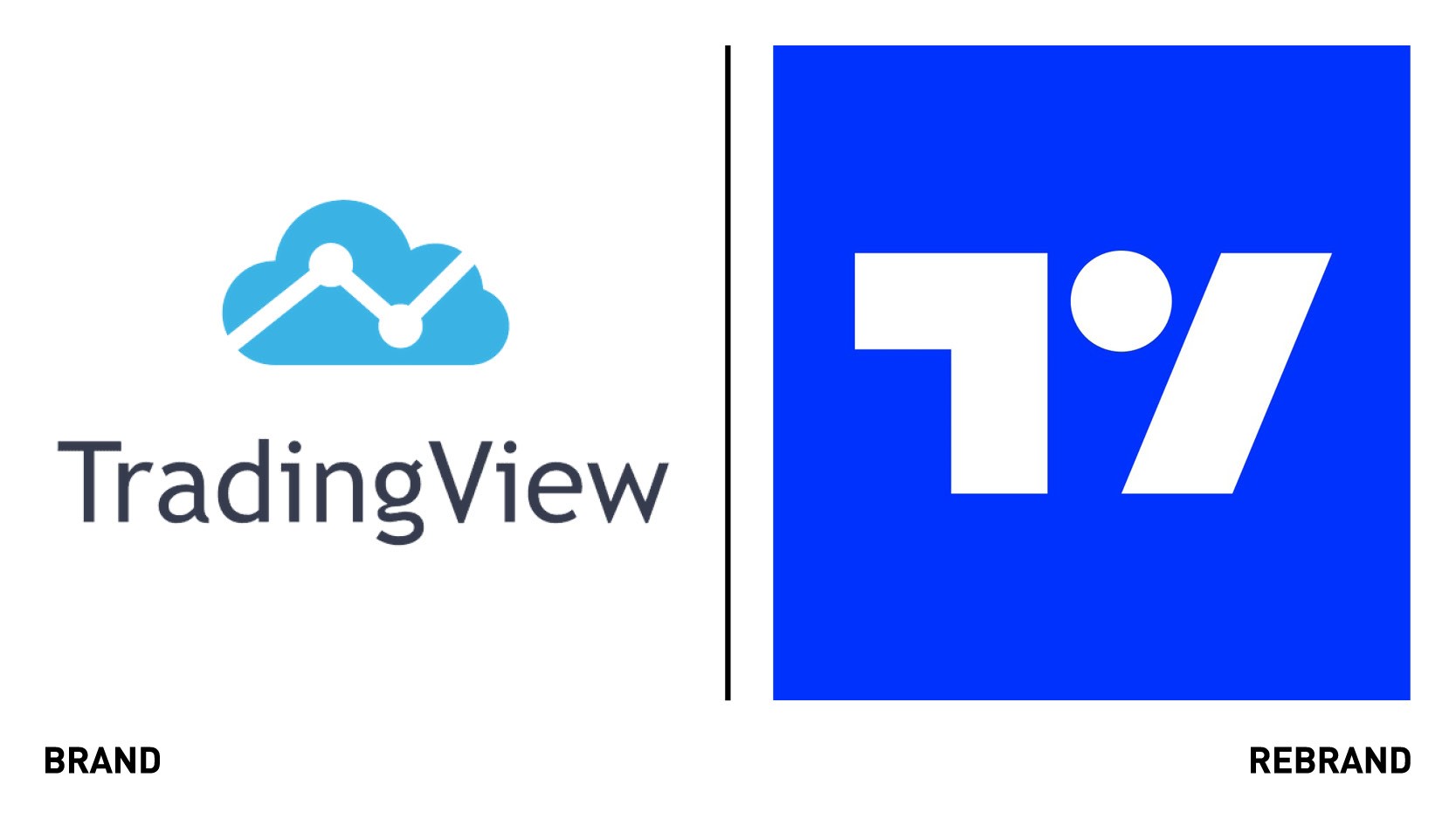
TradingView’s old logo was based on a cloud, symbolising ‘ the cloud,’ and a line chart to represent the company’s charting product, explains TradingView’s CMO, James Maddison.
“The problem was, cloud computing is now ubiquitous, and there are lots of logos using this language and—a decade on—charts only represented part of our total product offering,” he says.
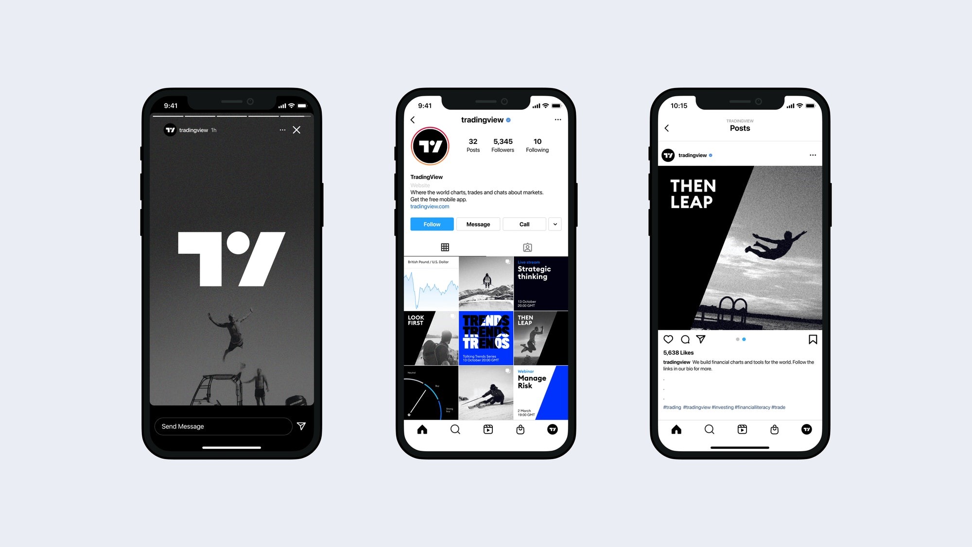
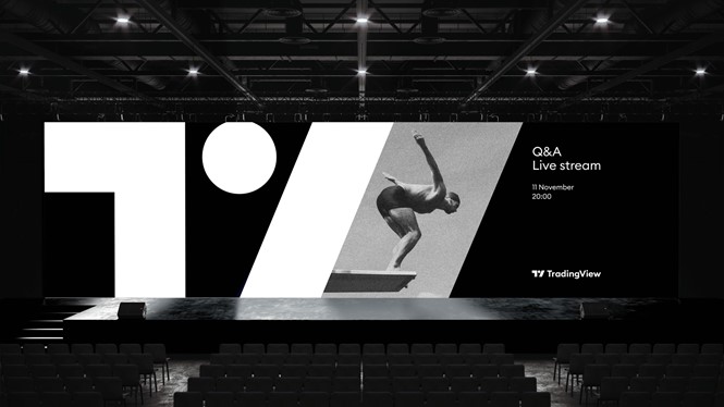
Referencing the idea that knowledge is power, the team at Pentagram devised a new tagline for TradingView ‘Look First / Then Leap,’ which this epitomises the brand’s users’ keen entrepreneurial spirit and expresses the vision ‘always an informed decision.'
The TradingView logo is at the centre of the new brand identity and features abstract shapes based on the letters’ T’ and ‘V .‘ The modern symbol is formed of three shapes: the right angle representative of a frame or focus around a viewpoint, a dot which represents an eye (linking back to ‘Look First') and a forward slash which symbolises the ‘leap' or decisive moment.
The primary colour palette consists of black and white whilst the secondary colour palette features two complementary shades of blue and a more colourful tertiary palette with turquoise, orange, and purple. The colours, which are used to illustrate the trading chart, which is a key part of TradingView’s offer, allows for the chart to be viewed in both the light and dark themes.
The team also created icons that are employed to flag features such as upgrades, open-source, and indicate when more extended time periods are involved.