One Studio creates new brand identity for Primenet UK


Sheffield and Nottingham-based design agency, We are One Studio, helped global IT support provider Primenet UK develop a new brand that would reflect the scope of its services and its positioning within the industry.
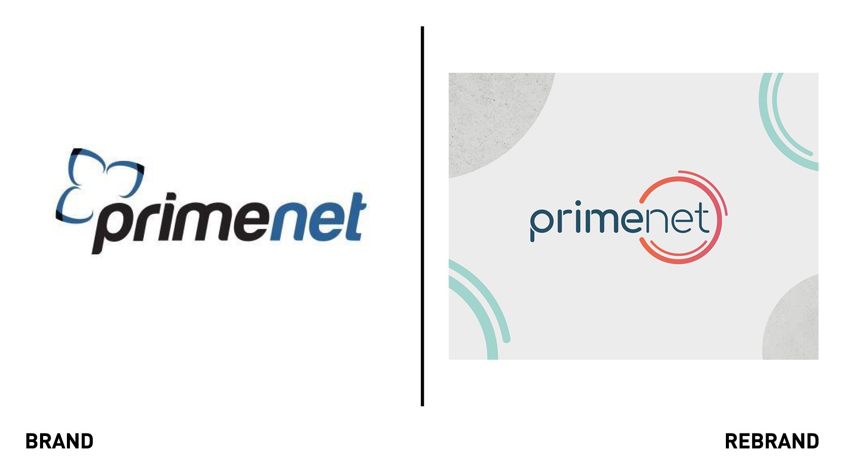
The old brand lacked personality, using characterless generic IT imagery and iconography that also made it feel outdated. Primenet sought a brand that would be individual in their field and easily recognisable as theirs, yet also flexible enough to work across all the platforms it offered.
One Studio conducted workshops with Primenet’s marketing director and stakeholders before developing the core brand concepts and presenting them to the team. One studio particularly focused on Primenet’s customer-led attitude, trustworthy and personable approach, and positioning as 'knowledgeable experts.’
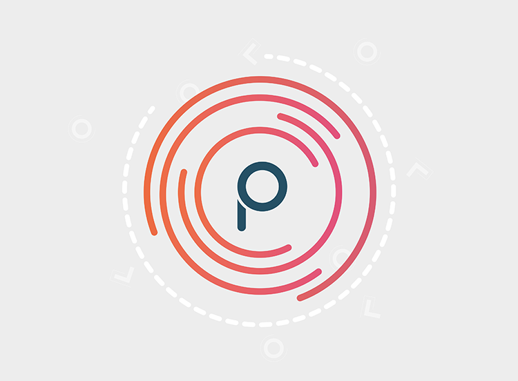
The chosen identity expresses these core business values -propositioning and positioning- in one idea: Primenet has a 360º approach to making IT simple. To reflect this, One Studio designed a rounder font, making it softer, friendlier and more contemporary than the old one. The circles symbolise the brand’s end to end service, whilst the subtle smile within the icon is a nod to Primenet’s services, customer-led approach and good customer service.
The circle graphic informs the rest of the brand look and feel and was used to create other supporting assets. One Studio also created a suit of graphics and icons that complement the circle graphic and inform the rest of the visual identity. The new colour palette ensures the graphics stands out, with the light grey or white background giving the brighter primary and secondary colour palettes a greater punch.
In addition to the overall visual identity, One Studio also produced a set of guidelines to support the brand and a suite of icons to pair with messaging on and offline.