Blond designs brand identity for new fintech company
Creative design agency, Blond, designed the brand identity and strategy for fintech company specialised in crypto funding, Vent.
Vent’s launchpad, VentUp, enables users to identify early-stage opportunities for investment, with all startups vetted so users can be confident in their investments. Blond’s brief was to create a brand that could be unique to the fintech market, using simple design language that is easy to understand, in addition to better inclusivity and a stronger community drive, in line with Vent’s core mission.
Blond began by conducting some research to understand the market and the ways in which Vent could effectively communicate with its target audience. Based on the insights of the research, Blond saw an opportunity to simplify and humanise the crypto investment offering, often polarising and targeted at a small consumer group, to appeal to a broader demographic. However, the agency also felt that its design needed to be subtle and sensitive so as not to alienate early adopters.
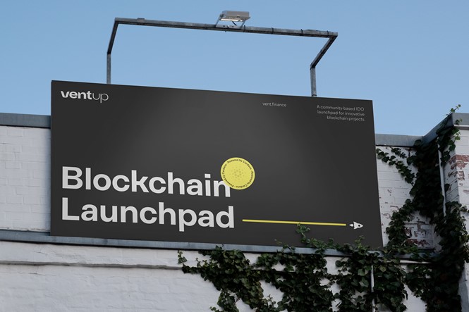
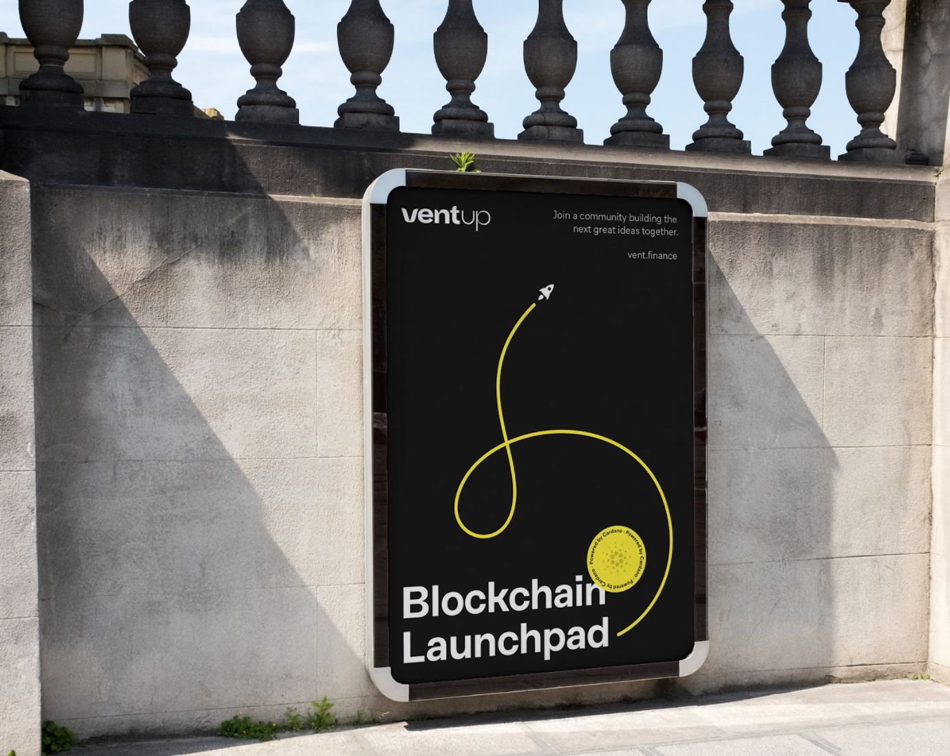
Blond adopted a playful yet confident aesthetic to strike the right balance between appealing to a younger demographic as well as the crypto-savvy and crypto novice audience. The letter “V” of the client’s name in the logo, reminiscent of a growing plant, symbolises an inclusive community with open arms, while reflecting the ‘launchpad’ nature of Vent, nurturing new ideas and helping businesses grow.
Getting the juxtaposition right between the logo and the product line played a key part in Blond’s design process. This ensured that they work together aesthetically when positioned next to each other, and they are "flexible" enough to form a clear distinction between them without the use of colour or extra space.
The colour palette, which primarily consists of black, white and yellow, is kept minimal; it seeks to be bold and current but also aims to bestow trust. The animated stickers and vibrant signal colours also help add a touch of fun, humanising the brand and making it more personal.
The overall identity design aims to be dynamic and fresh, yet welcoming and approachable, making it easy for both novices and regular investors to engage with the brand, without alienating either of them.


