McDonald’s launches global packaging redesign
With over 60m touchpoints in use everyday, McDonald’s packaging matters. One of the world’s largest fast-food giants worked with independent brand agency Pearlfisher to launch a new global packaging system, which brings a sense of joy and ease to the brand through bold and colourful graphics.
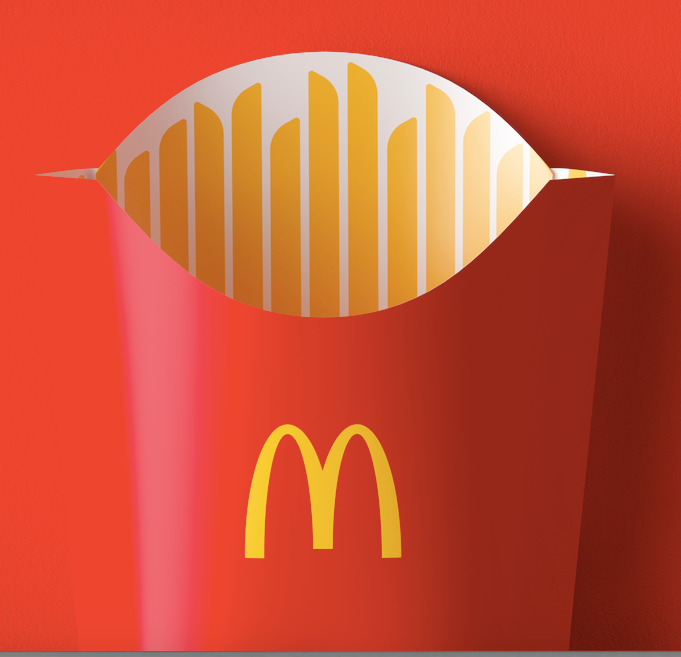
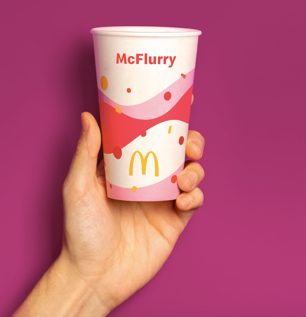
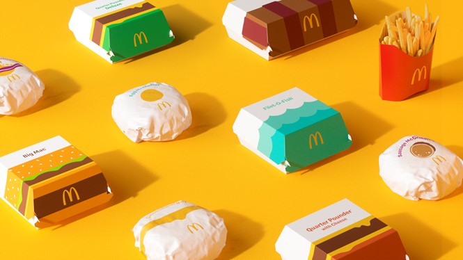
The graphic system serves as a single visual framework for the brand’s portfolio of products, capable of transforming the modern expression of the global icon and evolving brand perception along the way. Transitioning from a design system with prominent on-pack messaging, the graphic representations of menu items help make each of the structures more connected and evocative of McDonald’s’ playful point-of-view. From the cool, blue waves on the Filet-O-Fish clamshell to the golden, melting cheese on the Quarter Pounder, the packaging makes for an expressive, visual system.
“Our task was finding out what was really special about each menu item to design a system that would make it easy for others to do the same. There’s beauty in the simplicity of McDonald’s’ iconic menu items. We aimed to find the most special, recognizable and iconic expression of each – celebrating them in a way that makes people smile,” says Matt Sia, creative director at Pearlfisher.
The redesigned packaging ensures that operations remain efficient for McDonald’s’ crew members making each meal, with each wrapper, clamshell and pack is designed to be identifiable where order assembly occurs. The easy-to-understand graphics drive recognition regardless of where in the world orders are being assembled, shared and enjoyed.
Earlier this year, fellow fast food brands Burger King and Subway also introduced new, simplified packaging.