Burger King’s rebrand introduces a mouth-watering throwback to the ’70s
The undisputed king of Whoppers has undergone its first global rebrand in over two decades, including a new logo, packaging menu boards, and uniforms. The new identity is ‘mouth-watering, playfully irreverent and proudly true’ and pays homage to Burger King’s greatest classics.
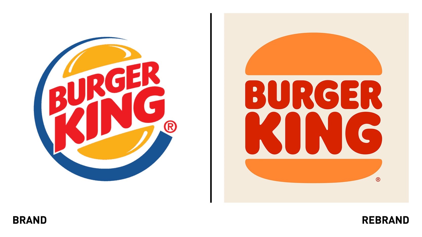
Working with global creative agency Jones Knowles Ritchie, Burger King decided to abandon its logo, introduced in 1999, in favour of a flat design featuring two halves of a burger bun around the words ‘Burger King.’ This new approach resembles the logo used from the 1970s-1990s. While more refined and confident, the new design pays homage to the brand’s heritage and the iconic position the original logo held in popular culture.
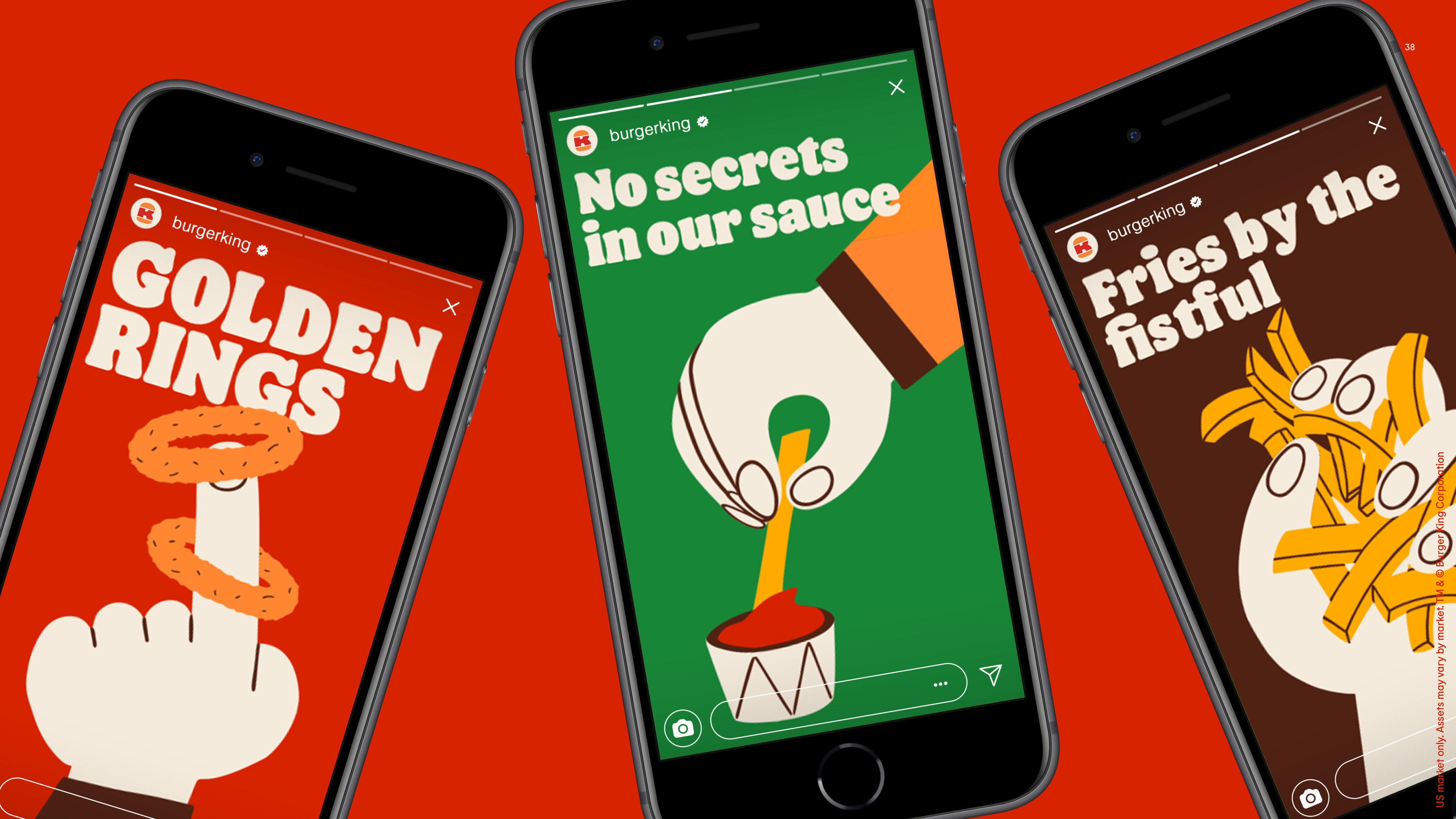
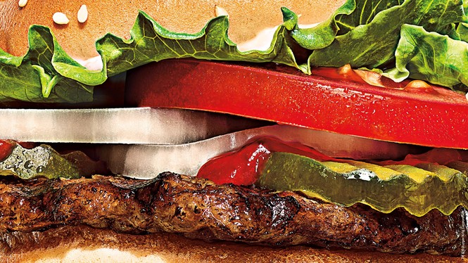
While the logo is simplified and flattened, it by no means diminishes the vibrant and playful personality character of the identity, which centres around authenticity and tastiness. This is reflected by the in-your-face photography style that uses big, dramatic close-ups of the juicy and perfectly grilled burgers people crave when thinking of Burger King.
“As our business evolves, we felt that our brand personality, attributes, and all the work we’ve done around food quality should be better reflected in our visual identity,” says Rapha Abreu, global head of design at Restaurant Brands International.
The bold typeface, Flame Sans, and the warm colours, ranging from mustard to orange, evoke the natural and organic shapes of Burger King’s food, and are yet another nod to the brand’s trademark flame-grilling method. Illustrations run through the visual identity, from the paper on the tray to the social graphics, telling stories about Burger King’s customers and enhancing the brand experience.