Little Big Brands designs new packaging for Ethel’s Baking Co.

Michigan-based Ethel’s Baking Co. worked with White Plains, New York-based brand and design agency, Little Big Brands, to develop a new identity and packaging design that would embody the heart and soul of the brand.
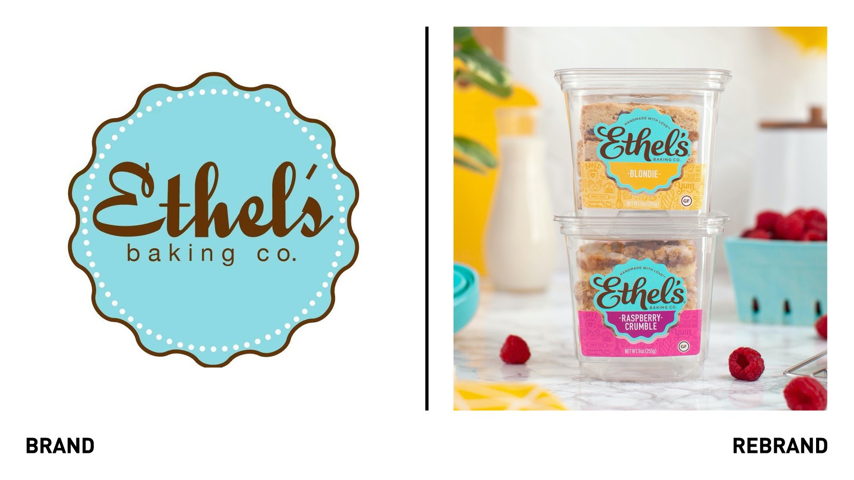
The rebrand's aim was to create a modern interpretation of Ethel’s that achieved shelf stand-out and prepared it for national exposure. Before any design could be presented,however, the brand story needed to be written in a way that was meaningful for consumers and authentic for Ethel, founder of the brand. Like Grandma Ethel, the brand needed to feel real, warm, genuine, and proud, embodying who Ethel was as a person.
“When we sat down with the Ethel’s team to discuss working together, it was easy to tell that this is so much more than a job for them -- it’s a family legacy. Profit and success are truly secondary to creating amazing baked goods that everyone can enjoy. It was impossible not to be inspired by this dedication to the craft,” says Richard Palmer, Little Big Brands’ ECD.
The logotype is an evolution of the original branding. Without loosing its essence, Ethel’s wanted it to feel more like a signature, as if the founder might’ve written it herself, resulting in a aims nostalgic and not too contemporary wordmark.
The new visual identity is centred around custom-drawn typography and illustrations, which aim to bring the flavours and the handmade nature of the products to life. Similarly, the palette, which was chosen so that the entire line is a complementary range, incorporates colours found in nature and the pantry palette. Each stock keeping unit colour was specifically selected to borrow from ingredients within the recipe so that consumers telegraphically understood the flavour before they even read it.


