Lantern designs new identity for PR agency Red Setter
London-based brand consultancy, Lantern, developed a new identity for Red Setter, a Brighton-based PR firm specialising in design agencies. This marks the company’s first-ever rebrand.
Red Setter felt the look and feel of the old brand no longer reflected the company and the changes it had undergone in the past 21 months, since Covid-19 began. With lockdown came the right opportunity to make the rebrand a priority and reevaluate what the company stands for.
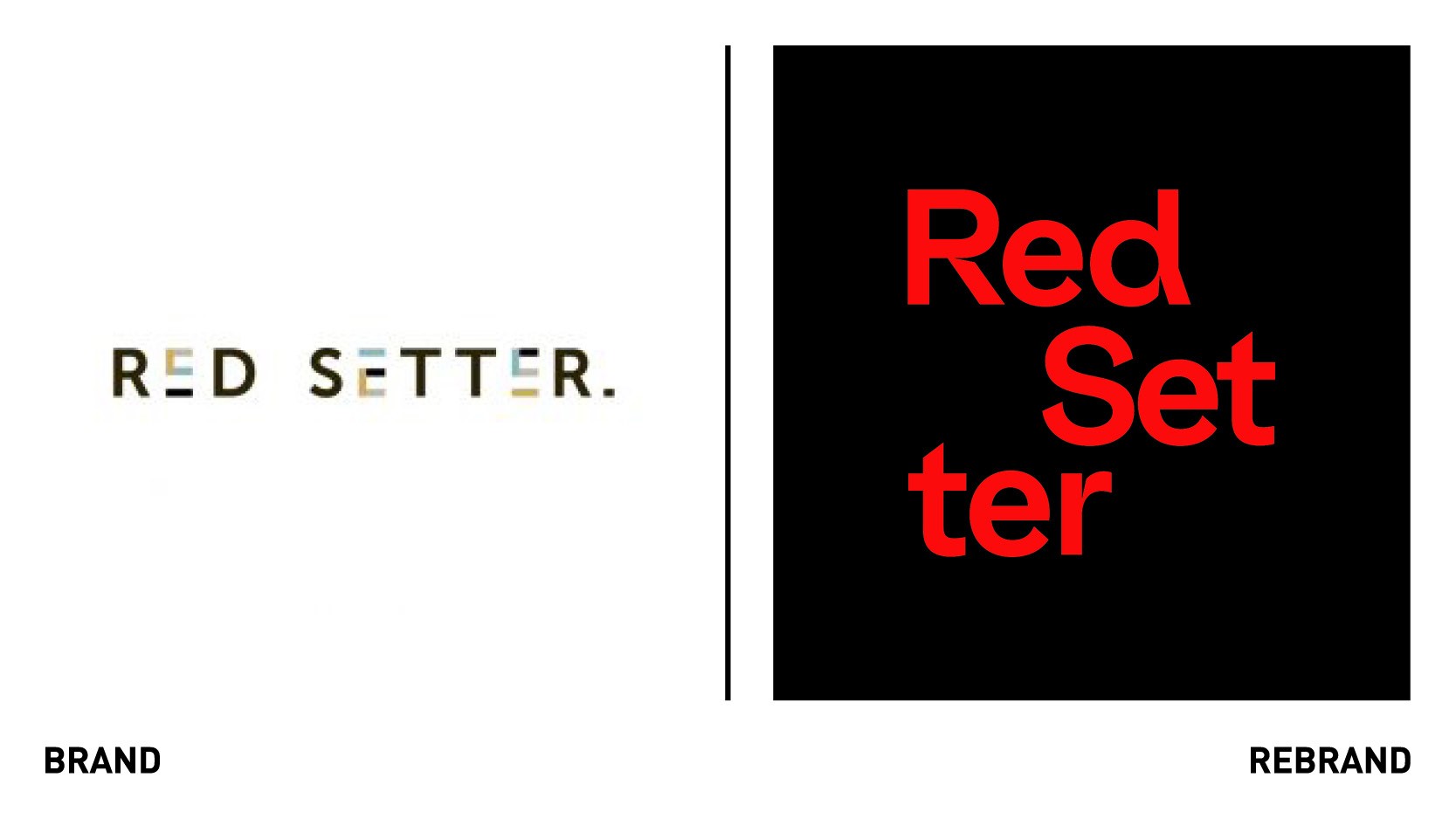
The new brand, which includes a refreshed logo and visual language, reflects the “rolling, scrolling, nature of today’s media,” says Claire Blyth, founder and MD of Red Setter.
“We’ve built an expert team of journalists, media specialists and PR strategists who share an unrivalled understanding of the design industry and the media. It’s insider knowledge that sets us apart, so we can set our clients apart and achieve the recognition they deserve. This is what we wanted to communicate in our new brand and show how we keep our clients relevant in an ever-changing world,” she adds.
Designing a brand that would appeal to a wide audience of designers and design agency heads proved to be challenging, explains Ryan Tym, founder of Lantern. The new visual identity had to standout whilst also communicate that Red Setter is uniquely positioned to understand life in the design world and the challenges agencies face nowadays.
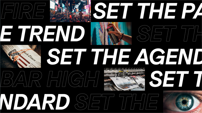
"When it came to the verbal side of the brand, we wanted to create an attitude for Red Setter that reflected the progressive nature of their business and the sector. The Red Setter name was a bit of a gift. With it, we could create a suite of messaging that plays on 'Set' and 'Setter'. This is an agency and industry that sets the trend, the tone, the pace and the agenda. Their clients set the standard and Red Setter sets them apart,” says Ryan Tym, founder of Lantern.
Lantern designed a deconstructed logo to reflect a world in constant flux. The visual timeline aims to deliver the centrepiece of the new graphic system, enabling Red Setter to hero creative headlines as well as showcase a stream of changing imagery. The imagery is often bleeding off the canvas to reflect constant motion. The predominantly black and white colour palette was chosen to reflect the clarity and conviction with which Red Setter speaks.
“Lantern spoke to our team, many of our clients, and other stakeholders. It enabled them to show us a vision of Red Setter that we’d never seen ourselves. Then they designed it verbally and visually, creating a look and feel, a way of talking about ourselves, that will not only show the world’s design pioneers what PR and Red Setter can do, but will also show the very best PR professionals and journalists out there what an exciting field design is to work in,” Blyth says.


